Categories
DMA 384 Projects

Project 4: Book

This project was more exciting then I originally thought it would be. I had a lot of interesting ideas for things to use from the beginning, Using a version of Clarendon and Gadugi, I wanted to have a balance of serif and sans serif fonts, which I feel I achieved.

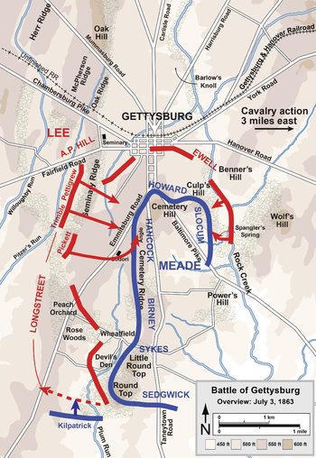
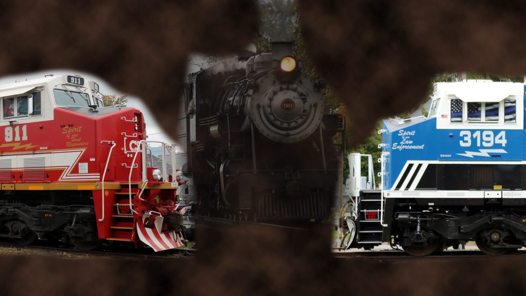
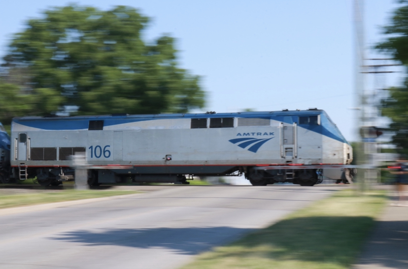
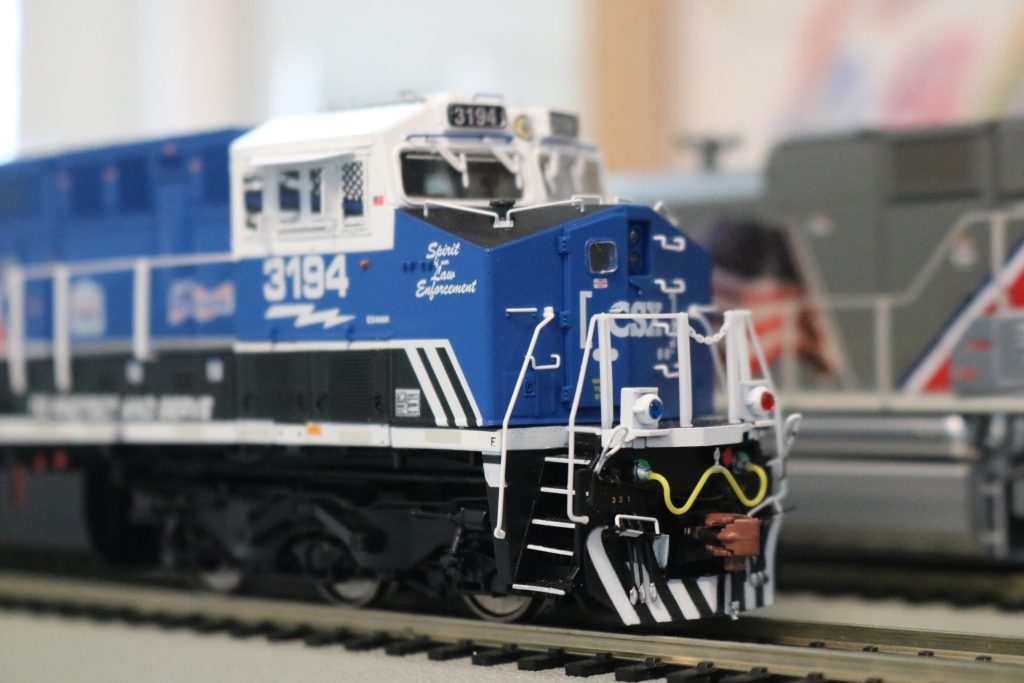
I used a poem from the Reverend Wilbert Awdry, the creator of The Railway Series, a photo that I took myself, and a piece of artwork done by my best friend Jake, I wanted to create a theme, and I feel like I achieved that.

I wanted to do more, but I wasn’t sure what else I would want / could do, maybe do more design work to the pages itself, but that was a afterthought.

Categories
DMA 384 Projects

Project #3

For this project of doing a historical poster, I knew exactly what I wanted to do from the very beginning. Using Clarendon, a font from around the time of the latter half of the 19th century, I created a poster based upon the Union victory after the siege of Vicksburg, Mississippi in 1863 during the American Civil War.

I wanted to keep with the theme of the era, and looked any many different posters from the time. Which are quite simplistic in how they are formatted. Larger lines of text to show the most important ones and smaller ones to show the lesser important details.

I would have liked to have added more information to both the actual poster itself as well as the part explaining the font. However, wherever I looked, resources were limited. But I am very happy how the final product came out.

Categories
DMA 384

Project #2

Since I heard about this project, i had a certain vision for how I wanted to do it, and I went about it in a very creative (as in this is only something I would do) type of way. I liked the concept of the text being shattered, and I wanted to do something along the lines of that. For this, I used one of my favorite movies, Gettysburg, and arranged the text in a way to mimic it.

Using a map as reference, I matched the text for the word Gettysburg with what would’ve been the defensive Union Line during the battle, and matching similar text to show where the roads were also laid out to give a better understanding as to what the viewer is looking at. Since this is also a battle of the Civil War, I wanted the text to look “battle worn” in a sense. By cutting some of the letters and arranging the pieces accordingly, I feel as if I accomplished that.

For the second one, I liked the idea of doing something reflective. I then decided to use another Civil War movie, Gods and Generals (an absolutely horrible film but I wanted to stick to a theme) and have them facing each other with the reflections being used as shadows. The idea being these are two rows of soldiers about to face off, such was the style of warfare for the time.

Categories
Uncategorized

Lab #1

Typography in the Wild

The type that I chose for this lab was the logo for the railroad company CSX transportation. I have never really seen something quite like it anywhere else. I find the text to be very large and blocky. Unlike other companies who tried to go for a more sleek and modern design, CSX went for something very simple.

Categories
DMA 212 Labs

LAB #5

For Lab 5, I decided to use Adobe Illustrator over Figma (I’ve worked with it for many years and find it to be easier to use). I also did not find it to be incredible challenging since I’ve done work similar to this design in the past for my own creations. What I did find hard was what exactly I wanted to do, but I decided to go with sustainability since I thought that there was a lot that could be done with that.

Categories
DMA 212 Projects

Project #2

This project was difficult for me specifically mostly due to the fact of what was being asked versus what I had at my disposal. Some of the steps I either couldn’t work how I wanted it to or didn’t feel right to me with what I had. I decided to use my two photos of CSX #911 and #3194, two of CSX’s special painted honorary units. I then used a photo of Strasburg #90, a steam locomotive currently residing on the Strasburg Railroad in Pennsylvania. I figured that this was a good way to show the rail industry as a whole, a very dirty and black past with a bright and promising future.

Categories
DMA 212 Projects

Project #1

I would say one of the things that I learned was how to use Adobe InDesign, I had never worked with the program beforehand and I think it can definitely be handy in the future, although I found it a little difficult to work with at the beginning. The easiest part was resizing the images in photoshop for the online portfolio. I think the one thing that could be improved was the photos I took of the different things that I purchased on the trip. They could have been better but given my time constraint I think they came out okay in the end. The one thing that could improve the project for the professor was maybe the explanation of the instructions for what to do, as I found them a little complicated. I think I can use InDesign for future projects (both school and my own) as I find it handy for making PDF style art. What I am impressed with is my level of creativity as I came up with this idea on my own and had no outside inspiration for this one.

Categories
DMA 212 Labs

LAB #3

Using the process of image masks is something I am definitely familiar with, yet doing them in these format was a different experience entirely. Using the magnetic lasso tool helped out an immense amount, and would say that was the easiest to accomplish, the hardest being trying to use the final option and getting into the finer details with trying to mask hair. I’m still not 100% on it, but I think I can be better over time.

Categories
Labs Uncategorized

LAB #1

Sample Photo from Unsplash
Original Photo
3D Object
Original Drawing
Advertisement

If I were to compare my original photo to the one from Unsplash, I would say that mine is better for a few reasons. While they both have this sense of motion, I would say the lighting and angle of the photograph is significantly better. I always find that roster shots versus a head on angle shot tend to turn out better, especially with capturing this sort of motion effect. As for the other photos, I would say that scans would turn out much better, mostly for the fact that the lighting as well as cropping can be used to enhance the image, as well as it can create a photo based on the image when its completely flat, to make sure you get as much detail as possible, without outside forces.

Categories
Uncategorized

Hello world!

Welcome to DMA Sites. This is your first post. Edit or delete it, then start writing!