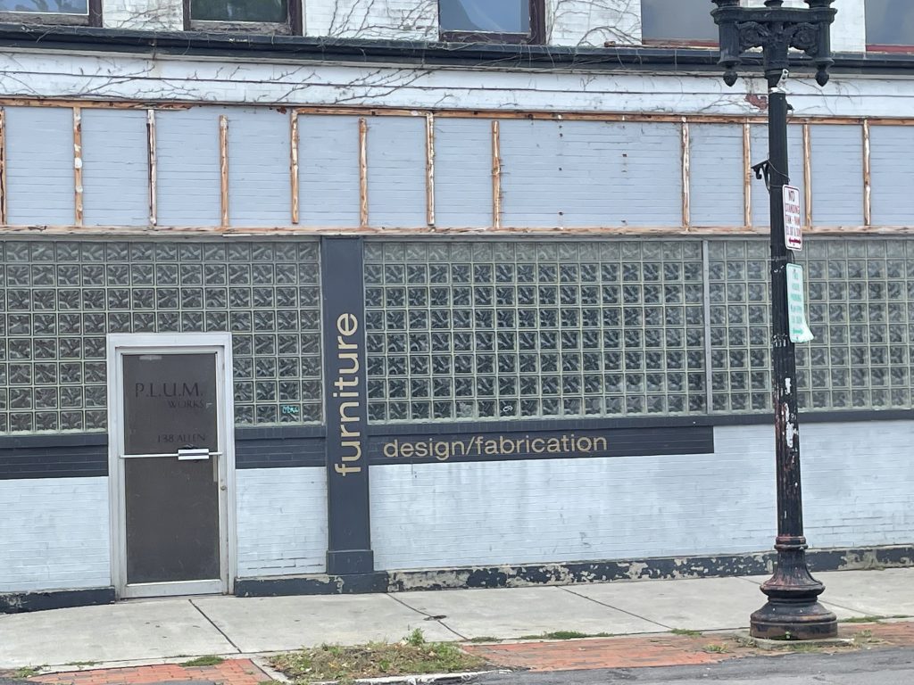
I am already realizing that there is a lot more that goes into typography than would appear on first glance. It takes into account the thickness of characters, spacing between them, roughness or smoothness, and much more. I realized while messing around in Illustrator that there are tools which allow a creator to make font fit their specific needs. I took this picture of a furniture store in down town Buffalo. I believe that is Helvetica. This has a very clean look to me, and I love how it goes in different directions. The color of this text also blends really well with the blue on the rundown building.