What did you learn?
Throughout the process I started to understand how much goes into pulling off a successful font. Looking at examples online I tried to figure out how to create a look/theme that matched between all of my letters. I had to rethink everything a couple of times. I would find that my letters started to contrast with each other. Ultimately I stuck to a set of rules that still proved difficult with certain keys.
What was Easy?
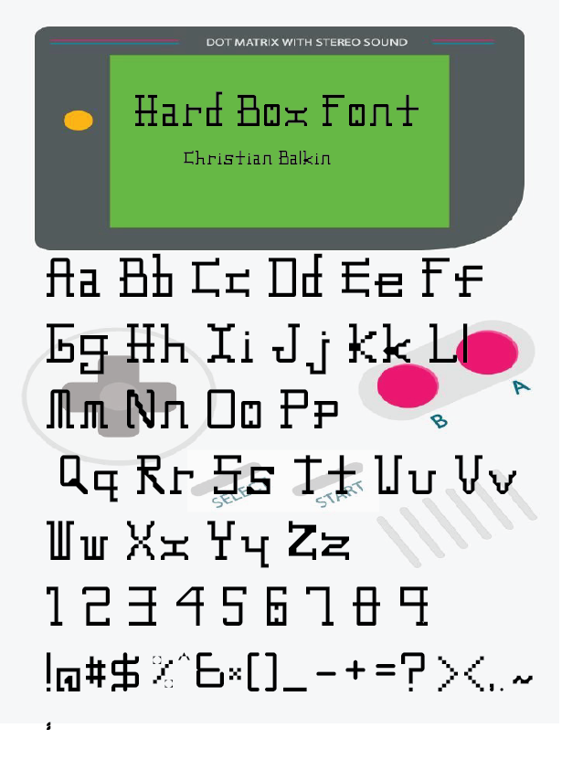
I found that certain letters and numbers proved to be much easier than others. I was constructing a pretty simple blocky text. My idea was something that resembled fonts that appeared in old video games. The tools on Fontstruct were easy enough to navigate so it just started coming together.
What was challenging?
Opposite of what was easy I found that certain letters and especially symbols proved difficult to make. The “&” was particularly challenging. The block pixel format was difficult to navigate the symbols that have lots of curves and subtle details. It was also difficult to keep track of the size between all the letters. The grids and markers assisted with this but I had to make lots of corrections when the rough font was complete. I also had small errors sprinkled throughout where certain letters did not match the theme.
How could your submission be improved?
In the finished product I still have some letters and symbols that I am not happy with. I think my submission could use some redesigns. My letter x is a good example. I think that it fits into the look yet it still stands out when being used in a sentence. Perhaps some fine tuning on it would help it blend better.
How can the professor improve the assignment in the future?
Ultimately I liked the way the assignment was run. I think some students may benefit from some lessons on how font designers approach some of the more difficult symbols.
How might you apply your knowledge in future assignments or work scenarios?
In the future I would put much more time into creating a set of rules. I did not go into this font with a very solid idea on what I wanted to create. It caused me some problems as I got into it with certain things contrasting.
How did a specific reading, video, or example inspire or help you?
I looked online at a lot of font examples. These did give me some ideas on how to organize it. I based some of my loose rules on a mix of the examples I saw online.