What did you learn?
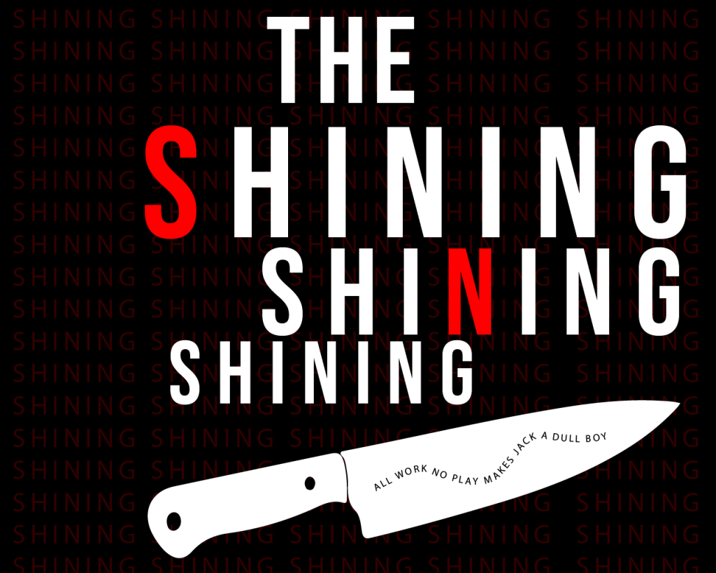
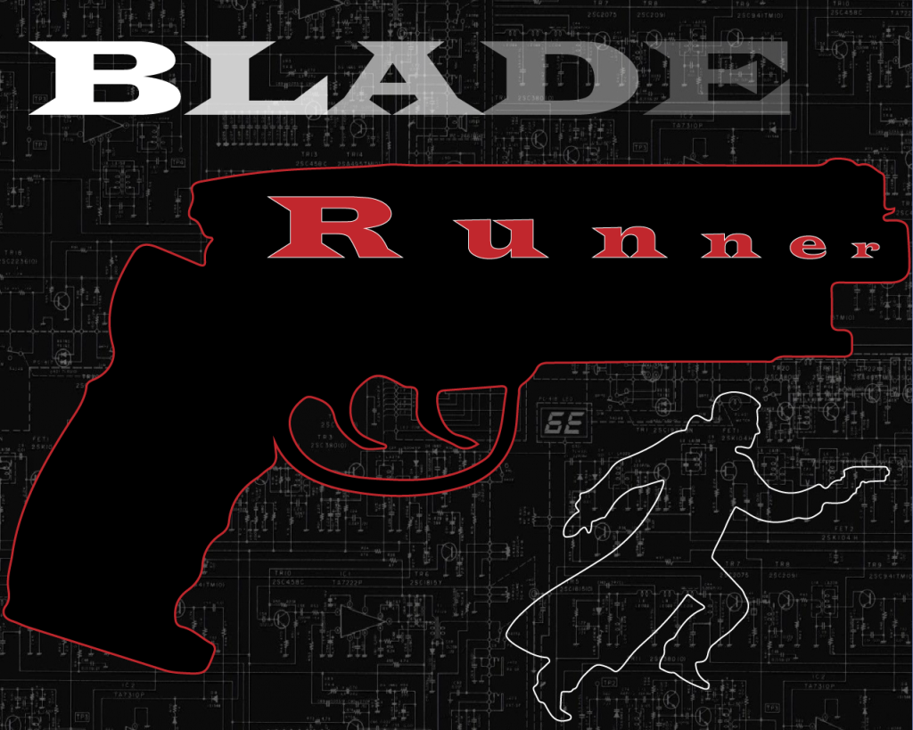
- I really enjoyed this project and was pretty satisfied with my finished images. I decided to make posters for the movies “Blade Runner” and “The Shining”. This was the first time I designed something where the letters/words were taking the center stage of the image. When working with text I’m surprised to see how very subtle changes can make a difference. On both posters I realized that attributes such as character spacing could make or break the image. It was also important for the look that the words are symmetric with one another.
What was Easy?
- As mentioned one of the aspects I placed prevalence on was the spacing between letters. I used illustrator to create these and the Type tools respond well. Setting up the spacing and aligning the separate text boxes was pretty seamless. I also realized that changing the color/outline of some characters really helped the words as a whole pop on the screen.
What was Challenging?
- I had some issues with my “Blade Runner” poster. I felt like it was too empty/bland. I tried to add numerous things to it but I ultimately found they all made it look worse. I found that there is a very fine line when working with text. It can borderline to much or too little and the challenge is in finding that middle ground.
How could you submission be Improved?
- As said I had some issues with my Blade Runner poster. My issue is with the bottom half, most of the text is centered near the top. Perhaps I should have added additional text to the bottom such as the directors name.
How can the professor improve the assignment in the future?
- I thought this assignment was laid out well. My only point would be that the project description does not specify that two posters should be made. Other than that, it made a clear point what the project was about and what to start researching to get ideas.
How might this knowledge be applied in the future?
- I use text a lot in projects yet I never do to much to design it other than resize and change colors. I found with this project that text can be used as a very powerful center object. Applying this in the future I would like to give text more center focus.
How did a specific source help?
- I was having trouble balancing everything in my poster for the shining. I found a video that introduced an interesting technique by changing the opacity of a background image. After applying this I ended up with the style I was looking for.