What did you learn?
- This project got me thinking a lot about the history of type design. I learned a lot about futura and fonts in general. After a lot of online research I started to better understand the design format that fits a certain font, and it’s always representative of the era it comes from.
What was Easy?
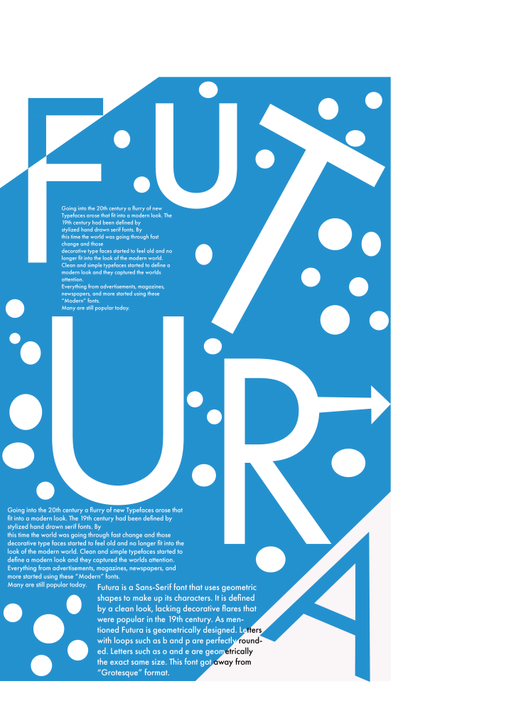
I used illustrator for this project. To get the overall design of my poster I had each letter spelling out futura in separate text boxes. This made it easy to place each letter where I wanted it and give a specific color and font size.
What was Challenging?
I first came up with the design of my poster, then I started thinking about where I wanted to place the paragraph text. I realized I had not left myself enough space to do this effectively so I had to do some redesigning.
How could you submission be Improved?
I was happy with the way I designed my poster by placing Fututura across the page. I felt like there was too much empty space so I filled it with a poka-dot design. I’m not sure if this improved it or made it worse. I’ve considered that the cleaner look may have been better.
How can the professor improve the assignment in the future?
This assignment was straight forward and well explained. I realized when I went to thing of a font designer I was not familiar with any. Perhaps it would be beneficial to speak about more designers early in the semester.
How can this be applied in future assignments?
This got me thinking a lot about designing for a certain time period. In the future I plan to do more research on fonts to discover which one would best suit a specific design need
How did a specific source assist with this?
This is a website that lets you put in a search font and brings up results of posters made in that font. I used it to get references of other designs that had been made using futura.