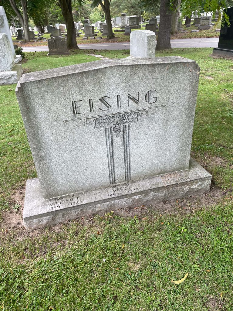
This Grave has been labeled using a Decorative Typeface. I really like the letter design with this font. While some of the letters are separated it maintains a clean sharp look.
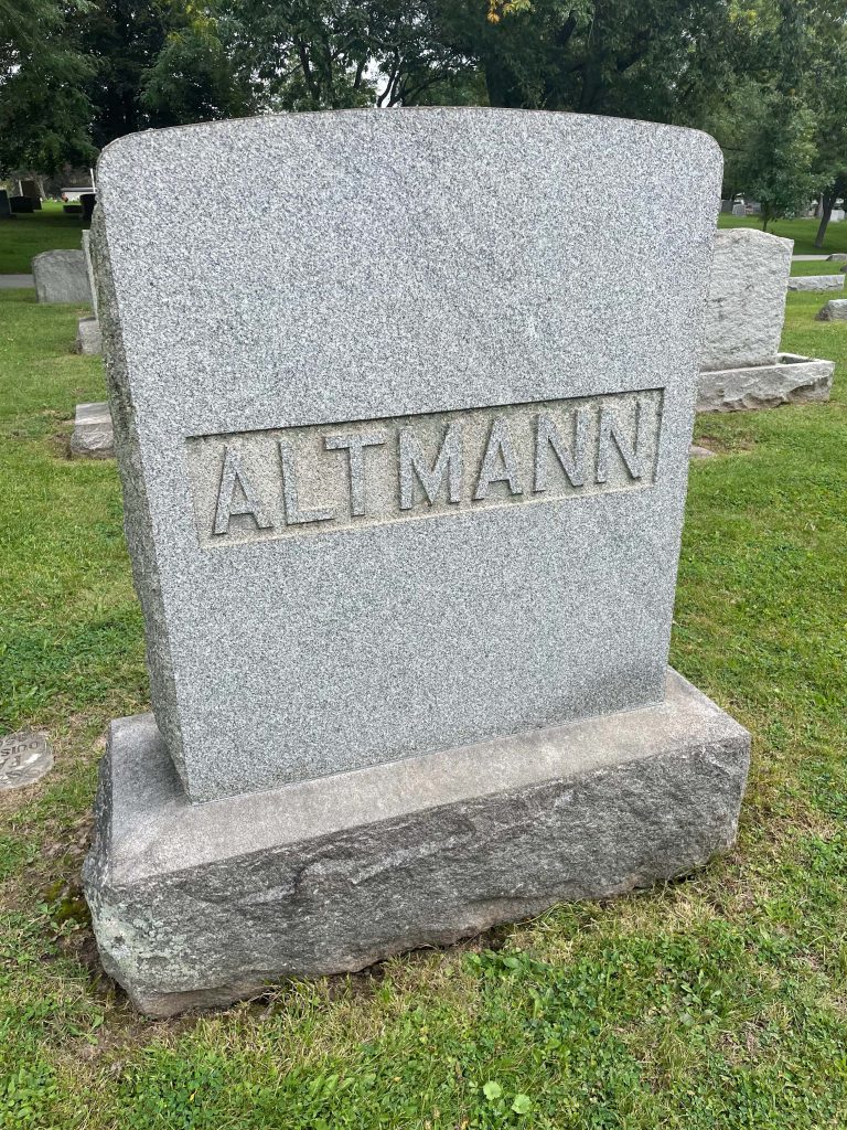
This stone is a great example of a Sans Serif font. It has a very clean look and allows the name to be the center of attention.
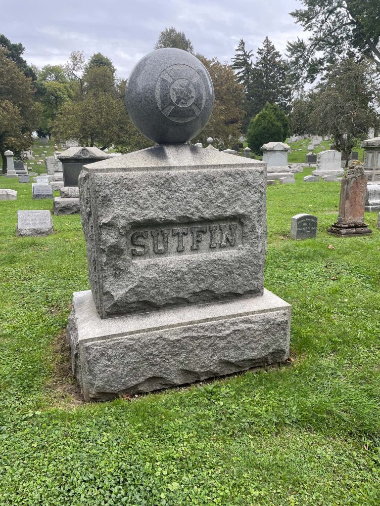
This was one of the harder fonts to find throughout the cemetery but here is an example of slab serif. This would not be my first idea for a grave font but I must admit it stands out. The characteristics of slab serif give it a blunt delivery.
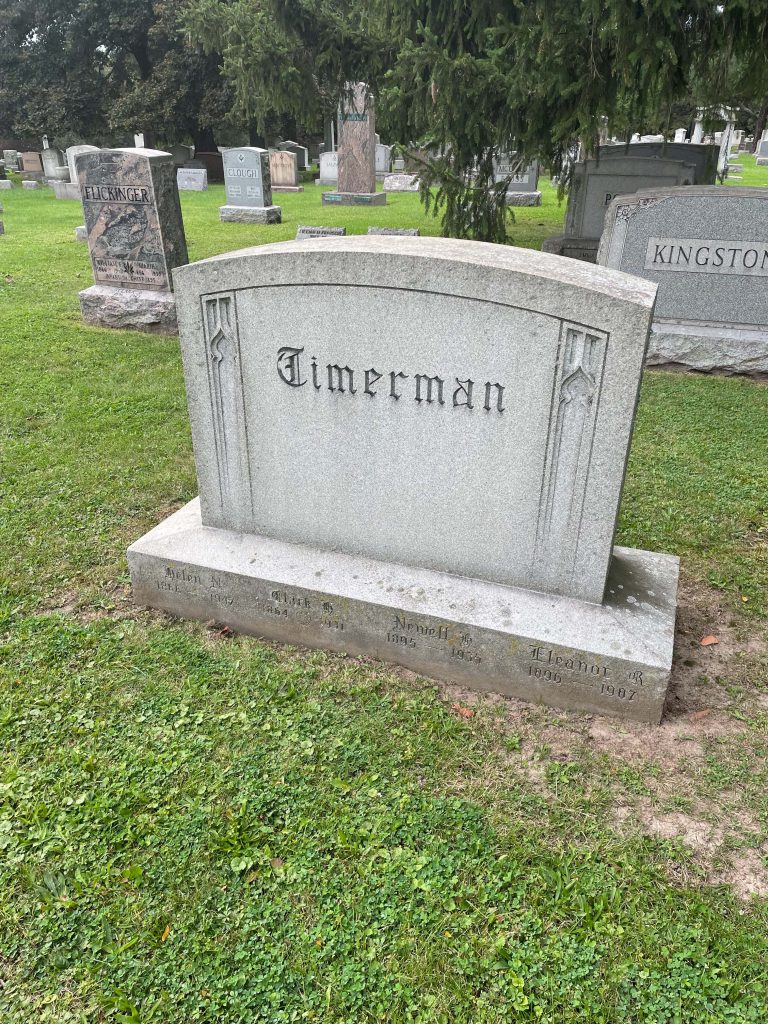
This gravestone is marked using Black letter font. I think this is a really cool looking presentation. The font choice gives it and old and distinguished feel. It works great in this situation(being on a grave stone), yet I imagine in others Black letter may not be the right choice.
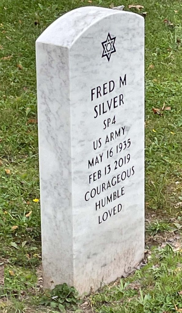
Here is a great example of a serif font. It is very clean and has a simple presentation. I think this is a great choice for a veterans grave. It definitely seems like a font that would implemented well in the military.
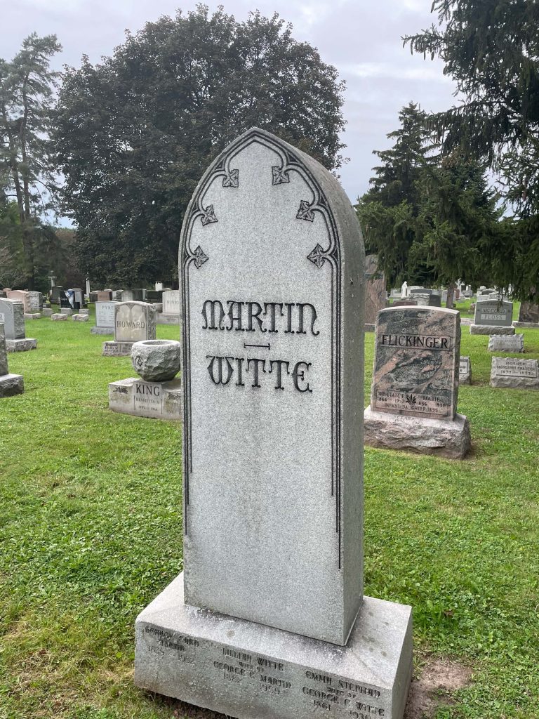
This is a decorative font that we came across while exploring the cemetery. I really like the presentation on this stone. It has a sort of medieval vibe to it. The letters line up nice with one another, especially how the M goes to the A. I could see this as something like a Knights tomb stone.
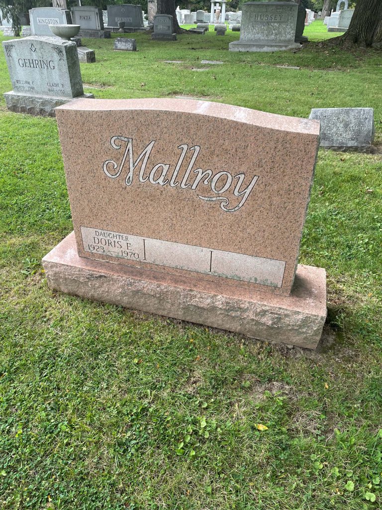
This grave stone went with a script font. I think this looks really nice and I love how the Y loops down under the end of the name. This font is decorative and distinguished, a great choice to be used on a grave stone.