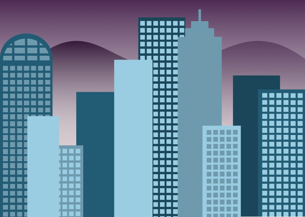
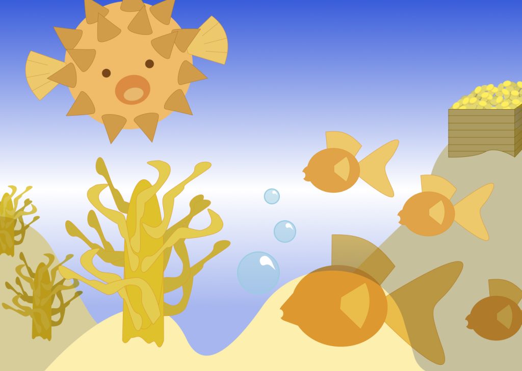
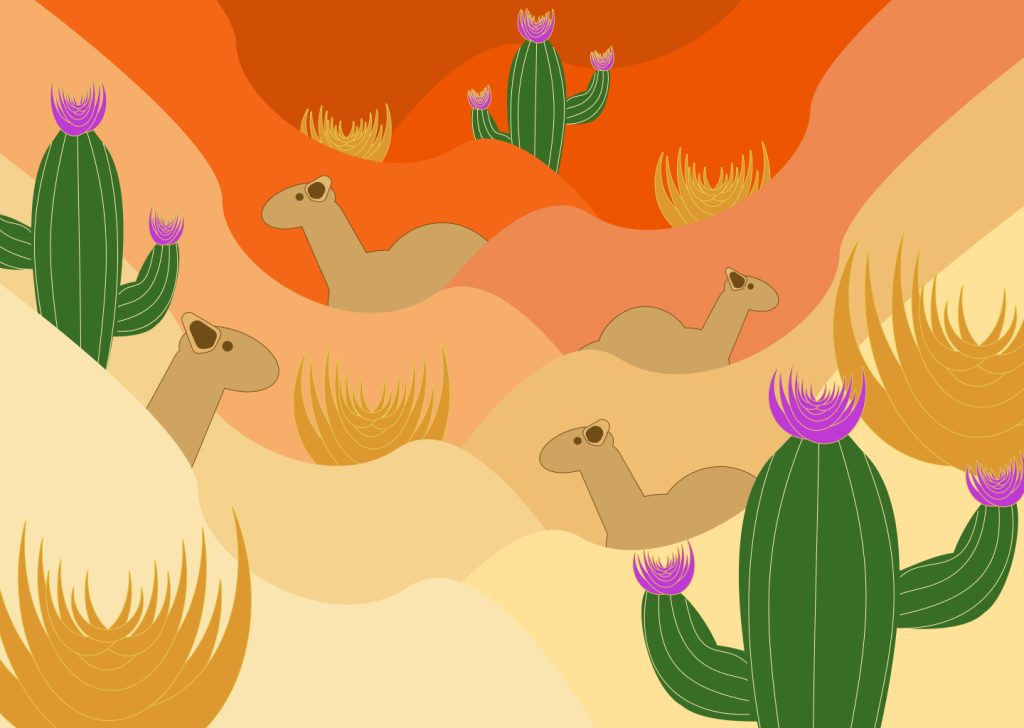
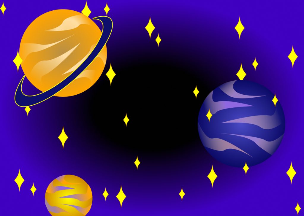
For this project we learned different kinds of color schemes and in the project we were tasked to make a landscape that uses the different schemes. Up above in my project I used the analogous color scheme for an urban city, the complementary color scheme for a seascape, the triadic scheme for an arid dessert, and lastly the split-complementary scheme for the outer space landscape. During this project I learned how to create different images just from the foundations of basic shapes. I also learned how to take images on figma and curve the lines in order to make more detailed images. What I found was easy was layering each image in order to create a dynamic scene for each frame. There were a few challenging things about this project. One mainly was time management, since I knew that I was going to be using simple shapes I underestimated how long each frame would take for me. Another challenging element to this project was making sure I was able to show the different color schemes. There were moments where I had to stop in order to think of whether or not the frame was showing the scheme I was going for. So in those moments I would take a moment for myself and try to rethink how to do the landscape in a better way. For example for the Arid Dessert I was complete with the sand and was gonna go for an analogous theme but then I had to pause and remember that I had used that theme. So in order to fix the problem I came up the idea to have cacti with flowers in order to bring more colors for a triadic theme between the colors orange, green, and purple. If I were to continue working on this project I would rearrange the buildings of my urban city so there are more contrasts with the shape and so the image itself doesn’t feel congested, same goes with the dessert scene. This assignment was pretty good for students to explore different color options and how to use them for contrast and I feel as though there is no need to change the assignment. Working on this project made me realize I need to change up my color palette a little more and with that it will help me bring contrast into my work and give my work more of a ‘popping’ effect.