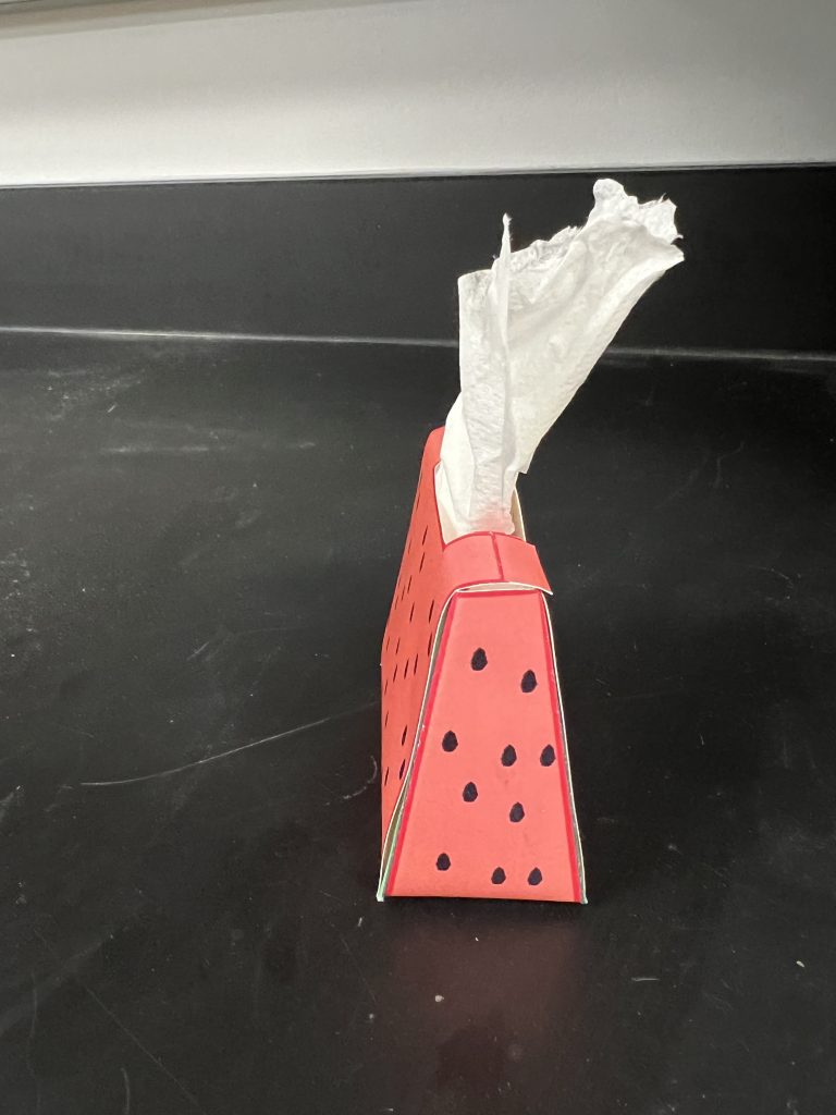
This project was definitely required me to think a little more about the technical side of things when it comes to print design. Making sure my tissue box folded correctly took a little while as I had to print it multiple times to realize what needed to be fixed and improved. I still thing project 2 was the most fun for me to actually make and it was really cool to have a an actually t-shirt with the logo I made on it. But I did enjoy having to figure out how the package was going to correctly fold and getting it to come together at the end was very rewarding. One improvement I could made was making my seam a little tighter at the top of my tissue box as there was a little space that you probably wouldn’t see on a professionally done box. I actually used Figma quite a bit because I feel like I much more efficient with it and it is just more user friendly then adobe for some tasks. The graphics I did on my package was that of a watermelon because the package is in the shape of a watermelon slice which I thought was pretty unique because you don’t often see packages in the shape of things that already exist. Im pretty happy with how it turned out and hope to take the skills I learned in this project and apply them to other projects in the future.
