
What did you learn?
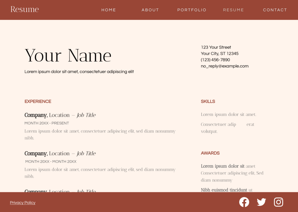
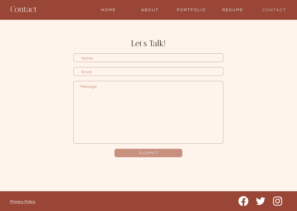
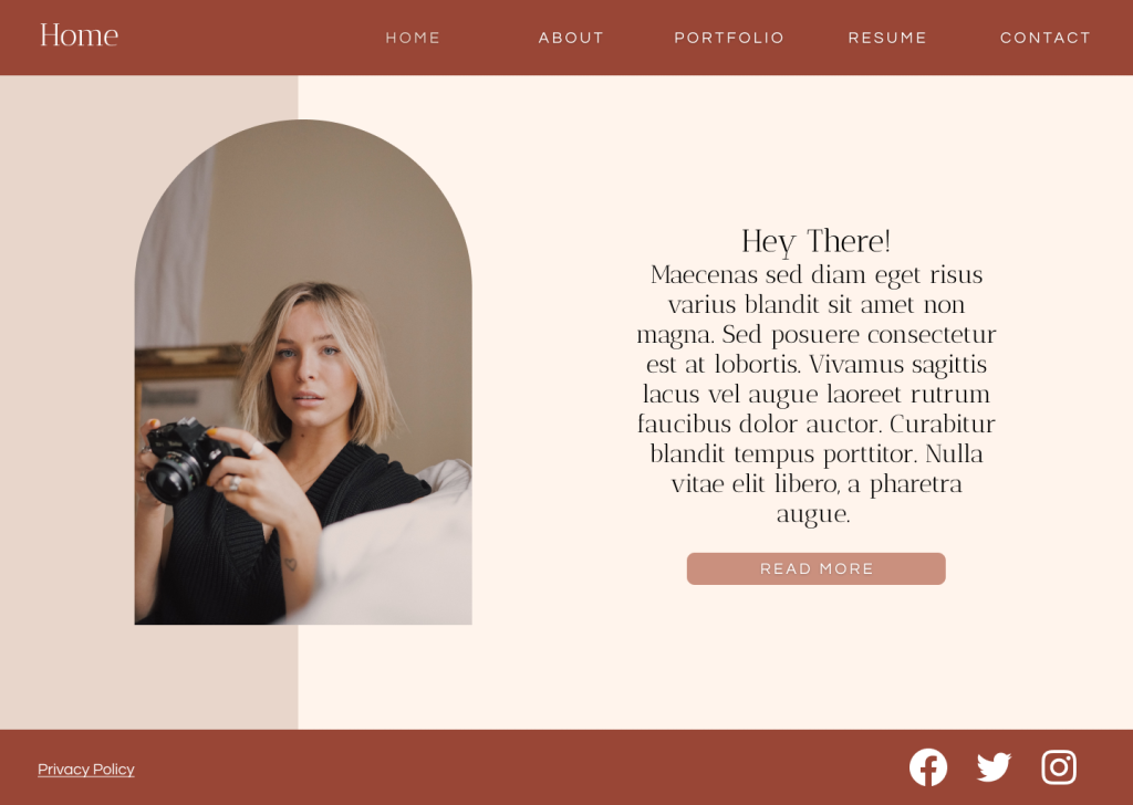
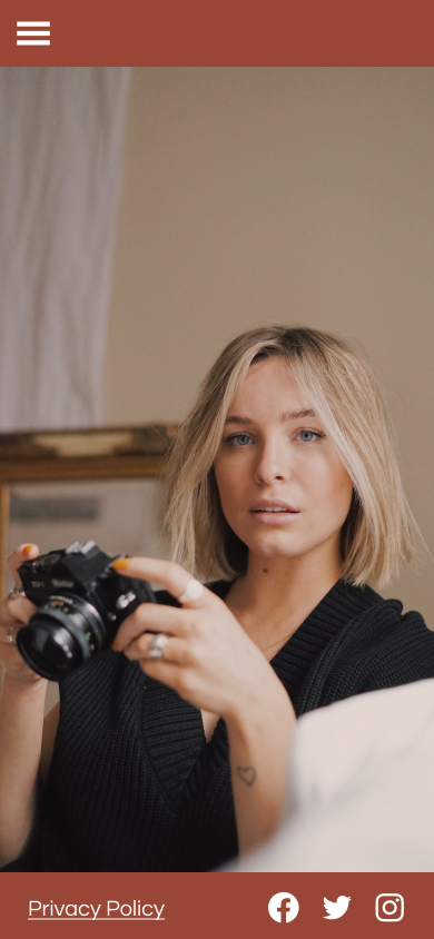
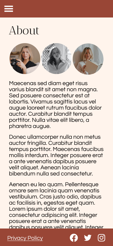
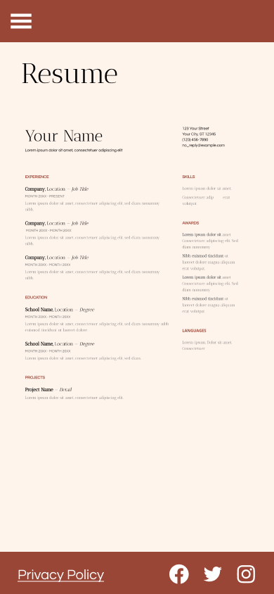
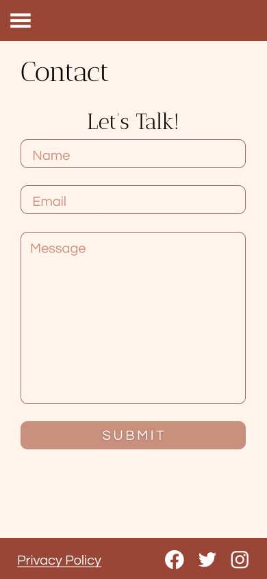
In this project, I learned more about working with typography and color styles, how to create a mobile “hamburger” style navigation menu, and how to enable vertical scrolling in Figma. I also had my first experience with front-end coding in Codepen.
What was easy?
Working with color and typography styles and setting up the navigation were easy.
What was challenging?
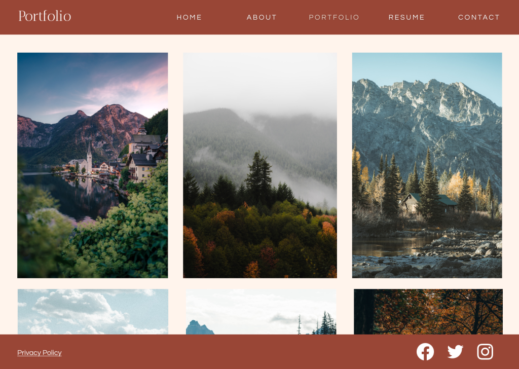
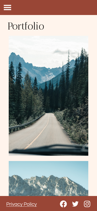
Figuring out vertical scrolling and making sure that none of the content got cut off in the process was a bit more challenging. Setting up the desktop portfolio page and making it possible to click through larger versions of each image was also a challenge.
How could your submission be improved?
To improve my submission, I might replace the general Lorem Ipsum text and Unsplash stock photos with actual content for a personal website.
How could the professor improve the assignment for the next class?
It might be more helpful to have the WIP due later in the process after having some more demos to work off of.
How might you apply your knowledge in future assignments or work scenarios?
In future assignments or work scenarios, I will be able to work more efficiently by starting with a design system so that if I want to make changes to colors, fonts, etc. later in the process, I can do all that in one place rather than having to change each individual frame.
How did a specific reading or video inspire or help you?
Looking through this web design Pinterest board was helpful for getting design inspiration!