What did you learn?
In this project, I got more familiar with how to use Figma’s type tools. I also learned the meaning behind terms like tracking, kerning, and ligature when talking about typography.
What was easy?
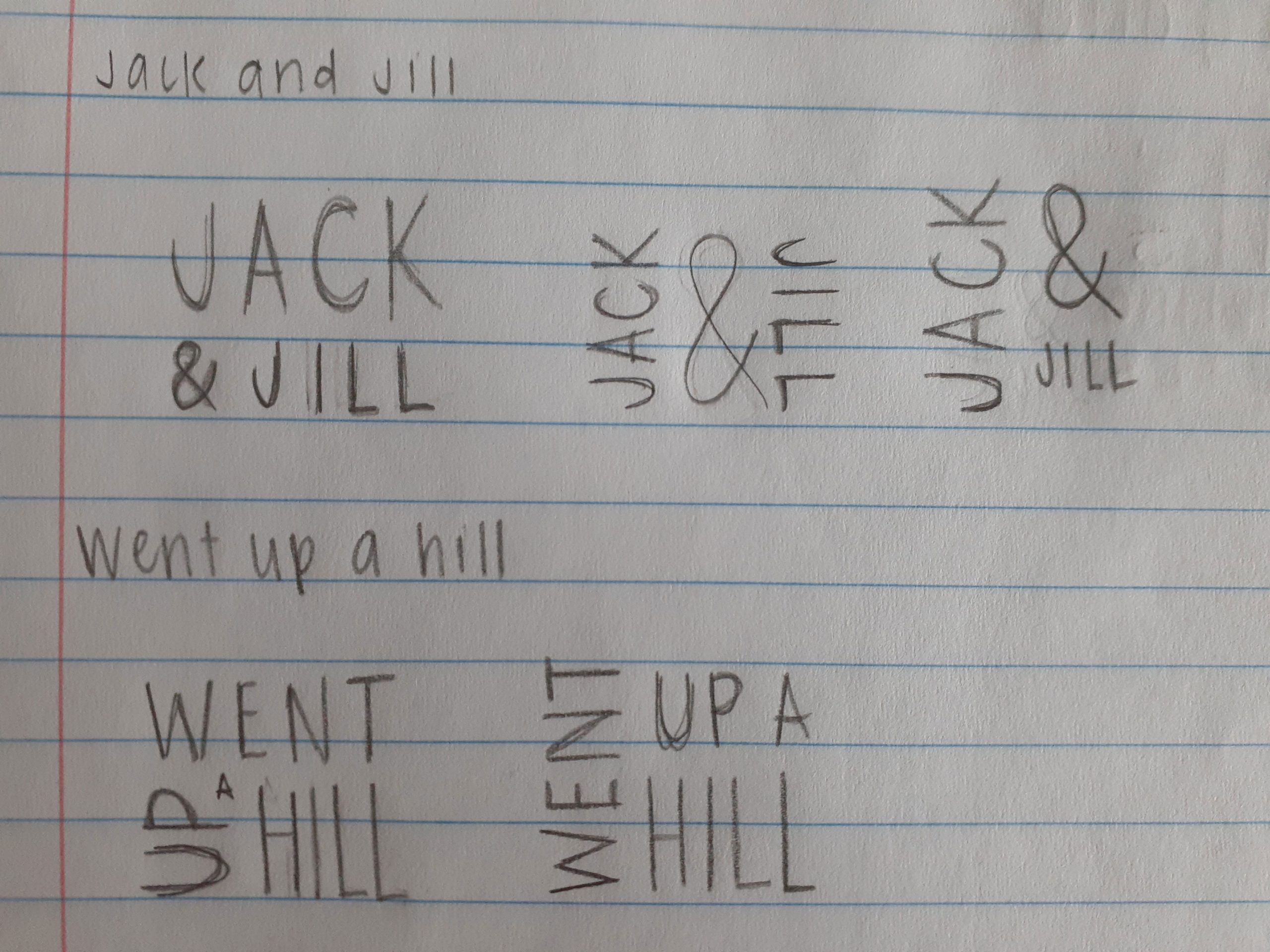
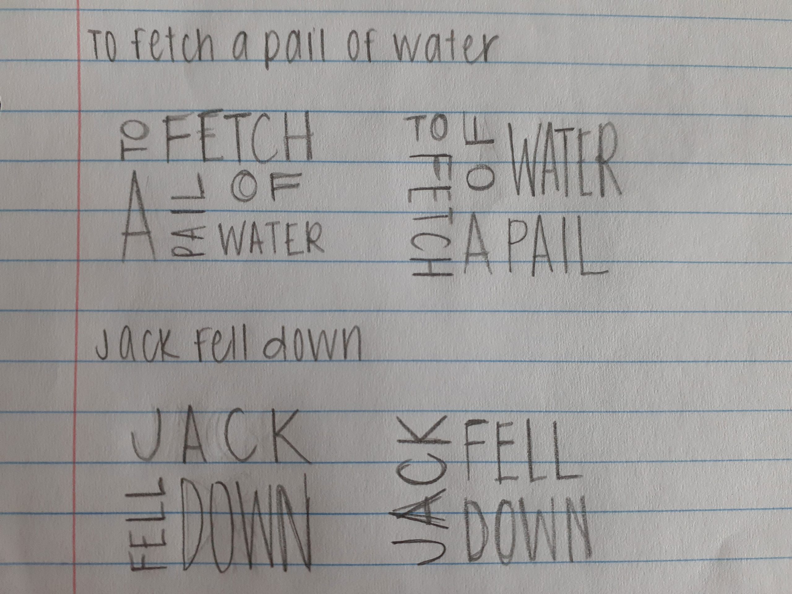
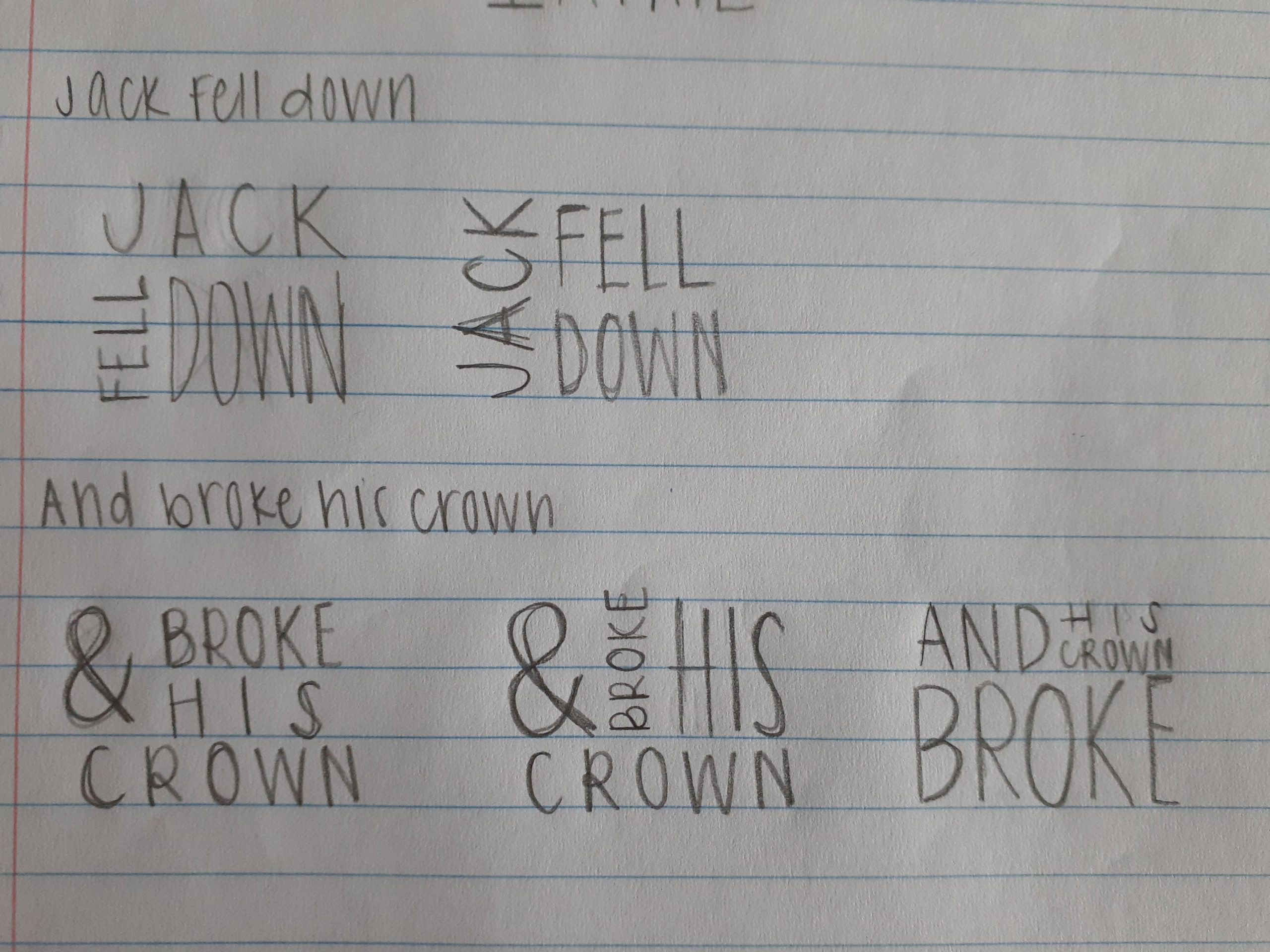
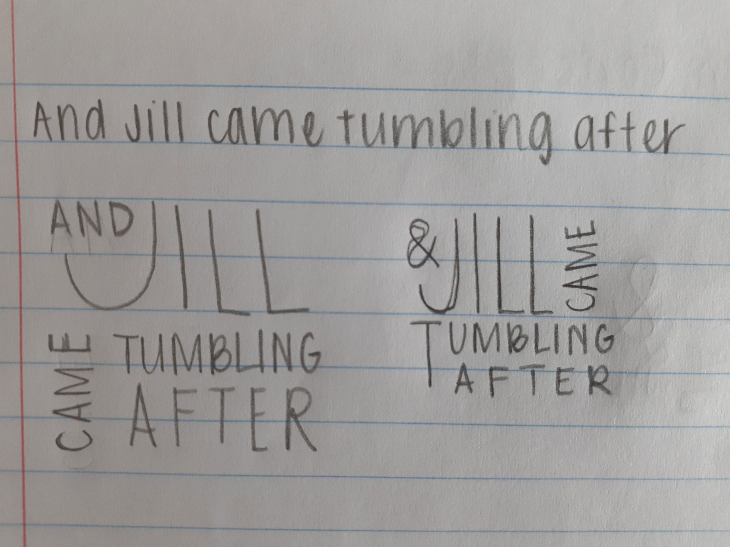
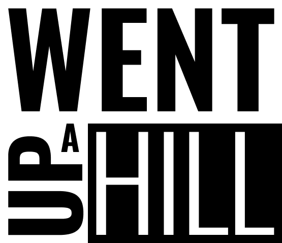
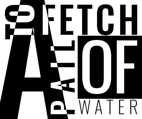
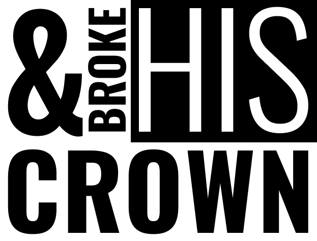
Sketching out different ways to arrange words and playing around with Figma’s type tools to adjust font weight, size, tracking, etc. were more fun/easy parts of this project.
What was challenging?
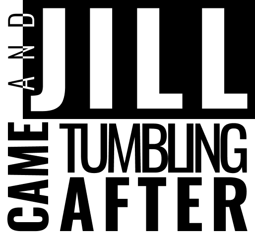
Figuring out how to incorporate white text on black backgrounds in each frame and getting the spacing between words right were more challenging aspects of this project.
How could your submission be improved?
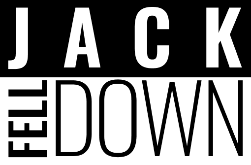
I might play around some more with the “Jack fell down” frame. Something about it feels boring next to the rest of the frames.
How could the professor improve the assignment for the next class?
Providing some examples of past student projects in the project 4 slides might be helpful.
How might you apply your knowledge in future assignments or work scenarios?
In future assignments or work scenarios where I’m working in Figma, I will be able to better make use of its type tools. I will also be able to choose fonts for future projects more intentionally now that I know to look at details like ligatures or whether the font is a variable font or not.
How did a specific reading or video inspire or help you?
The article on “How We Read” was helpful for understanding the importance of typography’s role in how we read and communicate. I had never given that much thought to how the physical act of reading worked.