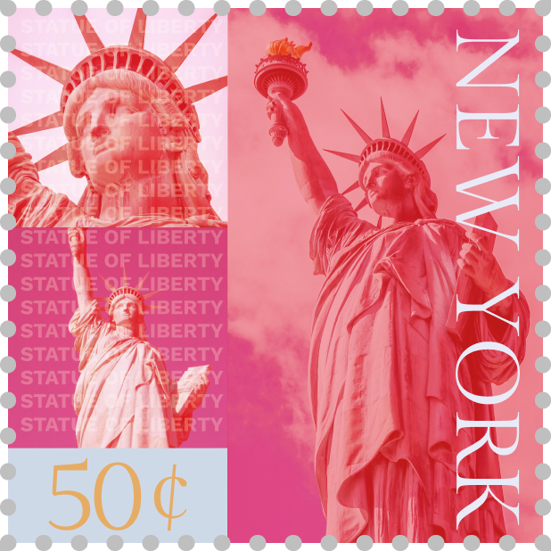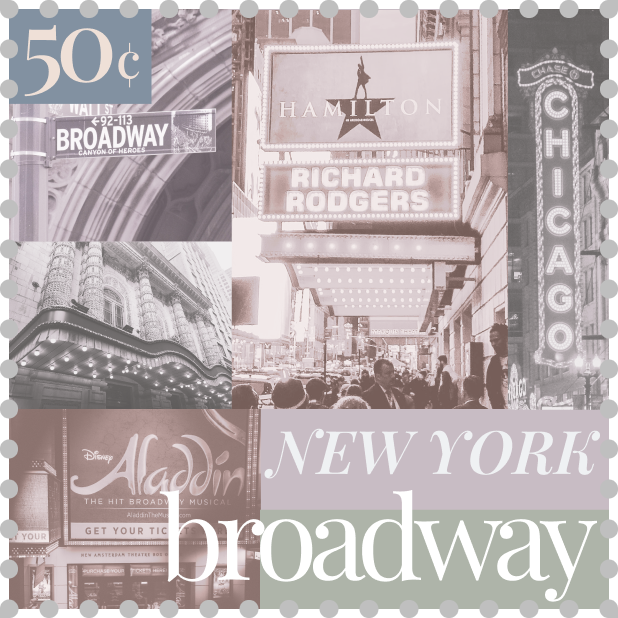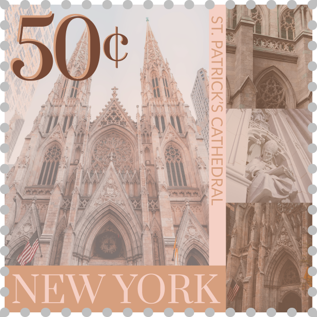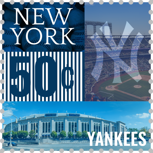


What did you learn?
This project brought together everything we’ve learned throughout the semester, combining gestalt principles/layout, color, typography, and image.
What was easy?
Choosing color palettes and fonts was easy.
What was challenging?
I found that this project took a lot of trial and error when it came to putting all the pieces together for each stamp after deciding on a color palette and fonts and sourcing stock images. Finding good stock images that worked well together and fit my vision was also more challenging.
How could your submission be improved?
My submission might be improved if I had planned better beforehand with sketching out each stamp. I ended up mostly making things up as I went for this project.
How could the professor improve the assignment for the next class?
I thought that this assignment worked well as is, so there are no particular changes I would make to improve the assignment.
How might you apply your knowledge in future assignments or work scenarios?
In future assignments or work scenarios that require bringing together color, typography, and imagery, I will be able to more confidently and intentionally put together something cohesive.
How did a specific reading or video inspire or help you?
https://www.reliablepsd.com/ultimate-google-font-pairings/
I found this article to be a helpful source of inspiration for choosing fonts/font pairings.