




What did you learn?
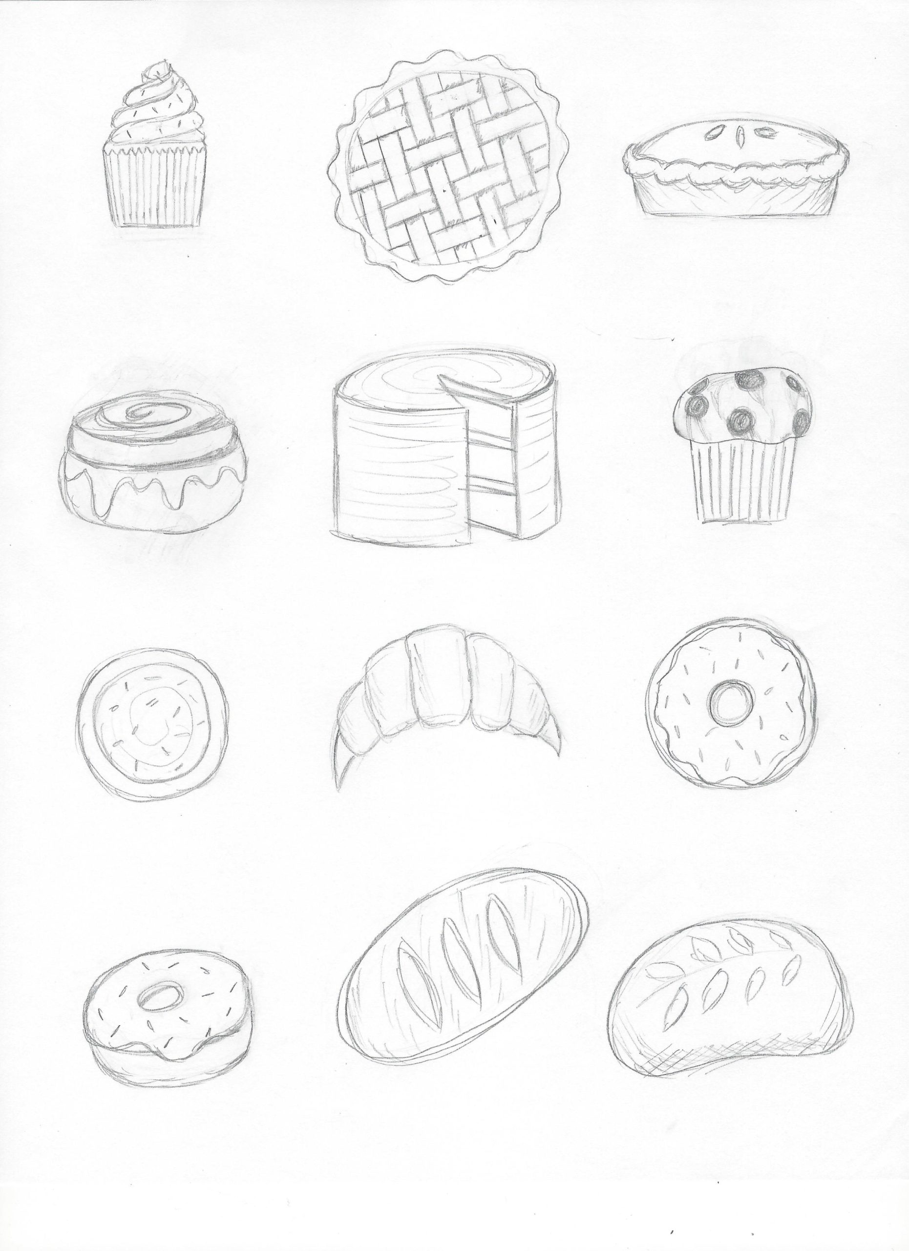
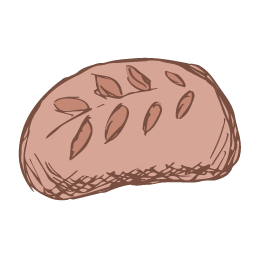
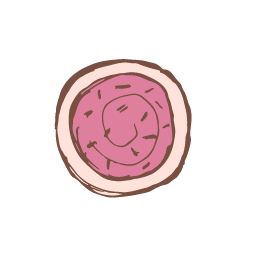
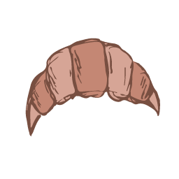
In this project, I learned what spot illustration is, various methods for creating it, and how to create a cohesive set of themed spot illustrations while sticking to a consistent style and limited color palette.
What was easy?
Coming up with a theme and color palette and sketching out my ideas on paper were easy.
What was challenging?
Deciding on how to best approach going from sketches on paper to vector illustrations/choosing and sticking with a style was more difficult.
How could your submission be improved?
I might spend a little more time cleaning up the image trace layer for each illustration. I wanted each illustration to look clean while still having a hand-drawn feel, and I think I could continue to work on finding that balance.
How could the professor improve the assignment for the next class?
Having demos for more of the approaches shown in the spot illustration slides might have been helpful.
How might you apply your knowledge in future assignments or work scenarios?
Creating digital illustrations from scratch like we did in this project seemed really intimidating at first, but now that I know how to break things down to basic shapes or even work from pencil and paper drawings, I feel more confident going into future projects where I might create unique illustrations rather than using existing ones pulled from the Internet.
How did a specific reading or video inspire or help you?
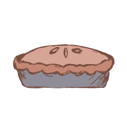
Of the styles we looked at in class, I was inspired by both the drawing approach and the Saul Bass approach. I started with the drawing approach with pencil on paper, and then I scanned and converted those drawings into vectors using image trace in Illustrator. Then, underneath the drawing layer, I added a color layer using a more imprecise, blocky approach.
