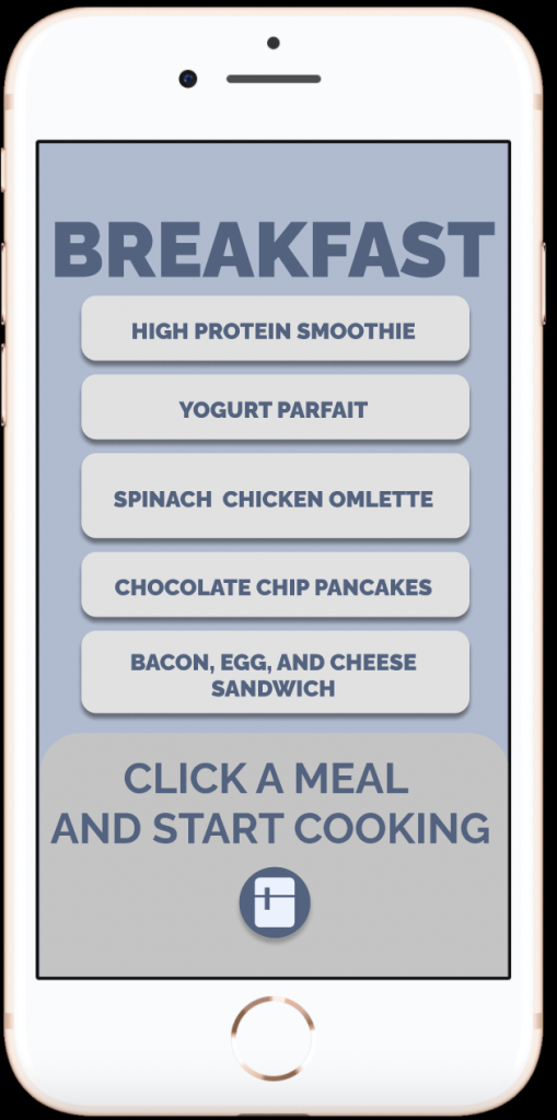
In this project I learned how to do app flow on Figma to a greater and better degree and I learned how to create a pop up menu as well.
What was easy?
It was easy to create a design style for my app, as I really enjoy picking styles and colors that work well together.
What was challenging?
It was challenging to get my pop up menu to work in Figma at first. However, I was able to eventually figure it out and center it on the app accordingly.
How could your submission be improved?
My submission could be improved if my app had prototype interactions further than just the breakfast options. I could have gone further and prototyped all aspects of the app.
How could I improve the assignment for the next class?
The assignment could be improved if there were more specific guidelines for the app, rather than a check-in each week where new ideas for the app would be suggested. This made it difficult as new adjustments had to be done when the app was significantly worked upon already.
How might you apply your knowledge in future assignments or work scenarios?
This knowledge will allow me to think about design in a new way. I am now aware of how to create QR codes and shorten links, making it easy to share my work.
How did a specific reading or video inspire or help you? Refer to a specific reading or link for this; do not reference a class video or lecture.
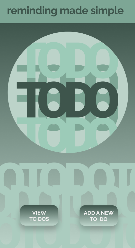
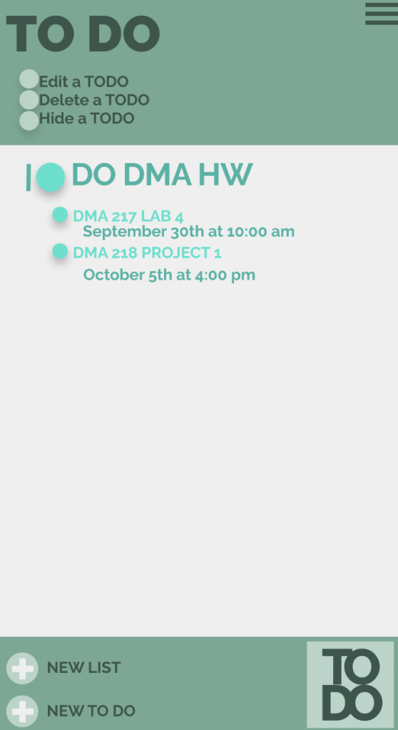
In this project I learned how to create components in Figma, prototype, and use Maze to gain feedback on my app.
What was easy?
It was easy to create a design style with different colors and font families. I enjoyed attempting to make an app aesthetically pleasing.
What was challenging?
It was challenging to prototype the app, as all of the buttons have to connect to a corresponding page. The concept appeared simple, but in practice, creating working buttons and features was a lot more work than anticipated.
How could your submission be improved?
My submission could be improved with better interactions within my app. I could have made more buttons and more flows in Figma, however, attempting to do that was very difficult, as the whole app would need to be adjusted and new flows would have to be created.
How could I improve the assignment for the next class?
The assignment could be improved if there were more specific guidelines for the app, rather than a check-in each week where new ideas for the app would be suggested. This made it difficult as new adjustments had to be done when the app was significantly worked upon already.
How might you apply your knowledge in future assignments or work scenarios?
This knowledge will allow me to think about design in a new way. I am now aware of how to use font families with different stylistic concepts, as well as use color in a user-friendly and appealing way.
How did a specific reading or video inspire or help you? Refer to a specific reading or link for this; do not reference a class video or lecture.
I enjoyed this project and how aesthetically pleasing the type looks when put together correctly. I learned how to use different variations of one font to fill up negative space, making a series of designs. It was easy to alternate between thin and bold type, as I could tell which kind fit the space and wording the best. However, it was challenging to fill up all the art board space. The type took a bit of finagling to make it take up as much space as possible without looking cluttered. My submission could be improved if I used Illustrator in my opinion, as it would have allowed me to move the words with greater ease. Figma prevented me from attempting more intricate designs. I think the assignment could be improved if it was laid out with directions on D2L. The knowledge that I gained in typography can be used in my future designs. I can now fill up spaces and use different fonts to create complementary type. I was inspired by looking at the past student work, as it gave me inspiration for laying out my words.
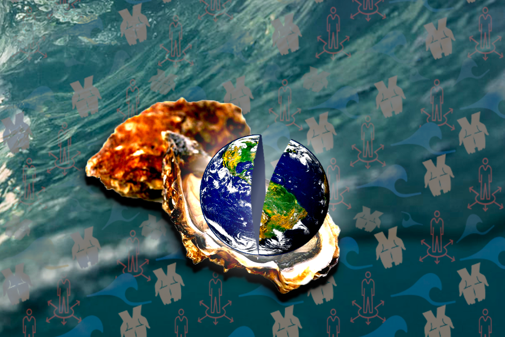
For this project, I created a fused metaphor symbolizing “the world is your oyster”. Through my work, I learned how to transform and warp images, such as the earth, creating more realism. It was easy to combine the 2 images, as this involved simple photoshop skills. However, it was more challenging to make the image look realistic and create a pattern in Figma. Creating a pattern that filled space, but didn’t look too busy took some time. My submission could be improved with a better pattern, as using waves, hands, and opportunity symbols may not convey the metaphor fully. The assignment could be improved by not requiring a pattern and leaving that just as a lab, as it takes away from the metaphor. I can apply the knowledge gained from this project to my future assignments as I know now how to warp images, allowing me to truly transform shapes. I was helped by the noun project (http://Thenounproject.com), as they provided me with symbols to use in my pattern.
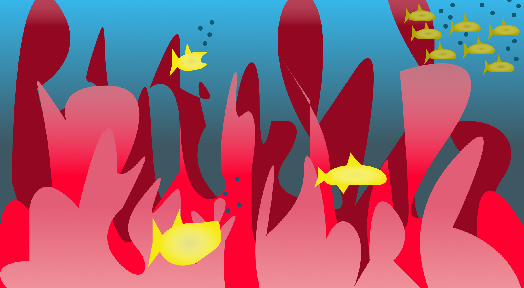
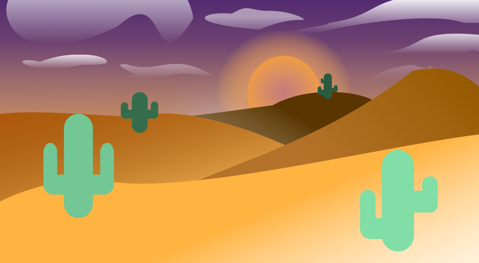
In this project, I created four different landscapes using various gradients, shapes, and Gestalt principles. I learned how to create radial and linear gradients, as well as understanding the different color schemes. I really enjoyed finding different schemes and relating them to the unique areas. I thought it was easy to draw out the various shapes and create the landscapes, such as the coral and the buildings. Figma is starting to become very easy to utilize in terms of drawing and designing. It was challenging to draw the cactuses, however. In order to make them realistic, I needed to understand how to curve the rectangles which I struggled at initially. I think I eventually created a decent cactus towards the end, however. My submission could be improved if I focused more on different gradients and different saturations. This could make certain areas in the artboard pop. I don’t believe this assignment could be improved, as I thought a good amount of time was given to work on it and the critiques helped greatly. I had a lot of fun with this project. I would apply my knowledge learned as I know understand color schemes. I can now use certain color schemes when designing in the future, allowing for a more aesthetic end project. I was particularly helped by the website, kuler.adobe.com. This helped me explore different color schemes and truly understand what analogous and triad meant, as I was unaware of the two before this class.
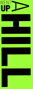
Artboard 1: I used the principle of proximity to establish a relationship between Jack and Jill.
Artboard 2: I used figure ground and created hills with the black background.
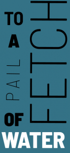
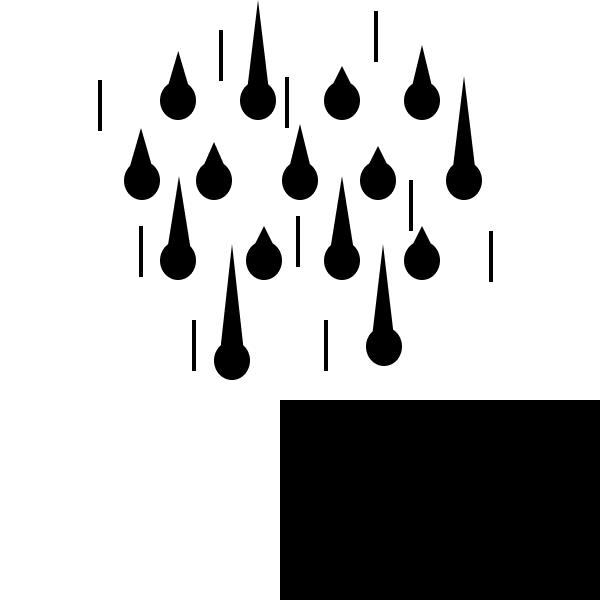
Artboard 3: I used continuation here, so the raindrops led the viewer’s eyes downward, without actually being on the bottom of the artboard.
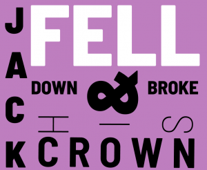
Artboard 4: Here I used the principle of similarity to establish Jack’s fall . The smaller parts of him represent his whole self failing down.
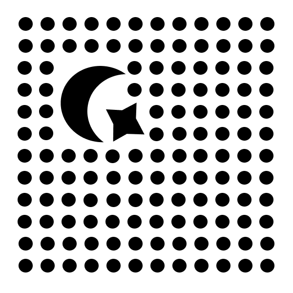
Artboard 5: The principle of closure was used to establish Jack’s missing crown. A piece of him is missing, yet it is assumed that the circle is closed through closure.
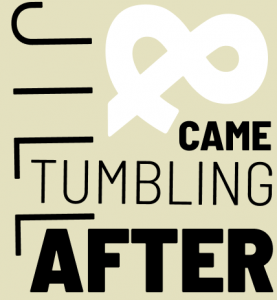
Artboard 6: Here I used repetition so the viewer would perceive Jill’s tumble as one singular element, rather than individual elements.
Representative:
Artboard 1: Here I used similarity to establish a connection between Jack and Jill and have them contrast their background. This makes them a pair that stands out, rather than individuals.
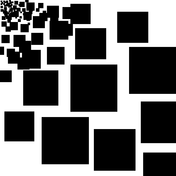
Artboard 2: Here I used repetition to create hills. Many of the same circles are overlayed to create a large hill, rather than many small ones.
Artboard 3: Closure is used here to represent the pail of water. There is obviously not a gaping hole in the pail’s side, so the principle of closure fixes that perception for us.
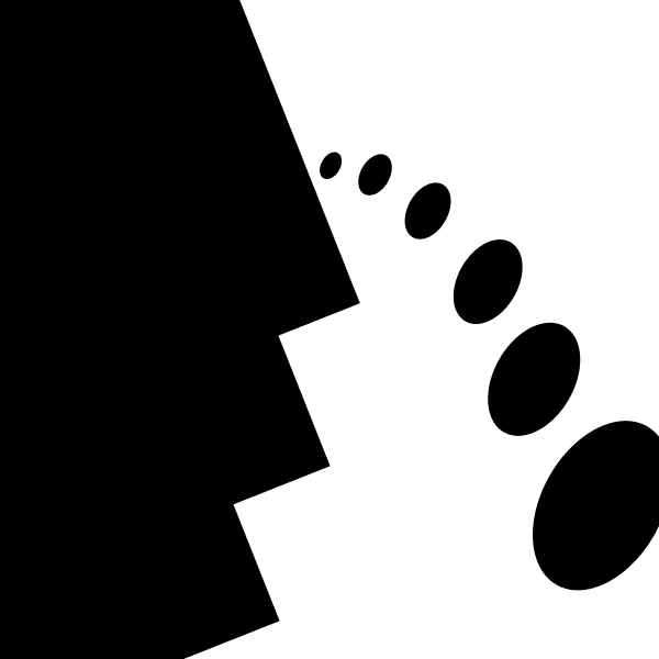
Artboard 4: I used continuation to demonstrate Jack’s fall. The moons are portrayed in a curve and lead the eye off the page, narrating his large tumble.
Artboard 5: This artboard uses figure ground to establish Jack’s crown breaking. Small triangles contrast with the background to create fragments and the triangles in the upper corner switch places with the ground.
Artboard 6: Lastly, I used proximity to establish Jill’s tumble. Many shapes are put closely together to establish a connection among themselves. This contrasts Jill against Jack, who is on the bottom of the artboard.
Reflection:
In this assignment, we used Gestalt principles to create a Nursery Rhyme. For my project, I chose to show “Jack and Jill” through shapes in both an abstract and representative manner. In this project, I learned all about Gestalt principles and how to put them into practice. Additionally, I combined this knowledge with the Rule of Thirds when designing my artboards. I also learned how to use Sigma in this project, which is an easier alternative to Illustrator. I thought it was relatively easy to create the representative artboards in this project, as it was simply telling a story through shapes. However, combining Gestalt principles with the abstract dartboards was quite challenging. I struggled with creativity in the beginning as well as trying to satisfy all 6 principles. My submission could be improved if I spent more time learning the ins-and-outs of Figma. With more knowledge of the site, I would probably be able to make more intricate shapes and tell the story in a more complex manner. Additionally, this submission could be improved if I was able to be more creative. I struggled in making abstract pieces. The assignment could be improved for the next class by involving color. I think simply adding gray shapes to the black-and-white would enhance the storytelling. From the knowledge gained in this assignment, I will now be able to identify design crimes that go against the Gestalt principles. Additionally, I will be able to follow the Rule of Thirds in the rest of my designs in the future. I was helped in this project by referencing the Gestalt lecture presented in class, as well as the links provided in the directions. Specifically I found the Smashing Magazine article helpful (http://www.smashingmagazine.com/2014/03/design-principles-visual-perception-and-the-principles-of-gestalt/). This article helped me further identity the Gestalt principles with more examples.
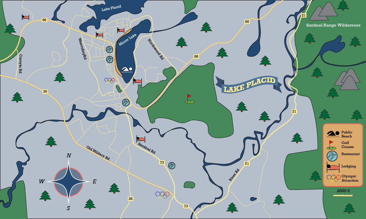
I chose to create the town of Lake Placid for Project 4. After the critique, I changed around a few items in order to make the map more readable. I changed the “Lake Placid” sign from blue to red to help it stand out more, made the Olympic symbol easier to view, added a few more icons, and made the text curved for the lakes and wilderness area.
This project was by far my favorite of the year and I learned a lot from it. I learned how to create a map from start-to-finish, including creating symbols, a compass, a flag, and other geographical aspects with the pencil tool. It was easy to draw the roads, rivers, and lakes. I honestly found it quite fun and would have gone into greater detail if I had the time. I also really enjoyed creating the symbols, I didn’t realize it would be so easy to accomplish. It was challenging to find a map area to create, as I struggled with which town and how zoomed out I wanted it to be. However, I ultimately chose Lake Placid as I really wanted to draw winding roads and aspects of nature. My submission could be improved if I made it more zoomed in and actually focused on the town, however, the region was much more exciting to do, so I wouldn’t change it. The professor could not change the assignment, every video was very helpful! The step-by-step instructions also greatly helped me through the project and made it quite easy to follow. I can apply this knowledge learned to future map-making projects and scenarios. I learned that I really enjoy this area of design so hopefully I get to do it again.
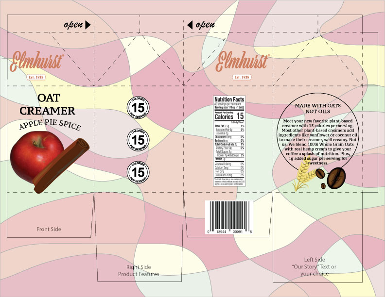
This is my product package for Elmhurst’s Apple Pie Spice Oat Creamer. I went for a natural and earthy design, as the company is plant-based and strives to reduce their environmental impact. I choose natural shades of green, yellow, brown, and reds for the background and the logo. I continued this theme into the other design elements, choosing oats, coffee beans, and apple, and cinnamon. I combined my design elements with simplistic type to make Elmhurst’s brand come off smoothly.
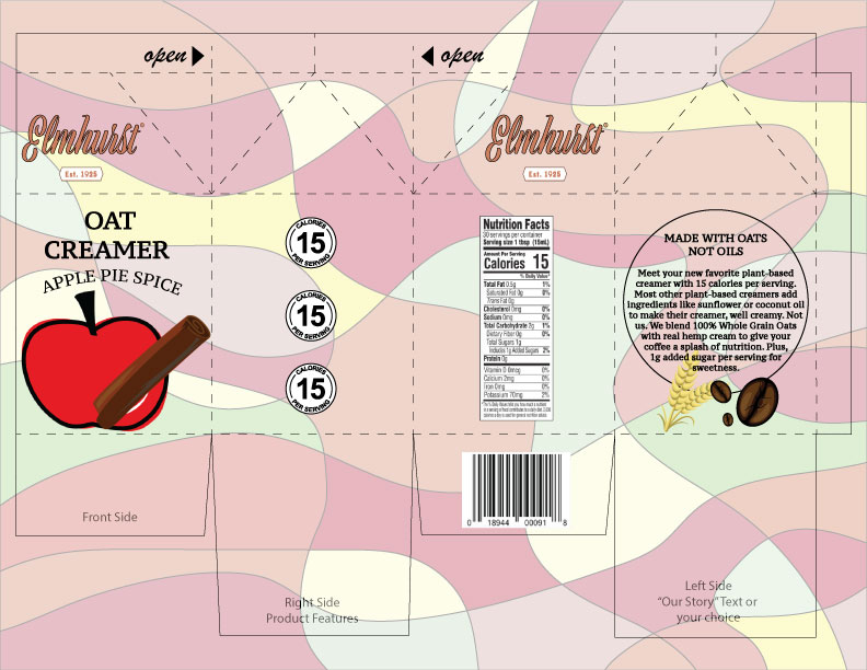
After the critique, I kept most things the same, however I changed the stroke on the logo and changed the apple detail. The stroke change was recommended by my classmates as it allows for “Elmhurst” to be more visible. The apple is also now more of a drawing, fitting the rest of the images. Through this project, I learned how to image trace, create a pattern in Illustrator, and cut out arcs of a circle. I also learned how to place many components together in Illustrator. It was easy to create the pattern. I found it very fun to choose the colors and create interesting lines. It was challenging to create the 3 calories circles. They wouldn’t duplicate correctly at first, but I eventually got it. The professor couldn’t really improve the assignment. The time allotted was adequate and having both screencasts and directions was very helpful. I was able to complete the project with ease. I will apply this knowledge in the future, as creating patterns and type is definitely needed within advertising projects.