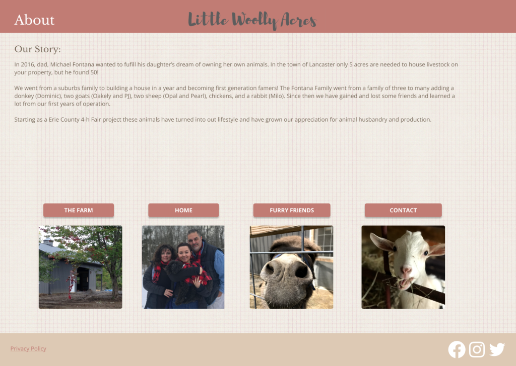
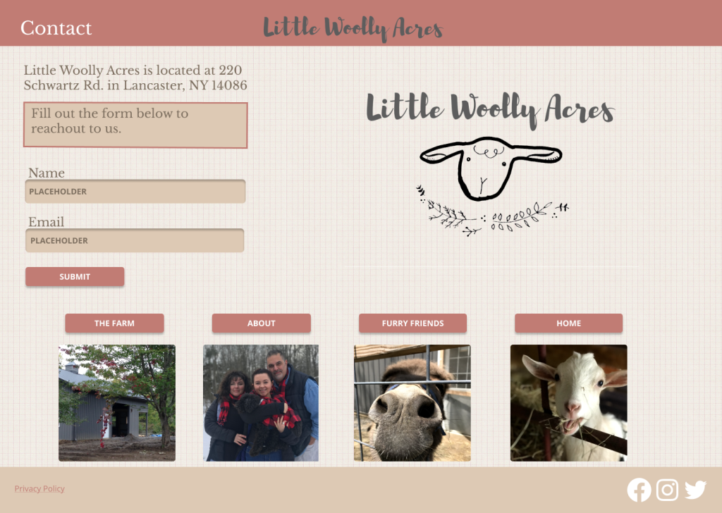
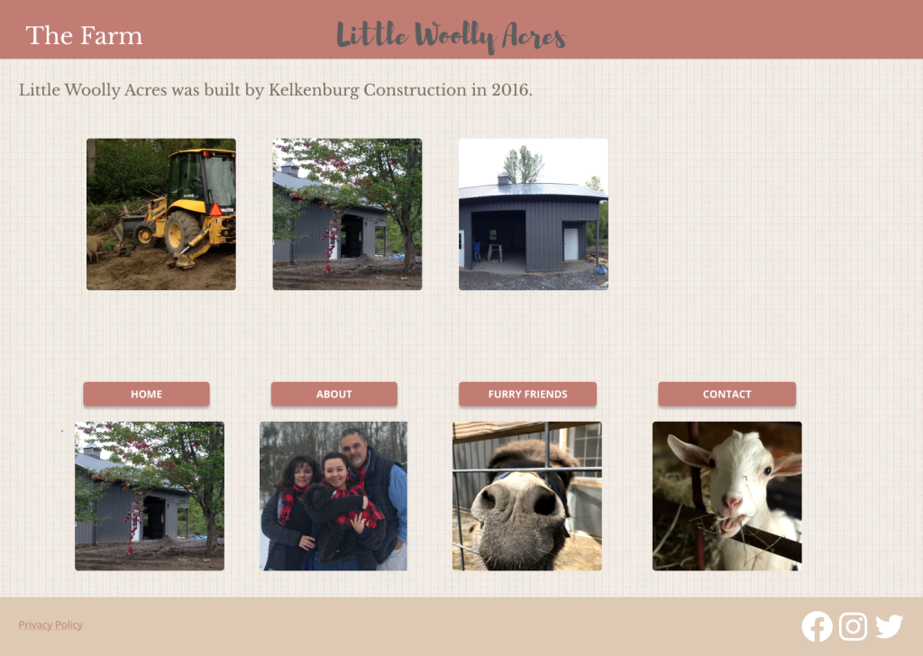
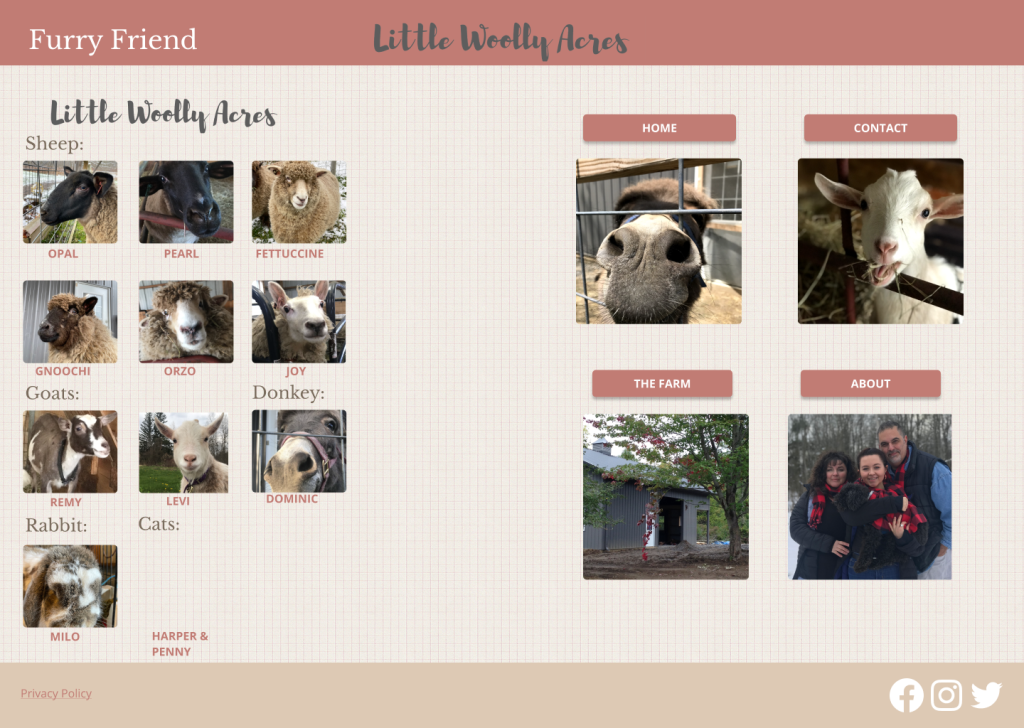
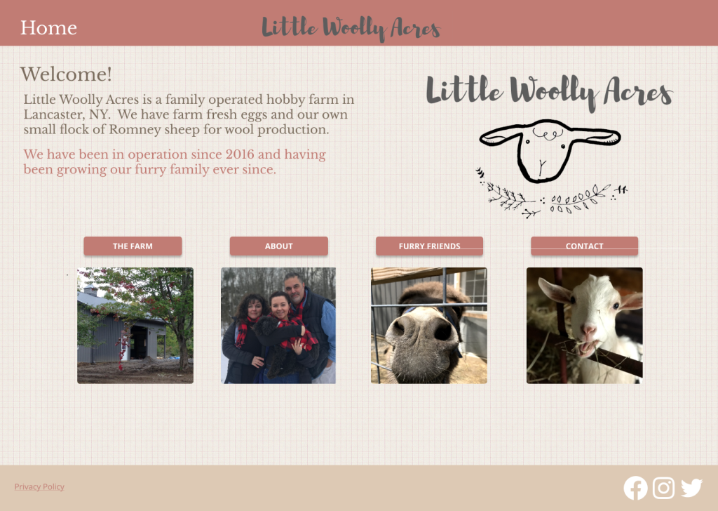
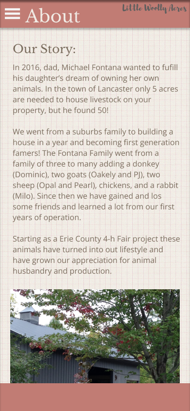
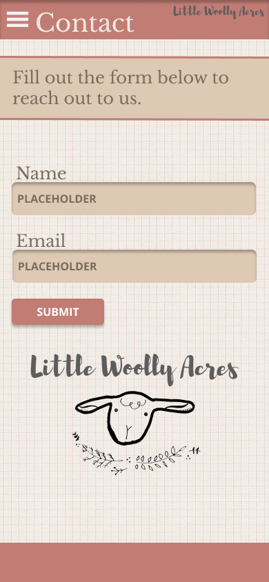
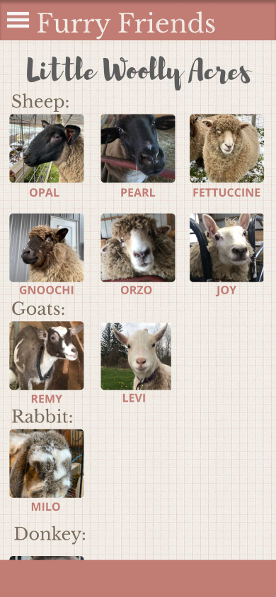
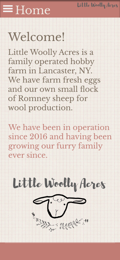
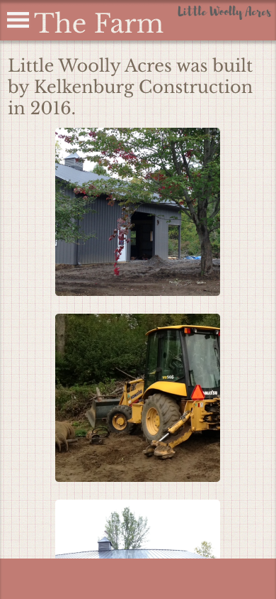
What did you learn?: Throughout this project, I learned how to make an easily accessible website on both a desktop and mobile device.
What was easy?: This project was somewhat simple because of our experience with the Figma program. Making a website prototype had similar steps to the app we created, but it had different navigation aspects.
What was challenging?: One challenging thing was to make it so the mobile navigation “open overlay” on the screen you were on and did not just change to the navigation screen.
How could your submission be improved?: One thing that could be improved with my website is readability. I was trying to go for a “shabby chic” farm style and color scheme, but that may have compromised the accessibility of the project.
How could the professor improve the assignment for the next class?: I currently only have ways in which the professor could improve the assignment other than it was very similar to our first project. Maybe we could work on making them accessible and not just prototypes.
How might you apply your knowledge in future assignments or work scenarios?: One of the most important things I learned about this project was the layout and how they differ in mobile and desktop versions. I will keep that in mind for readability as the mobile version is more vertically oriented, and the content should reflect that. Also, I gained an appreciation for coders because that was one of the most challenging lessons of this project.
How did a specific reading or video inspire or help you?: The most helpful resource for me when making this project was looking at other styles of websites on Dribbble and looking at local farm websites around the area to ensure my website had all of the necessary information and the specific look I wanted to achieve.
Check out my Website here
