- What did you learn?: By completing this project, I learned about variant fonts. I was unaware that one font could have more changes in weight and width than just bold, regular, and italic. I also learned what serif and san serif fonts are.
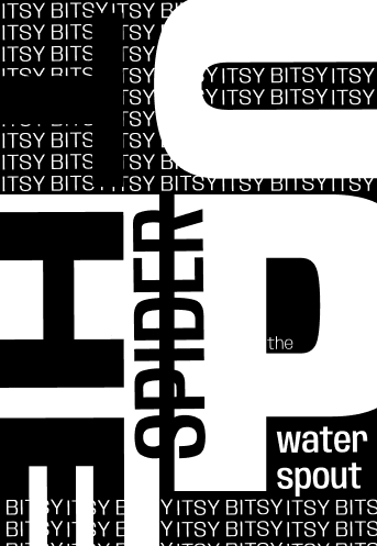
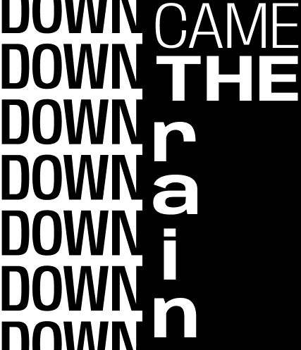
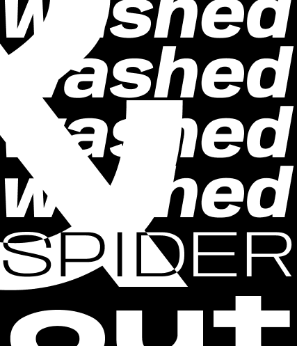
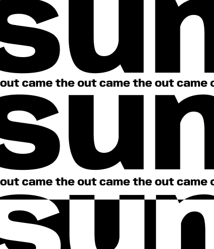
- What was easy?: One easy thing was how Figma’s fonts could easily be manipulated. The slider to change the width and weight is very convenient and helps achieve the perfect look for this project.
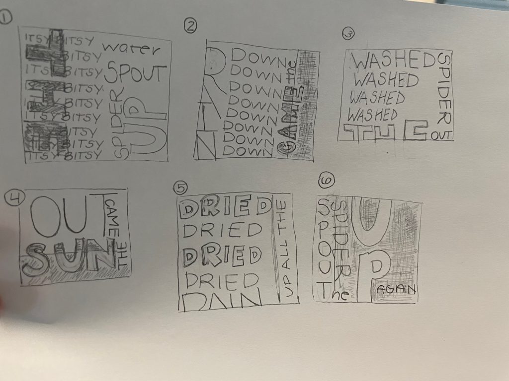
- What was challenging?: A challenging part of this project was finding a perfect font for this project. After looking up Google Variable fonts, it was a bit of a long process to plug and search them on Figma to see how they looked and to see if they had the preferred capabilities for this project.
- How could your submission be improved?: My submission could be improved by taking more risks. Looking at my pieces all together, they have a similar style. This could be a good thing for a cohesive piece, but experimenting more with font size and type might be an excellent way to complete this project.
- How could the professor improve the assignment for the next class?: The professor could enhance this assignment for the next class by providing a list of variable fonts in Figma that have the weight and width option. This would save much time for the students working on their projects.
- How might you apply your knowledge in future assignments or work scenarios?: I LOVE FONTS… so knowing there are more ways to edit them for any project is exciting.
- How did a specific reading or video inspire or help you?: One specific reading or video that inspired me was the presentation by Miggy. That presentation showed us all the capabilities of fonts on Figma to implement in our project.