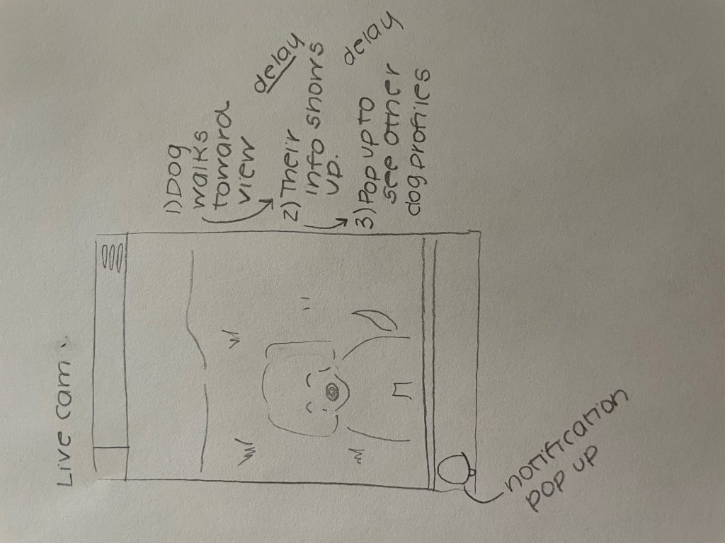
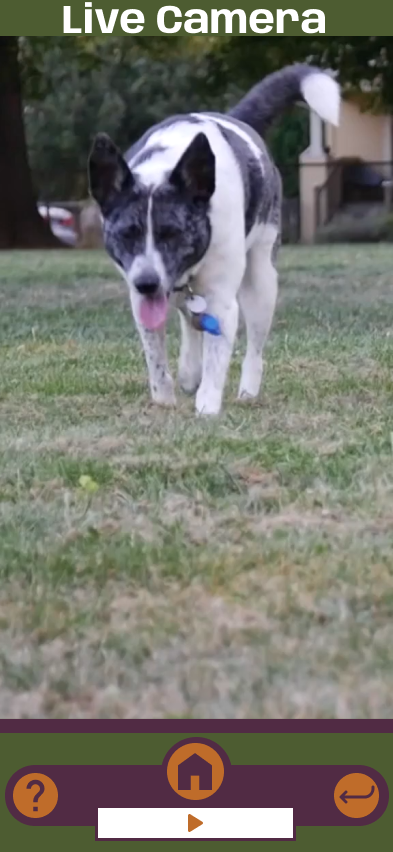
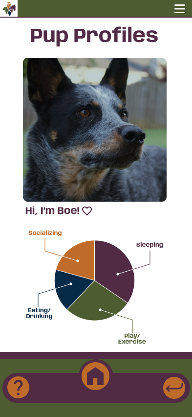
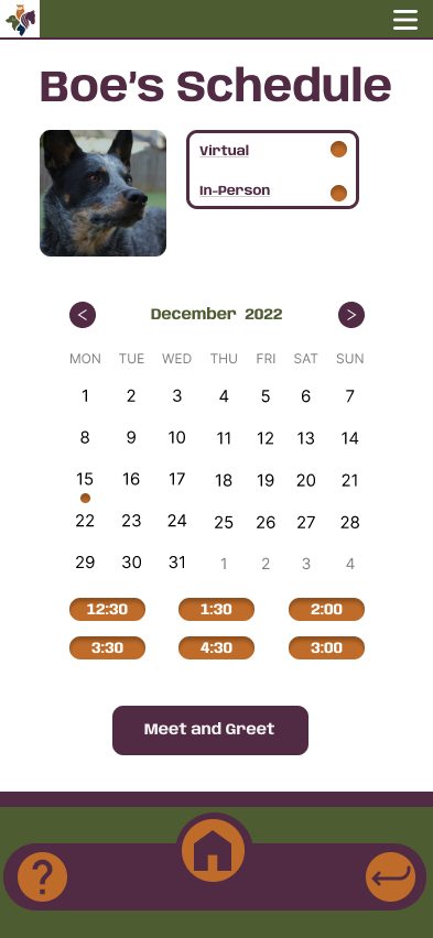
What did you learn?: Completing the AR app taught me many tools to make my app easily accessible to the viewer. I first learned how to add a video to Figma. Also, I learned how to delay overlays to show up to show the following “direction” for the viewer. This was especially helpful in making the notification part of my taskbar.
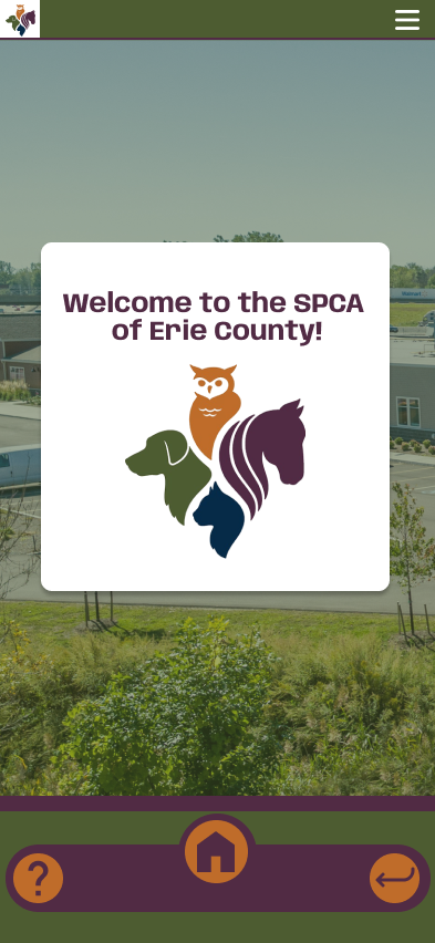
What was easy?: One easy thing was the design, including the color scheme for the app. Since I was catering my app toward the SPCA of Erie County, they already have colors in their logo, and I tried to stay with a simple, easily legible font.
What was challenging?: The challenging part of this project is how in-depth it gets by the end. Each flow ends up with many noodles, which can confuse you if you do not organize your labels. Also, timing the notification part in the taskbar was challenging, but it added a nice touch to the app overall.
How could your submission be improved?: My submission could be improved by creating the app around one of the specific dogs at the SPCA. My app created a hypothetical situation, but it could be even better to get an inside look into the adoption process for the outside viewer. Since I interned at the SPCA this summer, this app would be helpful for those attending the facility.
How could the professor improve the assignment for the next class?: This was the first time using Figma to do a project like this, but the video instructions and adding delay confused everyone initially. With us working out the kinks as a class this semester, it will be more straightforward for years to come.
How might you apply your knowledge in future assignments or work scenarios?: By creating this app, I learned a lot about accessibility. Through an app that guides you through a location, I can learn about problem-solving and accessibility.
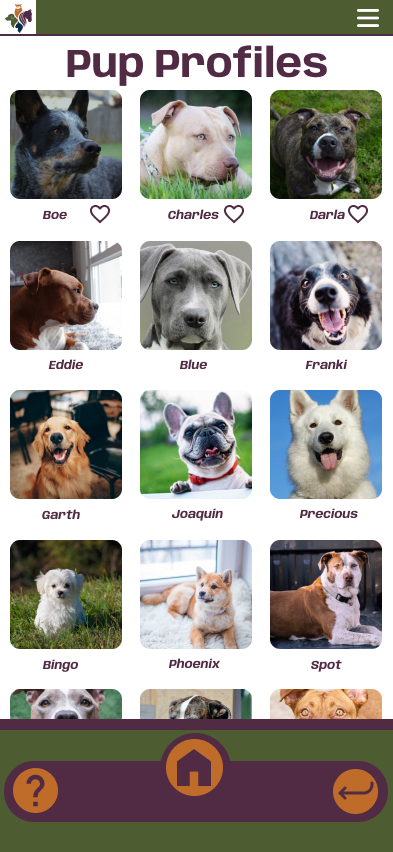
How did a specific reading or video inspire or help you?: A couple of things that inspired the creation of my app was Migi’s presentation about his class at RIT. It was great to see how they helped an individual get through the hospital and how they problem-solved specific issues they were having. Lastly, the taskbar at the bottom of each app frame was an idea brought to me by Kyra. She found the example on Dribbble, and we thought it would be an excellent way for the viewer to navigate through our apps.
Here is link to my app description: https://docs.google.com/document/d/1nrMJaANYEU7SccvwTZ2uBjdrARmBx7GHJ9zPI0MdD3w/edit?usp=sharing
Here is a link to brainstorming project topics: https://docs.google.com/document/d/1h9i2haq4rU1XyqB_rgyJ2d55M557yzgEHy3jBRSoC80/edit?usp=sharing
