

Reflection:
1: What did you learn? In this project I learned the importance of the color schemes when designing something and knowing how to make it look appealing. I also learned how to do a lot more things in Figma like making your own shapes with the pen and pencil tool or the different types of gradients you can use for your shapes.
2. What was easy? The easiest part of this project was figuring out which objects I wanted to make most noticeable and stand out in each of the frames. For example, I knew that I wanted the planets in the outer space design to be the first thing that grabs your attention and I did so by making them bigger and adding vibrant colors to them.
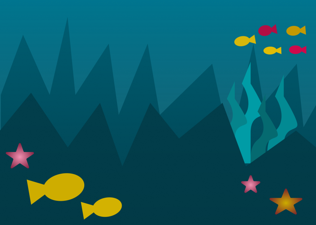
3. What was challenging? The most challenging part was using the pen tool. Although I got the hang of it after a little practice, I found it difficult to have control over it and make it look exactly how you want it to look. It started to frustrate me because it took awhile to make my seaweed look somewhat realistic.
4. How could your submission be improved? My submission could be improved by maybe adding more detail into the desert and outer space design, however I wanted to make sure it did not look too cluttered so I stopped adding objects before it started to look too busy.
5. How could the professor improve the assignment for the next class? Maybe have us incorporate more than one color scheme into one of the frames to make it more of a challenge.
6. How might you apply your knowledge in future assignments or work scenarios? If I happen to be designing something in the future I will have the knowledge of color schemes to apply to my designs in order to make it look as aesthetically pleasing as possible, such as using triadic colors rather than a bunch of random colors.
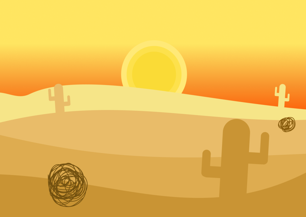
7. How did a specific reading or video inspire or help you? The reading that helped me was Cameron Chapman’s “Color Theory for Designers Part 1”, specifically where they talked about warm colors and how the colors red, orange, and yellow are the colors of sunrises and sunsets. I applied this into my desert design where I made the background a Gradient from yellow to orange to represent a sunset. https://www.smashingmagazine.com/2010/01/color-theory-for-designers-part-1-the-meaning-of-color/