What did you learn?
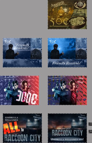
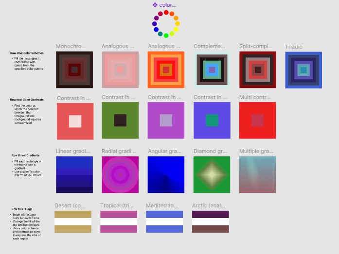
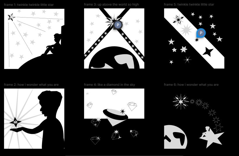
I learned a lot about maintaining consistency in design. Working on a series of stamps taught me how to create cohesive designs that feel like a group. It also helped me refine my skills in Figma and Illustrator, especially with color schemes, typography, and layout.
What was easy?
Brainstorming ideas and sketching out concepts for the stamps was enjoyable and straightforward. Working with color palettes was fun, and coming up with imagery to represent different aspects of the chosen location was creative.
What was challenging?
The biggest challenges were ensuring all four stamps looked cohesive while remaining unique, finding fitting images, and pairing fonts effectively. Adjusting typography to fit the layout grid without making it look cluttered was also challenging.
How could your submission be improved?
I would refine the typography more, spending extra time on font contrast and placement. Checking the alignment of all elements carefully would improve the overall consistency of the designs.
How could the professor improve the assignment for the next class?
Providing more examples or in-depth tutorials on techniques like blending modes and using textures would be helpful. More visual references would make it easier to understand how to approach complex parts of the project.
How might you apply your knowledge in future assignments or work scenarios?
The skills I gained in creating consistent designs will be invaluable for branding, marketing materials, and social media content. The focus on color theory, typography, and layout will be useful in almost any design project moving forward.
How did a specific reading or video inspire or help you?
The font-pairing guide and Figma tutorials on cropping images and blend modes were particularly helpful. They provided practical tips that made a big difference in my project, helping me match images and type effectively.


