Project 1: Layout
Jesse Nowicki | Dunkle
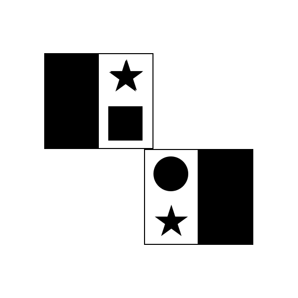
Image 1: Similarity

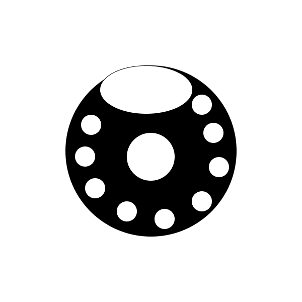
Image 2: Closure

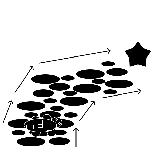
Image 3: Continuation

Image 4: Shared Fate

Image 5: Repetition

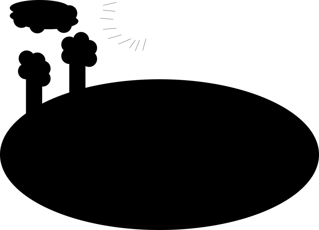
Image 6: Figure Ground

- What did you learn? From this project, I learned very much about the true textbook rules and guidelines of design. In the past, I was more focused on different colors, placements, and other aspects of design rather than applying the real rules that actually change a persons
- What was easy? The repetition slide was really easy because It was just copying and pasting images of the same size, orientation, shape, etc. and just repeating them (repetition).
- What was challenging? Trying to figure out how I could make something simple so complex. In the past I’ve only used photoshop and wanted my work to have as many complex details and be abstract as possible.
- How could your submission be improved? I believe my submission could be improved if I was to have a better story / meaning behind each side. I was just watching a video about how big space really is and that’s why I decided to pick this topic because basic information about space was in my mind at the time of working on the project.
- How could you professor improve the next assignment? Nothing really. As stated before I am used to complex work in photoshop, when doing more simple work such as business cards for a marketing client, I usually struggle because I can’t apply my creativity as much.
- How might you apply your knowledge in future assignments or work scenarios? I learned the basic concepts of design, If I can continue to work on these and progress my knowledge, I can master the basic concepts, that will snowball into me learning much more at a higher level.
- How did a specific reading or video inspire or help you? I was just watching a video about how big outer space really is, and then I decided to do my homework and started working on this.