What did you learn?
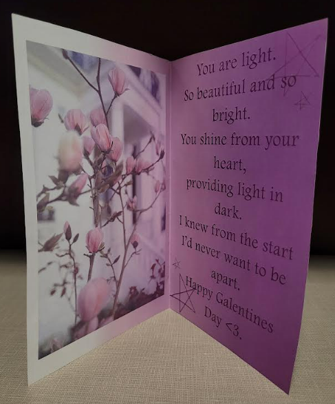
I learned so much from this first project. I had never worked with Adobe Photoshop before, so everything that I did to make this card was a new experience. I learned how to work with layers, remove backgrounds from images, create shapes, add a text box and type along a curve, add noise, and from there create background gradients, and so much more! I learned a great deal about Adobe Photoshop while making my Valentine’s Day card!
What was easy?
If I am being completely honest, not much about this project was easy for me. I had to refer back to the slides that laid out step-by-step how to insert shapes or edit the opacity of images we imported. It was hard to keep up with the pace of the class because I couldn’t really see the board or the buttons being selected before making an edit or altering the card. I did however being to get the hang of removing the background from images after a lot of practice. I feel pretty confident in doing that after trying the various methods in class.
What was challenging?
This project was much more difficult than I anticipated. Being so unfamiliar with the program Adobe I had quite the learning curve. All of the buttons and features that Photoshop offers creates a fair bit of confusion when trying to figure out which button does what or how to delete something that you ultimately didn’t really like after you created it. I had a difficult time figuring out how move elements on different layers. Once I figured out how to select the individual layer I wanted to work with or edit over on the right-hand side of the screen, it became much easier to change or move features added to the card. I also initially had some difficulty with writing on the custom line, the shape wasn’t quite coming out how I imagined but I eventually tried it out a few times and played around with the program and liked what I ended up with.
How could your submission be improved?
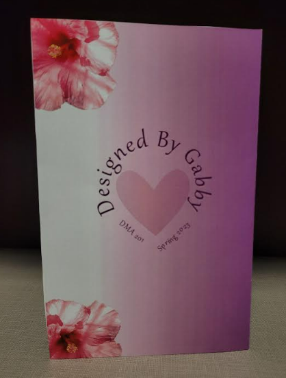
I believe that my submission could have been improved by adding a bit more to the front of the card. I’m typically a perfectionist when it comes to my assignments or life in general, however, I learned very quickly that when it comes to art it is very difficult to find what you deem to be perfect. I realized after I finished and printed the card that I could have made the text on the front a bit larger to fill up some space. Also after I printed the card, the gradient was a lot darker than shown in Adobe, so if I could change anything I might have brightened that up just a bit so that the flowers on the front could be seen a bit easier.
How could the professor improve the assignment for the next class?
I feel like maybe one more day of in-class work would have allowed me to play around a bit more with the features of Adobe Photoshop. I frequently needed assistance from the professor or my peers which took a while when the other students needed help too. I had to wait to get help before I could proceed which took up some time of in-class work. I also think that sometimes it was hard to keep up with the speed of what the professor was doing and after a while, I fell so far behind that I only referred to the slides posted online and just kind of had to work at my own pace.
How might you apply your knowledge in future assignments or work scenarios?
I am very excited to work on my next project in Adobe Photoshop! I want to play around a bit more with new features but also really practice the new skills and elements that I worked with on the Valentine’s Day Card project. I want it to become easier and a bit faster when trying to remember how to import images or remember which button meant what when they aren’t labeled. I think one of the most valuable things that I learned from this project was how to remove a background from and image and how to place embedded photos onto my work. I will definitely use that skill in the future while working on editing pictures or creating other graphic design projects.
How did a specific reading or video inspire or help you?
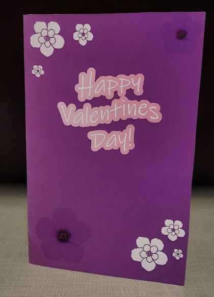
The “Robin Williams’ four basic design principles for non-designers” article that we read outside of class and discussed a bit in class was very helpful when thinking about how I wanted to structure or design my card. Zhenghui Shen talked about the importance of repetition and using similar colors and structures when designing. I tried to use similar colors and themes throughout my Valentine’s Day Card to keep the whole thing looking cohesive. I used a range of purple to pink and a common motif of flowers when designing my project! I also practiced using contrast on my card in order to draw more attention to a particular part of the page. When choosing the font and the coloring on the front of the card I wanted to outline the letters in a color that would stand out against the purple, so I selected a light pink.
https://wiredcraft.com/blog/robin-williams-four-basic-design-principles-for-non-designers/