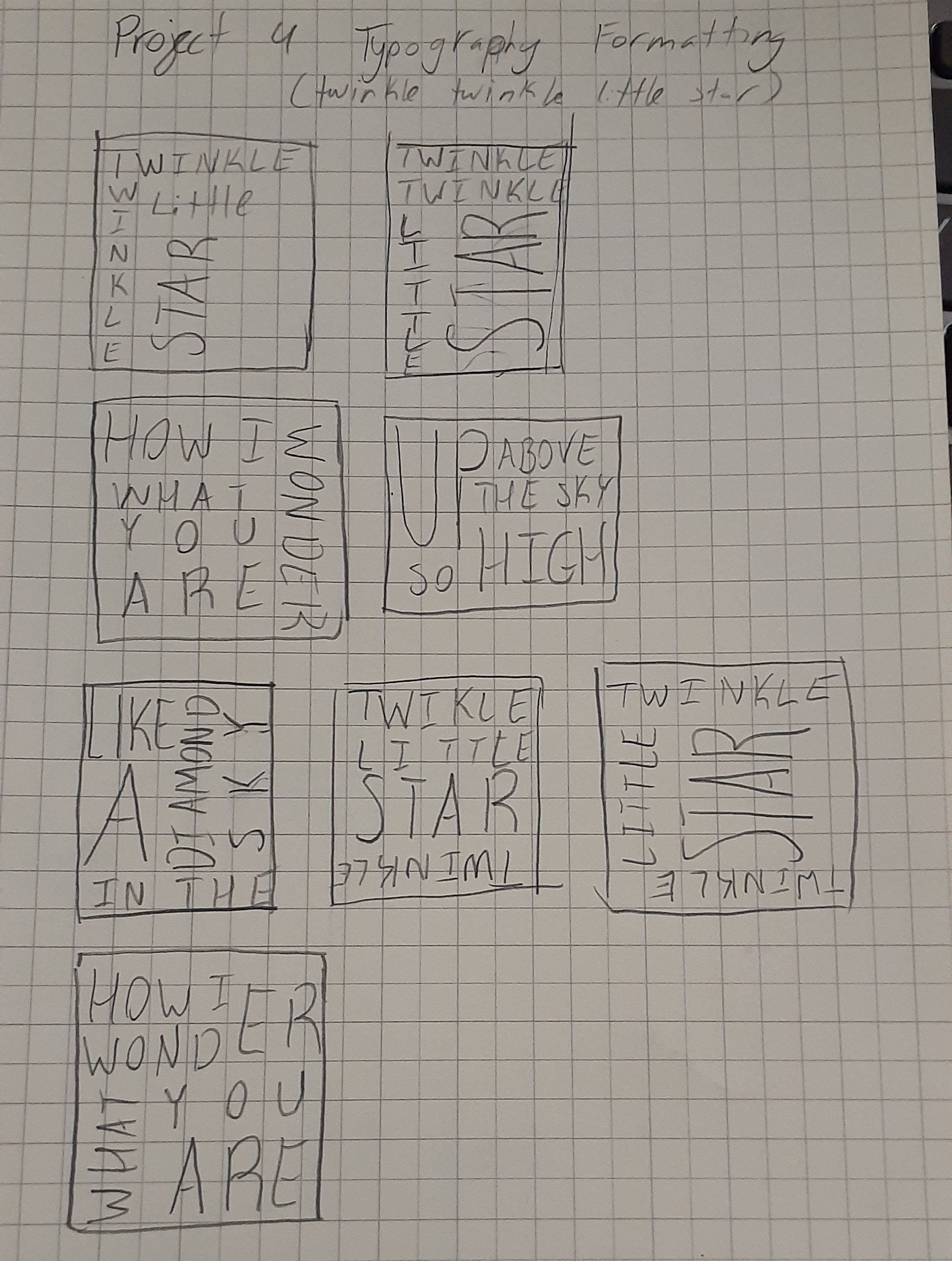
DMA 214: Project 4 Typography
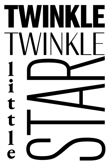
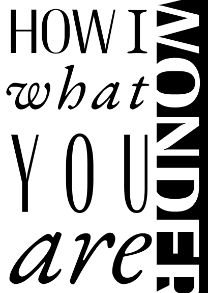
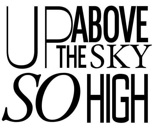
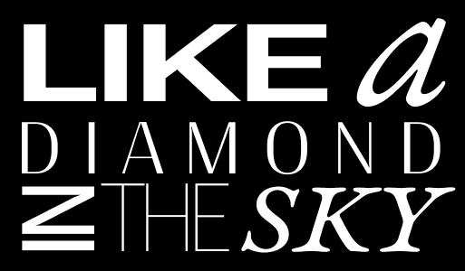
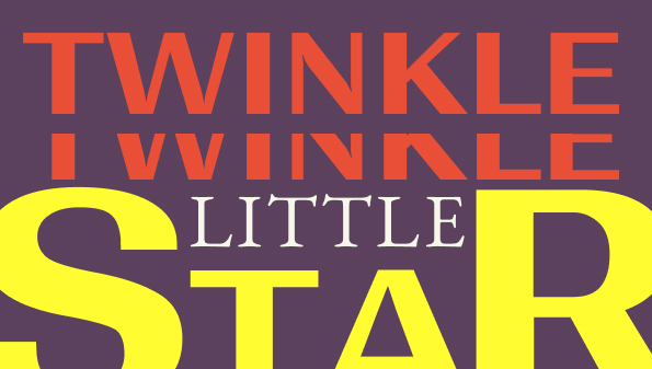
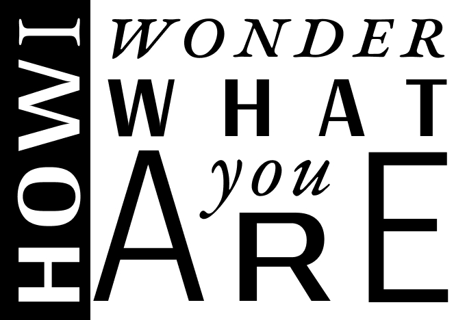
Twinkle Twinkle Little Star
What did you learn?
I learned how different types of fonts will complement each other.
What was easy?
The easiest part was likely just thinking of what each frame would look like.
What was challenging?
The most challenging part was making sure that all the type would line up well and look good and organized.
How could your submission be improved?
Maybe having more contrast in my Frames.
How could the professor improve the assignment for the next class?
Show more fonts that are easy to customize in Figma.
How might you apply your knowledge in future assignments or work scenarios?
I could use this in design whenever I find myself using type.
How did a specific reading or video inspire or help you?
A site that I find helpful to knowing more about typography is this one: Typography: What is it? The Complete Guide for 2023 (careerfoundry.com).