by Bella Leiker
Jack and Jill Nursery Rhyme
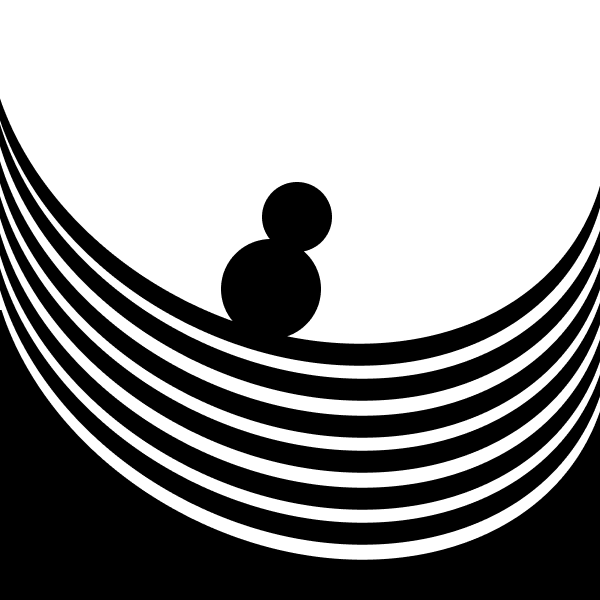

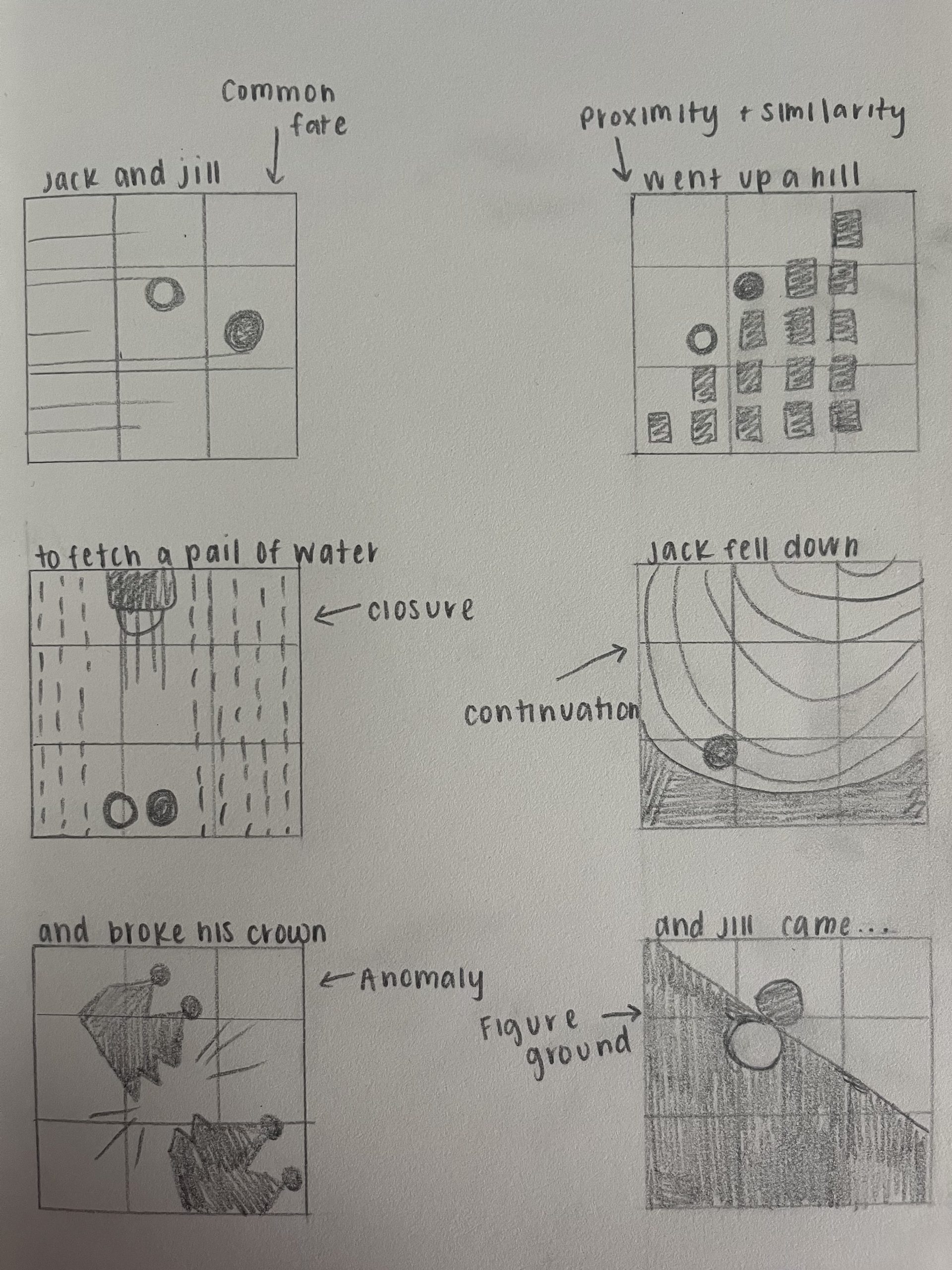
Frame 1:
Common fate, only one of the lines exit off the page whereas the rest come from the left and look as if they will exit on the right. The focal point is the intro to Jack and Jill. All of the lines look like they share the same destination.
Contrast in shape and value is also exemplified in Frame 1 as the difference between Jack and Jill is portrayed through the white circle in Jill’s character.
Repetition is also prominent in the size and shape of the lines running across the frame.
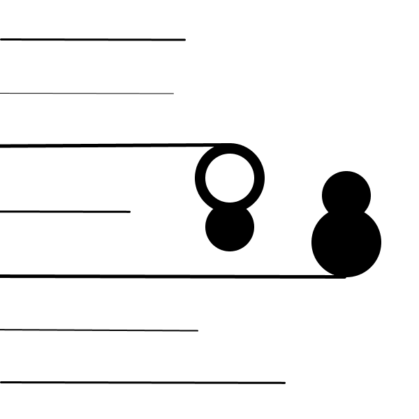
Frame 2:
Proximity, the square elements are closer together in a pattern which is perceived to be more related than elements farther apart. This is helpful in establishing a focal point on the “outlier”; the element not part of the group, referring to Jack and Jill going up the hill.
Similarity is shown in this frame as well. The square elements that are similar are perceived to be more related than elements that are dissimilar.
Contrast in size is shown as we see that Jack is significantly larger than Jill, drawing the eye to this difference.
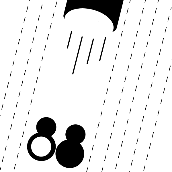
Frame 3:
Closure, the dotted lines emphasize movement towards the bottom of the page, like water coming out of a pale. The audience assumes that there is downward movement when the lines are not solid, exemplifying rain. The viewer assumes when we think of a line, it is a solid line, rather than a dotted, broken line.
We see repetition in the dashed lines as it looks like multiple little lines in the same space, creating focus on those lines.
Disruption is shown as the whole frame being shifted diagonally throws the viewer off a little bit. Same with the bucket, giving an illusion.
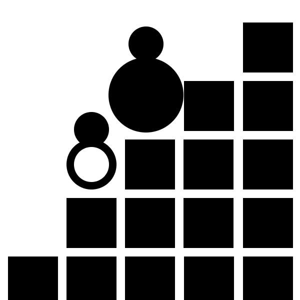
Frame 4:
Continuation, the repetitive curved lines signify back and forth movement the circle is on. Elements arranged in a smooth curve are perceived as a group and are interpreted as being more related than elements not on the curve. Furthermore, lines pointing in a direction lead our eye to a desired “focal point,” or Jack rolling down the hill.
Repetition is also shown as the repeated curved lines draw focus to the Jack falling down the slopes.
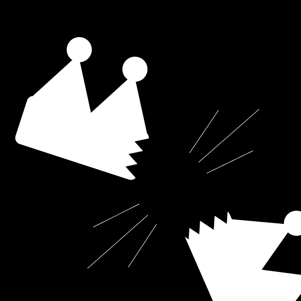
Frame 5:
Anomaly, the crown break is positioned on the lower right intersection of the rule of thirds, drawing the viewer’s eye to the lower right. The focal point is the realistically nothing, and that’s why our eye is drawn to it.
Figure ground is represented when our eye cannot tell whether the black or white is supposed to be the background. This draws attention to the switch up of colors.
Frame 6:
This frame conveys Figure ground, essentially meaning exploring opportunities for figure and ground to switch roles. The black and white figures play with our mind leading us to not know which one to focus on.
The overlap of the white over the black figure represents closure, as we see that the white figure is fully connected and circular, the black figure is not, it doesn’t fully close, but your mind leads to that assumption.