by Bella Leiker
Landscapes Using Color Schemes


- Urban City- Cool Analogous: For this Urban City, I used a palette of cool analogous colors, which allowed me to convey a sense of calm sophistication with the cityscape. I incorporated the cooler side of the color wheel, still utilizing some sense of warmth, to make it a little more fun, establishing a sense of tranquility. The dominant shades of magenta served as the backdrop of the city, symbolizing the warm sunset, while the sub-dominant colors, including a range in pale to deep blues and subtle purples, accentuating the city experiencing the sun going down. Contrast is created through the use of a light pink and the deep shadows in the windows of skyscrapers. The pink moon fading away is also a focal point with its position on the right hand side. There is a sense of unity through the repetition of the windows and the background buildings. Depth is created through the more detailed buildings in the front and less detailed buildings in the back. There is continuation in the landscape through the repeating magenta layers in the background, as well as some repetition.
- Seascape- Triadic: This landscape has a triadic color scheme utilizing blue, red, and yellow to create a mysterious seascape. I manipulated the blue as versions of teal, the dominant color, as the background creating a sense of depth as you get deeper into the ocean. The starfish and fish in the background vary in size and opacity to also create depth, signifying that they are farther away. The pale yellow and shades of red are the sub-dominant colors. The starfish draws the viewers eye in immediately with its contrast in size and color, making it a focal point. The large fish is also a focal point on the upper right intersection of the rule of thirds. There is continuation with the fish moving towards the left, as well as bubbles going upward.
- Arid Desert- Complementary: I chose to do a complementary color scheme for the desert landscape. The color scheme helps to bring some life to the desert with the yellow and blue shades. The dominant color is the muted, sand-like, yellow/brown in the foreground of the scene, the sub-dominant colors are the different shades of blue in the background along with the bright yellow sun. Contrast is created through the use of yellow in the sun, as well as the deep brown in the front. The clouds, and cactus, all fall on the intersection points using the rule of thirds. There is continuation in the landscape through the repeating layers in the background and foreground, as well as some repetition. The sun is a focal point with its bright yellow accent color and position on the upper corner of the rule of thirds. Depth is created as we explore the desert, and you can see the smaller cacti as it gets farther away. This was my favorite one! I loved manipulated the cacti and causing a sense of disruption.
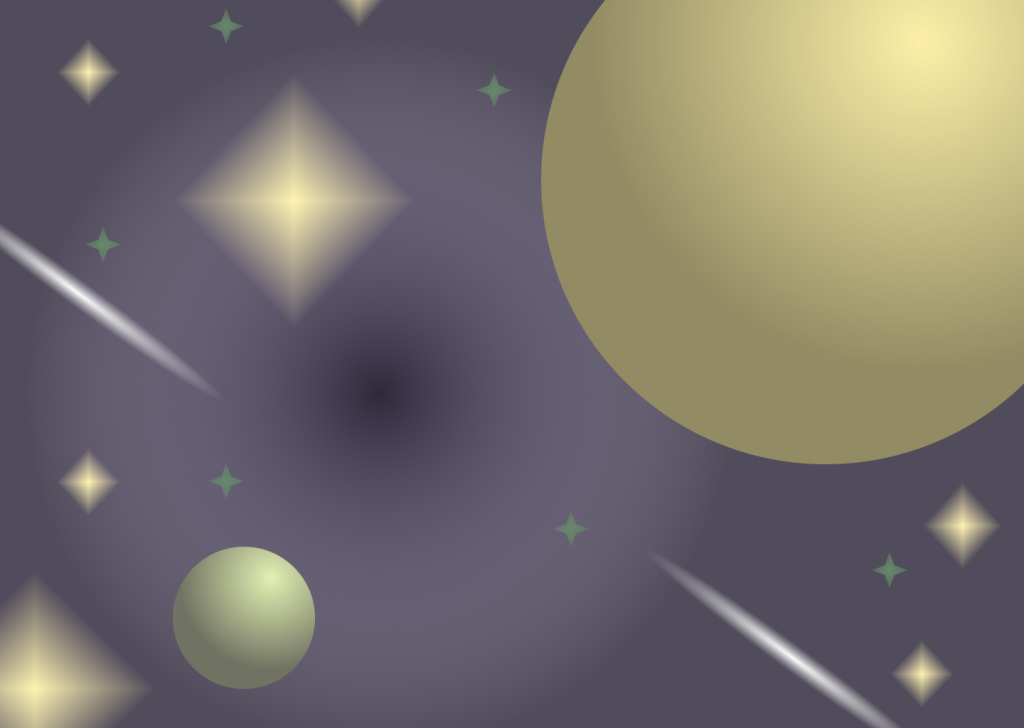
- Outer Space- Split Complementary: Purple, yellow, and lime green work well together in attempt to display my Outer space landscape. Purple, the dominant color, as the background is the darkest, creating a sense of depth. The stars in the background vary in size and opacity to also create depth. The pale yellow and green are the sub-dominant colors. The moon lies in the upper right corner regarding the rule of thirds, expanding into other sections, this planet draws the viewers eye in immediately with its contrast in size and color, making it the focal point. The small planet indirectly across from the moon establishes a focal point as well, contrasting how big the moon is in comparison. The shooting stars are also focal points as we brighten up with a bright yellow, almost white accent color. The aura in the distance encapsulates a sense of depth, why is it glowing, what is it showing us? There is continuation with these shooting stars moving around the planet.
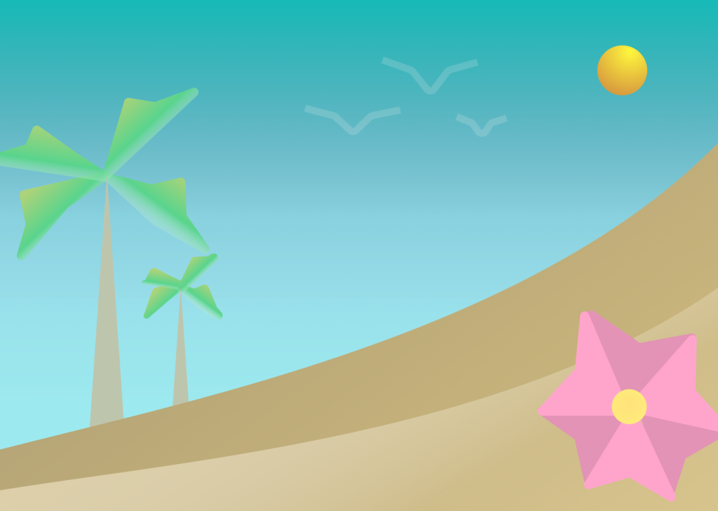
- Tropical- Coolors: I chose to embrace simple Tropical scheme by utilizing a palette dominated by the Coolors Plugin. This choice allowed me to play around with a bunch of fu, tropical colors in order to illustrate my calm beach day on vacation. The blue, linear gradient in the background played a pivotal role in creating that sense of peace, mimicking the clear tropical skies of a beach paradise. These hues convey a feeling of openness and sense of relaxation. Complementing the blues were the yellow sand dunes. These two shades represent the easily sculpted sand. In order to establish a focal point using the rule of thirds, I planted two lush palm trees, establishing a sense of growth in the simplicity. The faint birds in the sky display continuation as they fly towards the viewer, and the big pink Hawaiian flower accent serves as a main focal point with its contrast in size.
- Arctic- Monochromatic: I embarked on a creative journey to capture the beauty of a Northern Lights Arctic scene using a blue monochromatic color scheme. The decision to use a singular color, various shades of blue, was intentional as it allowed me to convey the mesmerizing nature of this sight. The bright, linear gradient formed the backdrop of the composition, representing the cold Arctic sky. These shades symbolize the remote environment where the Northern Lights dance. As I placed zig zag lines, and established a sky above, this spin on the Northern Lights emphasizing the creativity I have used throughout this project. A different type of vibe is encapsulated in each horizontal third, concerning the rule of thirds. The zig zag lines establish the beautiful continuation. Igloos are stationed at the bottom glowing in a bright white, contrasting in shape and size. A polar bear as another focal point helps to showcase the viewing of the Northern Lights.