Typography Nursery Rhyme
Bella Leiker
Overview
Project 4 was a fun one. Different from what we have been applying before, we were able to utilize words and typography. I decided to use the same nursery rhyme as I had used for my first design project, “Jack and Jill.” Typography, as a crucial element of visual communication, plays a pivotal role in conveying messages, emotions, and brand identities. This project seeks to showcase the art of typography in the digital age, pushing boundaries and redefining how we perceive and interact with written language.
Explore current trends in digital typography, including responsive design, variable fonts, and experimental typefaces. Showcase the artistic and expressive potential of typography in digital media, experimenting with innovative font designs and layouts. Create a visually engaging timeline that illustrates the evolution of typography, incorporating multimedia elements to enhance the storytelling.
This project aspires to be an innovative exploration, and the exciting future of type design in the digital realm. By engaging users through cutting-edge design possibilities, we gain a deeper appreciation for the power of typography in the evolving landscape of digital communication.
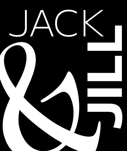
Frame 1: For the first frame, I tried to stick to a simple design. I included the black foreground, with the white lettering, making it pop. I did my best to respect the margins, while sticking to the Rule of Thirds. By creating the focal point (the &), it draws the viewers attention to that specific section of the design.
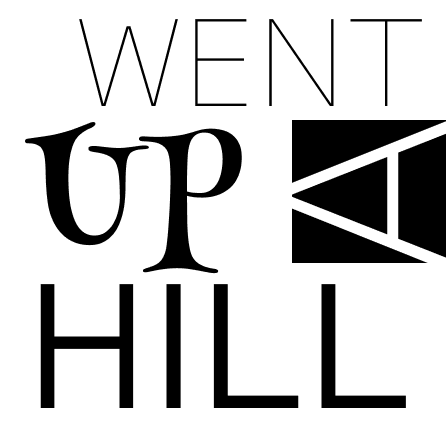
Frame 2: Following a simple design again, I tried variations in the thickness of the font itself that I used, as well as adding in a more fun font, creating a focal point on the word “UP.” I shifted one letter sideways, also drawing attention to that letter by creating a boldface black background.
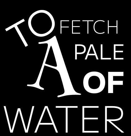
Frame 3: This frame was a little difficult for me as I was having a hard time with placement, I used the Rule of Thirds and margins to help me showcase the design best, and my sketches also helped me out on this. I created a focal point by enlarging the letter “A” while also slightly angling the “TO” along a black contrasted background.
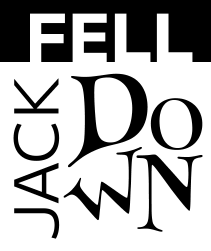
Frame 4: Frame 4 is one of my favorite frames as it is simple, yet I made it engaging. This frame only has three words, so I was able to emphasize each in a different way. I gave the “FELL” a bold type on a black sectioned background, “JACK” is sideways and in a thin font, and then “DOWN” is spaced out in the funky font I chose to create three focal points within the frame, while abiding by the design principle rules.
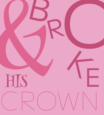
Frame 5: This frame was my favorite frame because I incorporated my own color scheme. I love pink, so I utilized different shades of pink to make certain words stand out. By enlarging the “&” and making it a bright pink, it adds flavor. The word “BROKE” is quite literally broken apart along the frame to convey the meaning as well as a focal point with the enlarged “O.” The two other words are placed in a way that makes sense with the placement of the others.
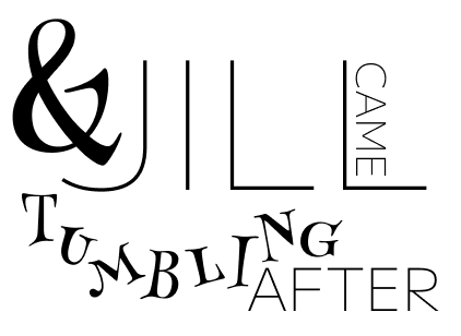
Frame 6: Frame 6 was my most challenging frame because it had so many words involved in the rhyme. I had a hard time figuring out which placement would look best with the fonts I had chosen. I had some fun with the “TUMBLING” as I had made it seem like the letters were tumbling across the frame. I created a few focal points within the frame as well.
What did you learn?
From my time working on this project, I learned that you have to be very careful and thoughtful when placing the words within the frame. I had to also recognize the Rule of Thirds, margins, and design principles to create my nursery rhyme using typography. I also expanded my knowledge on Figma and its fonts, and details within those fonts. We have not been using fonts or lettering in the course yet, so it was fun to experiment and figure out what worked/looked best.
What was easy?
The easy part of this project was choosing the nursery rhyme. I used Jack and Jill for the first project, which I had a lot of fun with, so I thought it would be fitting to use it for this project as well. Jack and Jill is a great rhyme to showcase the words, “UP,” “FELL,” “DOWN,” “BROKE,” and “TUMBLING” within this typography project, as I can angle the words and separate them into action-like words.
What was challenging?
The challenge for me within the project was figuring out the placement of the words on the frame. I had a lot of empty space at first, leading me to experiment and play around with where the words would go and what would make the most sense.
How could your submission be improved? How could the professor improve the assignment for the next class?
I honestly think I did a pretty good job, but my submission could be improved by other thoughts and maybe more critique sessions to help guide my placement ideas. My only suggestion for the next class when they complete this assignment would be to have more critique sessions for the project itself rather than the lab.
How might you apply your knowledge in future assignments or work scenarios?
This typography knowledge will be helpful as I delve into the world of Marketing. Knowing placement of words, sizing, and color, will help me to advertise and develop useful marketing skills within multiple aspects of the job itself. (Ad campaigns, business cards, posters, etc.) The mutlipe starter files, and instructions for the lab and projects helped me during the process of my project.
Project 1 Frames for the Nursery Rhyme shown below
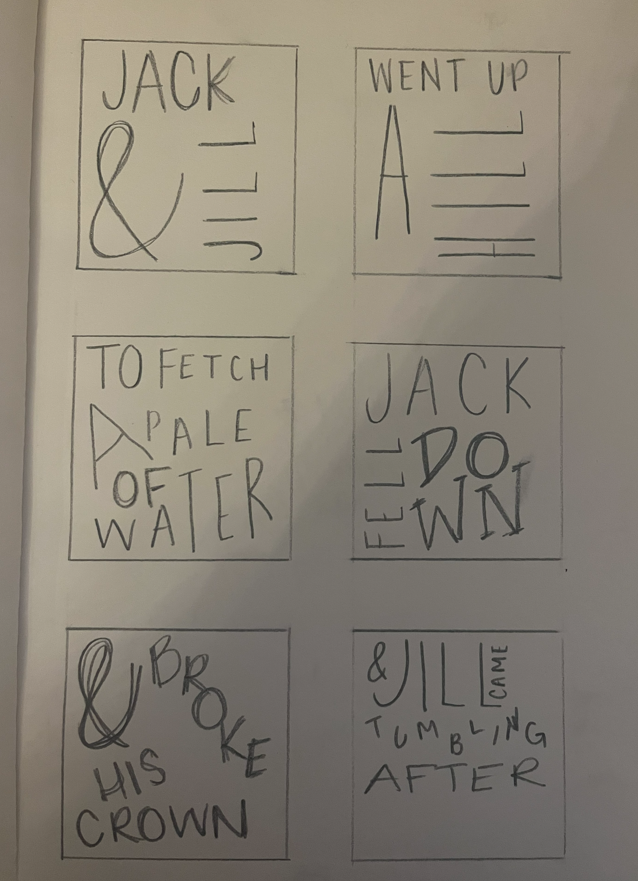
Sketches from the beginning of the project, we can compare them to the final project as I adjusted some focal points and placement.