Stamp Summative
Bella Leiker
Displaying Knowledge Through Hawaiian Digital Stamps with Figma
Showcasing Hawaiian Beauty
This final project showcases a collection of digital stamps, each representing a distinct Hawaiian location. From the iconic Waikiki Beach to the serene florals of Maui, these digital stamps serve as visual postcards, capturing the essence of the islands and allowing viewers to immerse themselves in the beauty of Hawaii. This blog post unveils a captivating project centered around the creation of digital stamps using the versatile design tool, Figma. The inspiration behind this project stems from the desire to go to the beautiful Hawaii. One of my good friends attends college in Hawaii and her everyday life is a dream. The project highlights the potential of digital media as a medium for storytelling and connecting people through art.🌺✨
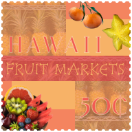
Frame 1: In the first frame, I created a lively fruit market theme using a warm analogous color palette, subtle pineapple background, and adhering to the Rule of Thirds. By maintaining proper margins and employing a grid, I aimed for a balanced composition. The incorporation of a playful font, except for a white-bordered classic font for emphasis, enhances visual appeal. The use of fruit clip-arts strategically directs focus to a specific area in the design.
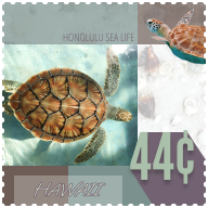
Frame 2: This frame is my absolute favorite. I have a special fondness for turtles. I applied intriguing effects using simple and playful fonts. I integrated vibrant colors from Coolors that complemented the turtle images, along with varying opacities for added visual interest. To highlight the “44 cents,” I utilized a bold font and created emphasis with a dark purple background in boldface.
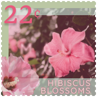
Frame 3: This frame turned out aesthetically pleasing. Leveraging the Rule of Thirds and mindful margins, I optimized the design, aided by my sketches. Emphasizing the pink flowers, I enlarged them to serve as focal points with varying opacities. The font was bordered in pink for prominence, and the “22 cents” featured a shadow effect. Additionally, I played with the opacity of “MAUI,” creating an illusion that becomes noticeable only when the center of the frame is focused upon.
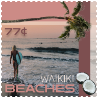
Frame 4: I find this frame enjoyable, capturing the beauty of Waikiki’s pristine beaches. The rotated palm tree and two coconuts serve as focal points, while a drop shadow enhances the impact of “77 cents.” The “WAIKIKI BEACHES” font exudes a cool surfer vibe. I maintained grid alignment and played with opacity variations, contributing to the overall appeal. I love the Coolors generated font, that went really well the picture I chose for the background.
What did you learn?
Throughout this project, I’ve learned how to navigate the power of various plugin features within the tools we’ve explored. From mastering the basics of design principles to learning how to use software applications, every skill learned contributed to my ability to effectively utilize plugins. This not only expanded my technical toolkit but also reinforced the importance of adaptability and continuous learning in a evolving digital landscape.
What was easy?
Figma, once again, takes center stage in this project. Figma provides the ideal canvas for bringing the beauty of Hawaii to life in digital form with its amazingly easy tools. The versatility of Figma allows for a seamless blend of creativity and precision, making it the perfect tool for crafting intricate digital stamps.
What was challenging?
I think this project was the easiest for me. I had a lot of room to add all of the skills we have learned this year. Color, Typography, Image and the use of design principles helped me to easily figure out where I wanted to put everything. As for each individual project, I felt like since we only had to focus on one component, it was hard to fill up all of the space.
How could your submission be improved? How could the professor improve the assignment for the next class?
This was my all time favorite project, and I think it was because I was able to use color, images, and had a lot of freedom for creativity. I think criticism is always welcome, so my submission could be improved by more critique sessions to help guide ideas. I have no suggestions for the next class. This was the best project, by far, I actually wanted to work on it in my free time.
How might you apply your knowledge in future assignments or work scenarios?
As I delve into the world of Marketing, my knowledge on these concepts will help me to advertise and develop useful marketing skills within multiple aspects of the job itself. (Ad campaigns, business cards, posters, etc.) The starter files provided, and critique sessions helped me during the process of my project.
Sketches
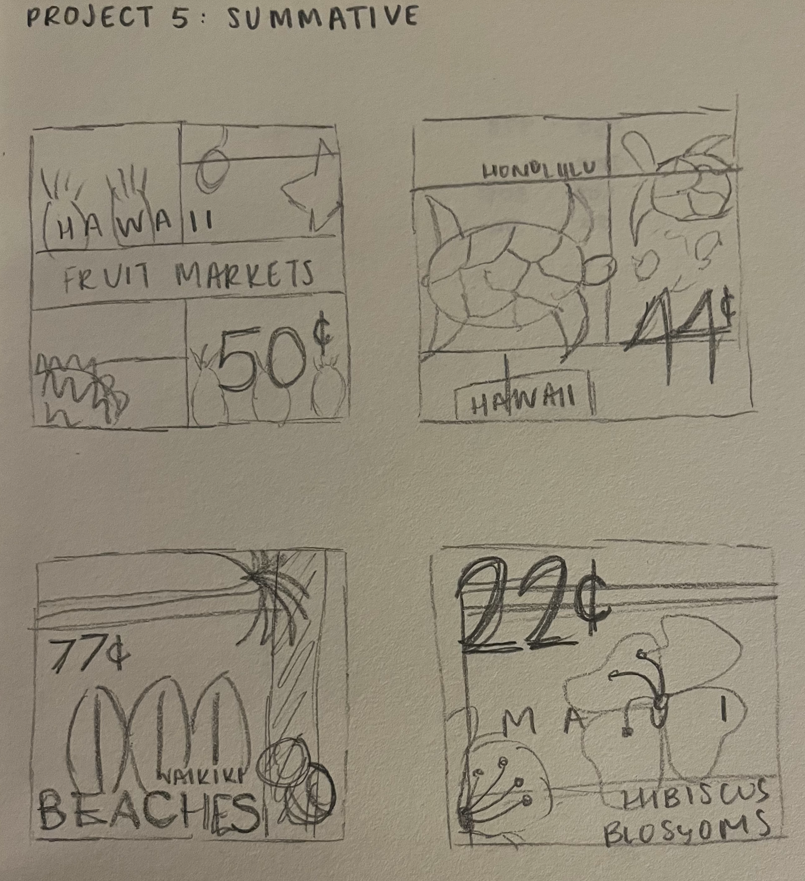
Sketches from the beginning of the project, we can compare them to the final project as I adjusted some placements, boldness, and you obviously cannot see the colors used, which weren’t established in the beginning.