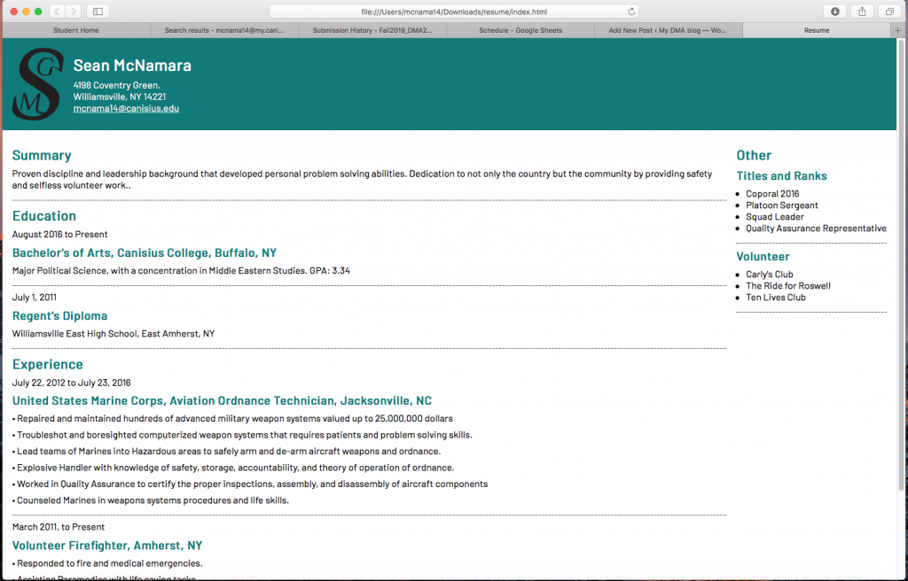
First the monogram, I liked the idea of having two smaller initals linked with a the first larger initial. The S worked perfectly with that. The only hard part about the monogram was linking the two smaller initials with the larger initial. It took awhile to tinker with the curvature of the lettering before it looked natural and smooth.

This is my first time ever working with code so it was a completely new skill. When I first opened up Dreamweaver and downloaded the scripts I needed to start my page I was quite intimidated by what I saw. To someone brand new to this the script looked like hieroglyphics, but after doing some of the simple tasks editing the page it started to become easier to me. Towards the end of the project it was actually quite entertaining to rearrange the script and watch your web page change. My favorite aspect of the project was changing the color of the header and the title words. I believe it ads a unique touch to my resume.

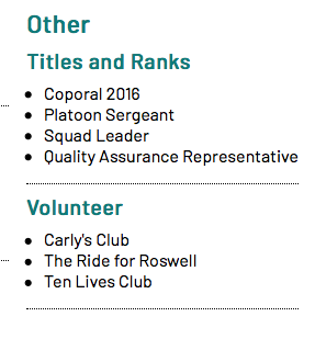
I also changed up my side bar to add a little bit more of a personal touch. I enjoyed this project the most out of the other four. Which is surprising because I really do enjoy working with photoshop!