
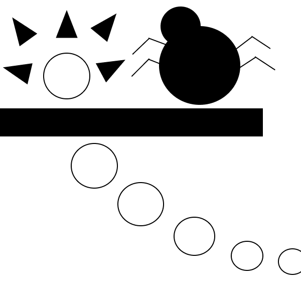
Sketches:
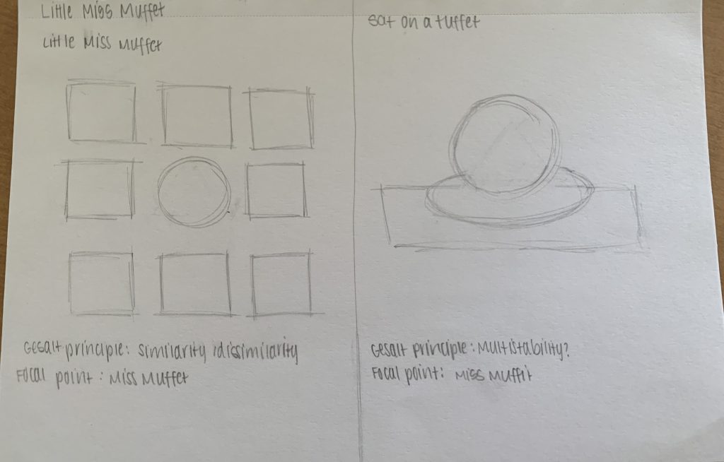
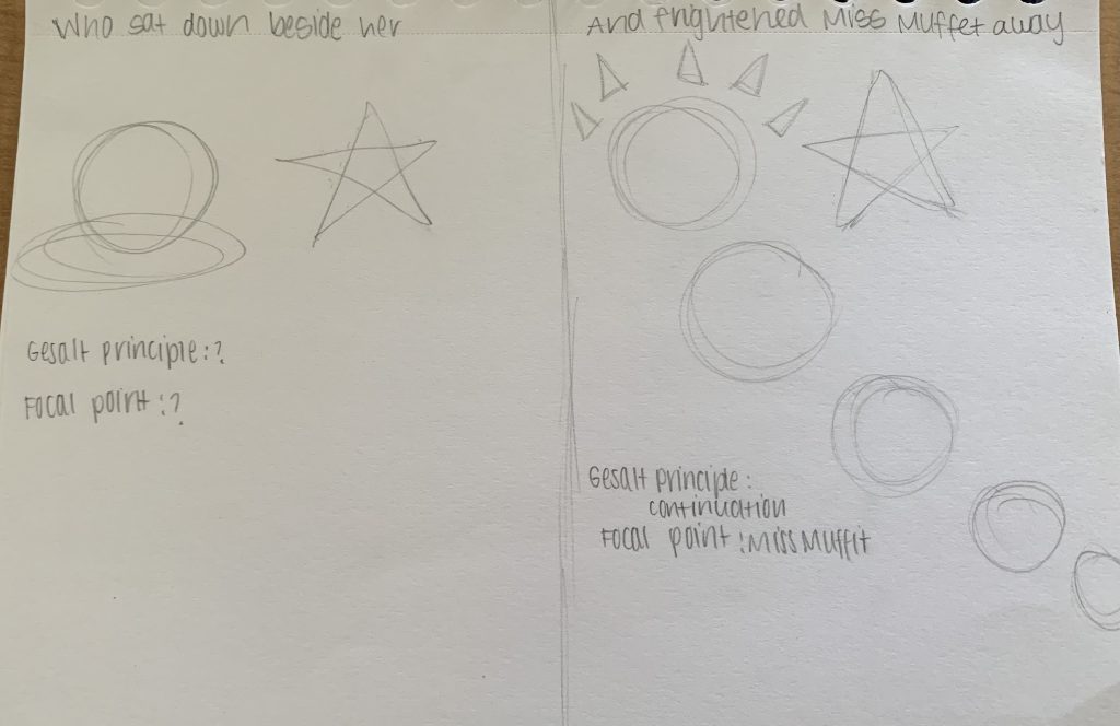
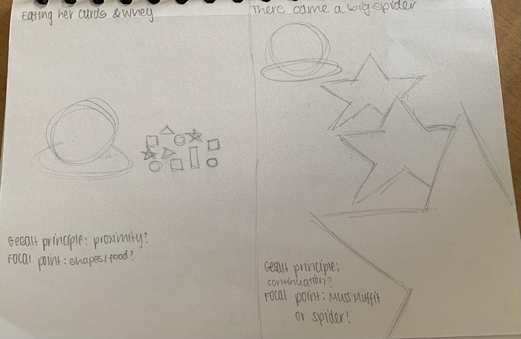
I chose to portray the nursery rhyme, “Little Miss Muffit”, through Gestalt principles. Even though there are various different Gestalt principles being used on each frame, I believe that all the frames are cohesively and accurately portraying the story through the use of placement, size and quantity of elements.
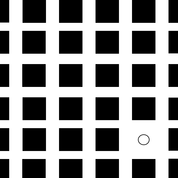
Frame 1- similarity
The size, placement, quantity and repetition of the squares create the opportunity for the circle within the frame to become a focal point. The squares create a similarity between each other and dissimilarity between the circle.
Frame 2- multistability
Due to multistability, the focal point is immediately recognizable as it is placed over the rectangle and stands out in the background as it is a different color.
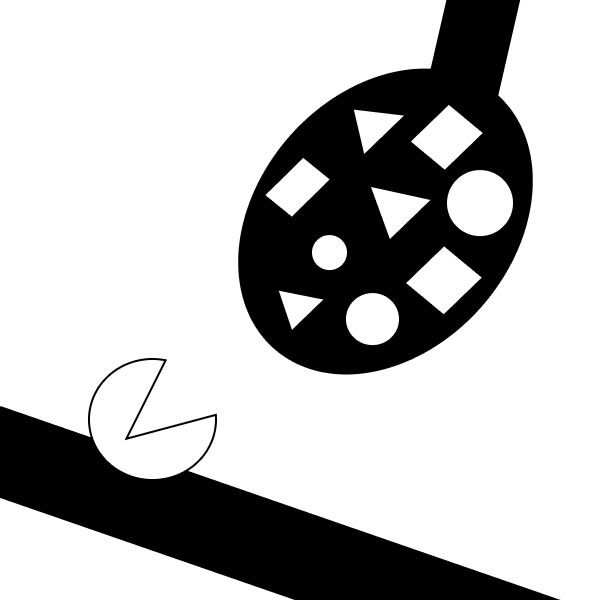
Frame 3- proximity
Due to the placement, grouping, and sizing of the multiple shapes on the spoon compared to the circle, it centers the audience’s attention to the focal point which is the spoon.
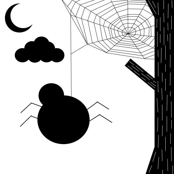
Frame 4- Repetition and shared fate
To create the upward movement of the tree bark, lines are positioned repetitively in the same direction. This shifts the eye to the spider web that is connected to the top part of the tree.
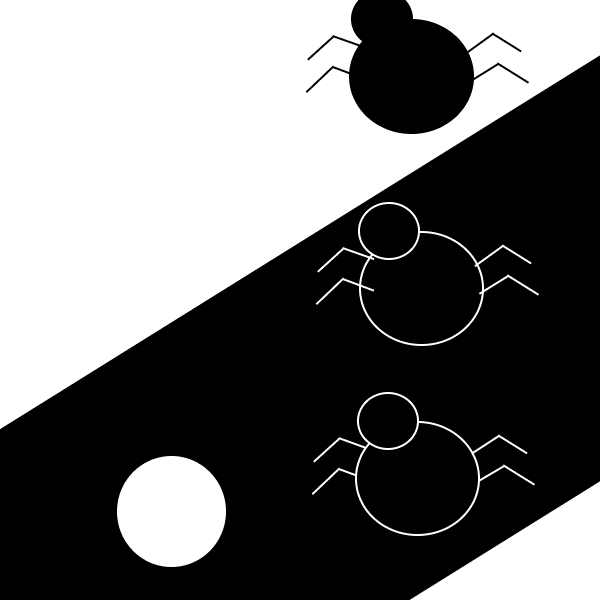
Frame 5- Repetition
By repetitively positioning the spider vertically, it creates the illusion that it is moving towards miss muffit.
Frame 6- Continuation
The circles are positioned in a continuous movement to create the illusion that the circle is moving off the frame.
What I’ve learned when doing this project is that position, size, and simplicity of shapes help collectively all play a part in portraying a story to the audience. Grids and the rule of third help optimize the position of elements. When doing this project it was relatively easy to incorporate gestalt principles as we had prior practice of the principles and their are many to choose from. Due to the fact this is something new I’m experimenting with it is challenging knowing if what I am trying to exemplify is being portrayed to the audience viewing my artboards. I think I could improve on my rule of thirds when placing my elements, allowing them to become better focal points. Another way I can improve is by spending more time on my artboards and also looking into more information on the principles being used. I will incorporate both the rule of thirds, grids and gestalt principles in future projects. I used inspiration from other student’s past projects and explanations of the gestalt principles from the web to help me establish a foundation for my project.