Categories
Uncategorized

Project 2

The bit I struggled most with this project was its open-endedness. I wasn’t sure exactly what to concentrate on, so I may have a few useless views and some I’m sure I missed. I learned more about Figma during this project, particularly how to scroll and use components more meaningfully. Creating the logo and other images were easy for me. Drawing in Figma is much easier than Illustrator. You can connect new lines to finished ones using the pen tool, and make one image from several finished strokes without trouble–something I struggle with in Adobe.
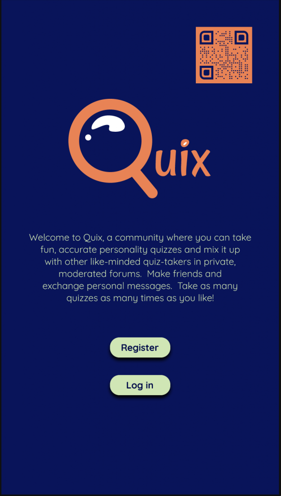
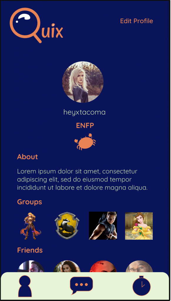
The difficult part was using design, like it always is. I wanted the app to look creative and professional, but it may have just turned into a mess. Some views have too much design and others have almost none. I’m just not cut out for creating layouts. If I created more views to demonstrate the functions of some clicks and buttons, I think it would be an improvement. For example, I have delete and retake quiz buttons on the Edit Profile view, but they don’t do anything. I used these buttons in place of the “Groups” view, which turned out to be useless once I added groups to the profile page. I think it was ultimately a better use of space.
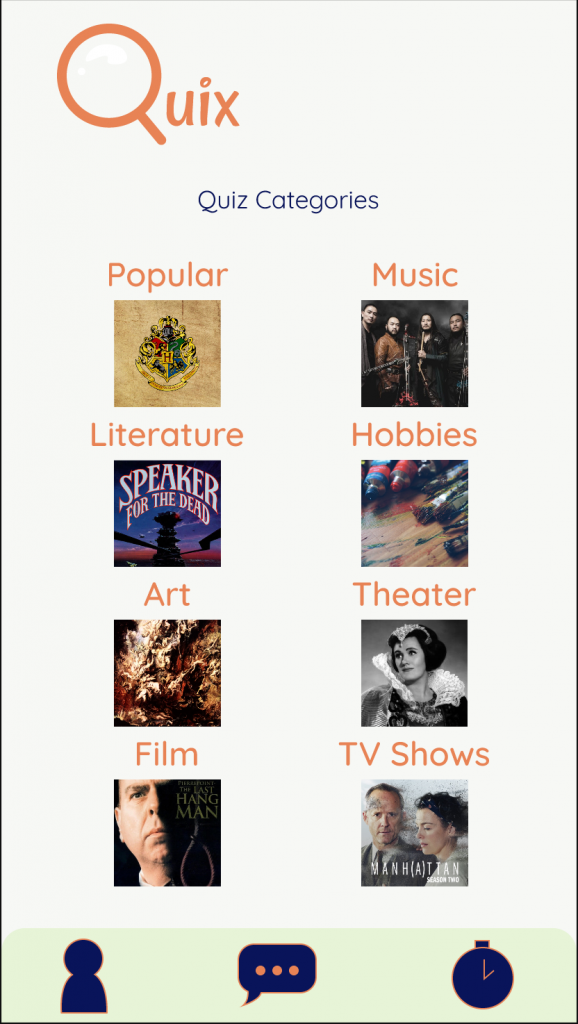
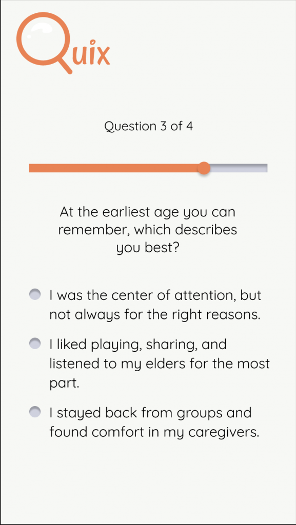
Adding animation brought some life to my app. Following the guides of “Animation for Attention and Comprehension” by Aurora Harley (that can’t be a real name), my animations were informative. They showed state changes and progression in and out and during the quiz elements of my app.
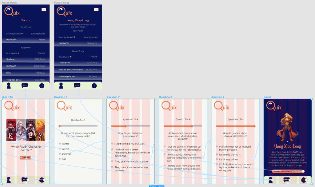
I think stricter guidelines would have helped me with this project, but that might be because I struggle with design. My classmates may have had no problem building their own designs.

My knowledge of Figma may help in future assignments, but hopefully I’ll be doing other things in my career!

Hopefully you can find my testing results here: https://app.maze.design/projects/23788106/mazes/23788085/results

I know this wasn’t my best semester, but I did try my best on this project. I think I’ll have more to offer in the psychological realm. Have a great Christmas and I hope I can visit with you again soon!

Categories
Uncategorized

Lab 6

I’d like to create a social media app that allows strangers to congregate based on shared psychological traits. These will be determined by fun personality quizzes based in the science.

Personality quizzes are popular on the internet, but they’re rarely accurate, and they’re based on the subjective opinion of the quiz’s creator. The creator could be anybody and have a variety of motivations to make a quiz. The quizzes provided on this app would be created by those familiar with psychology and creative minds, enforced by research.

Once a user completes a quiz, a private forum and live chat will be open to them including the other users who got the same result. This way, there’s a greater chance of making friends while virtually mingling, as opposed to following popular influencers on other social media platforms, or running into trolls. This is something that we’re really missing out on when going out now. We need to stay distanced from other parties, so we don’t get a chance to meet new people. On this app, multiple categories will be open to users based on quizzes, so there will be multiple opportunities to find users with similar interests and ways of thinking and feeling.

Problem scenarios:

  1. I will solve the lack of opportunities to meet new people by providing a social media space to help minglers interact with new people.
  2. As an avid online quiz-taker, I want to take worthwhile quizzes so that I can receive relevant insights from credible sources.
  3. I will solve the abundance of stupid online quizzes by providing fun, knowledge-based quizzes to help avid online quiz-takers have a satisfying experience.
  4. I will solve the popularity issue which arises on other social media platforms by eliminating “likes,” to help those who slip under the radar be seen on an equal playing field.
  5. As a minor, I want to use chatrooms that are safe and free of trolls, so that I can chat within my age group, and avoid online predators and otherwise toxic environments.
  6. I will solve the presence of online predators infiltrating kids-only chats by providing telling questions within quizzes as well as providing moderators in forums and chats to help minors be safe.
Categories
Uncategorized

Project 1

Salesforce QA Analysis:

It is easy to complete basic tasks.  It only takes one or two clicks to finish a basic task on both the computer and phone.  A minor issue I noticed when adding a contact was the contrast between the background and the text.  The black text on a white background has sufficient color contrast, but the text was on the smaller side and very thin.  I watched my dad miss a couple required fields when filling out the contact form.  Maybe the size of the text failed to represent important fields.  I think those with poor eyesight or the elderly could find this aspect inaccessible.

Target Demographic: amateur artists looking to sell their artwork

Accessibility: I focused on readability of text by using a sans serif font and a lowest size of 14

New feature: My eyeglass icon points in the opposite direction than those I’ve seen.

I learned how to use Figma fairly well. The prototyping was interesting. The only easy thing was making the logo, because I’m familiar with the pen tool from Adobe. Everything else was challenging. The biggest challenge that really prevented me from getting an earlier start was choosing a color scheme. I wanted to use something other than blue and orange, which is my go-to, but I really hated everything I came up with on coolors and the Adobe color wheel. Simplifying to two colors was the best thing I did for the entire project. I personally didn’t feel I got anything from the QA Analysis, and I think it may have even taken away from design time. Next time you assign the project, I’d leave it out. My time examining color will help me in the future.

I was inspired by Alan Cooper’s article on designers coding, because the thought that I might’ve had to code my app on top of all the work it took to design it made me ill. His staunch view against designers taking time away from designing to code was very reassuring. My only positive experience with coding was sitting next to my textbook and following each step from the very beginning to make a little faux website in Web Programming. It is not an intuitive process for me, so I don’t know where to start on my own or be innovative in this way.

Like I said, I struggled, and I’ll continue to struggle through this class. I did put my best effort in, though, so I hope that’s ok.

Testing Results: https://maze.design/projects/19882087/mazes/19881939/results