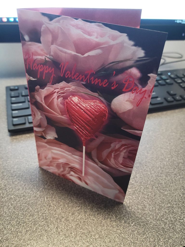
| I learned how to use photoshop better and how to take images and create my own Valentines Day Card. |
| The easy part of this project was picking out images and adjusting the sizes of the images/text. I also found adding effects like outer glow not particularly hard and choosing good colors. |
| What was challenging was cutting certain parts of an image out and use that. The tool that does that was hard to use and I had issues with the layer masks. I also hated cutting the white part of the cards and folding it, now that was truly hard. |
| I think I could make it more cohesive across the board color wise. The front, back, and inside of the card are completely different colors so it is slightly jarring. I also think I could’ve made the back more cool. |
| I think Dr. Dunkle could definitely elaborate more on the cutting tool of images. That was a bit hard. |
| This project was the first instance of me using Photoshop in my entire life. Now that I’ve done it and made a whole creation with it, I think I am comfortable trying out more stuff with Photoshop. I know the basics now. |
| The article “7 Beginner Mistakes to Avoid When Designing for Print” helped a lot as it made me realize the importance of contrast from the text and background color wise. My original color for the inside of the text was purple and it was very hard to see. |
