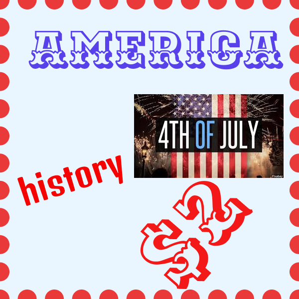
In project 4 I learned how to create stamps using texts and images. I created four stamps about the country, America. Each stamp included sports, history, architecture, and food about America. In this project we used different fonts to create depth. We also used different colors and line spacing to enlighten each stamp. I feel as though the Professor did a great job explaining the instructions to complete project 4. The lecture video and asking for extra help really helped me to complete this project. I believe that this project could help me in the future with advertisements. this can help me to be more creative when using different fonts to create advertisements. if there was anything I could’ve did differently it would be to use a tropical state such as California. The most difficulty I had was deciding on different fonts and using different line spacing to enhance each stamp. The easiest part of this project was finding images to put on each stamp. I believe that I did good with this project being that I feel more comfortable with using this software.
In project 3 we learned how to come up with a two word metaphor to create an image. To complete the image we had to use a vector image. a vector image allowed us to change the color to whatever we wanted. however we used to vector photos to symbolize the metaphor that we chose. for myself i chose a heart and shades to illustrate the metaphor “love is blind”. I thought it was easy for me to come up with two images to symbolize “love is blind”. The most difficult part for me was finding images that were a vector and changing the background. I honestly think this was my best project that I did so far due to the more practice I have with this software from the beginning of the semester. I think the professor did a good with demonstrating the instructions. The demo and extra help with the professor help me to complete this project in a unique matter. I can use this material in work forces by knowing how to create images using metaphors for advertisement. I also can use this to design products.
Our second project was a success. I learned different varieties of colors to create images. This project helped me to be more confident in the different setting we used to make different colors. For example, I learned how to change the saturation and brightness of the colors. I feel as though I could’ve manufactured more elaborate ideas to make my project more unique. This project will help me to build off of once we get into the next topic. I really enjoyed this project so far. Adding in positioning from last chapter helped improved this project as well. Learning how to come up with more extravagant ideas was most difficult for me as well as blending the colors. I’m excited for the next project.
Our first project I learned how to use different shapes to share meaning by telling a story. We used different techniques for example positioning was a major key for this project. Being able to position the shapes at specific lengths within the frames was key. I also learned how used different angles to support meaning of the story line. I feel as though the second to last square was most challenging for me being that I never used this software before. However, I believe this was good practice for the future. I thought drawing the shapes and using position was the easiest for me. I think some of the angles of my shapes could have some improvement. I think the professor did a good job explaining the project well where this will help any confusion for the next one. This project can help me with creating designs on templates for social media or anything for my major. The demo from the instructor helped me best. This project was a success looking forward for the next one