For this project, I created my own personal website. On this website, it has my resume, a portfolio, and a contact page for future employers. I learned how to use a new platform, Figma.
I found Figma to be very easy to navigate and quickly pick up how to use the tools. I don’t think this project was challenging because it will be useful to me later in life.
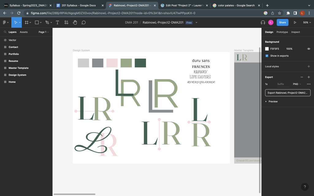
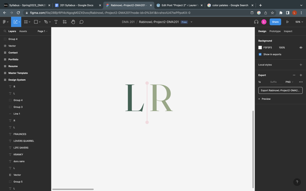
The most challenging part of this project for me was creating my logo. With my initials being LR, I did have some difficulty trying to decide how to blend them together. But my final logo I ended up liking very much because I was able to use the three colors that I used in my website design.
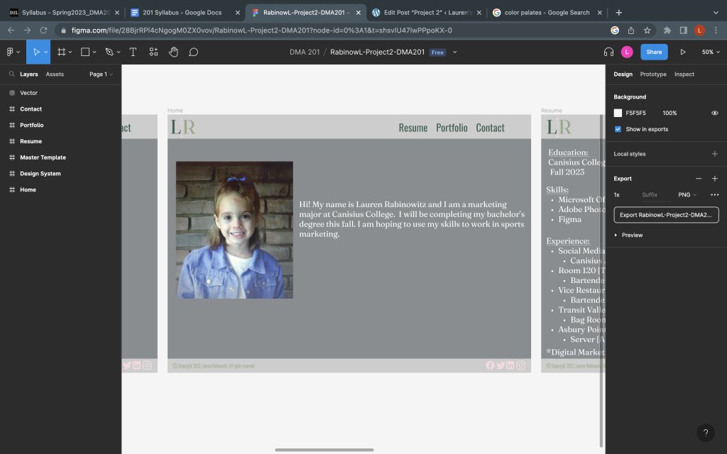
My submission could be improved by choosing a better photo for my home page. I ended up using a baby picture because I don’t really have any professional photos of me just yet. I also don’t have any recent photos of just myself and I thought it would be fun to use a baby photo.
I don’t think anything needed to be improved for the next class. We were given a lot of class time to work incase we had any questions. I also was able to use this platform on my laptop at home so I didn’t need to go to the lab on non-class days.
I will apply my knowledge in the future especially when I am trying to create my own business cards, which is what we did as Lab 4. Figma had a create format for it and again, it was very easy to design and use.
The website I used most was Color Codes (https://colorcodes.io/). This website helped me find the right colors I wanted to use in my website design and gave me the hex codes to copy into Figma. Also, they showed similar colors and palettes that went well with my starting color of sage green.
Logo Designs:

Final logo:

Home page 🙂

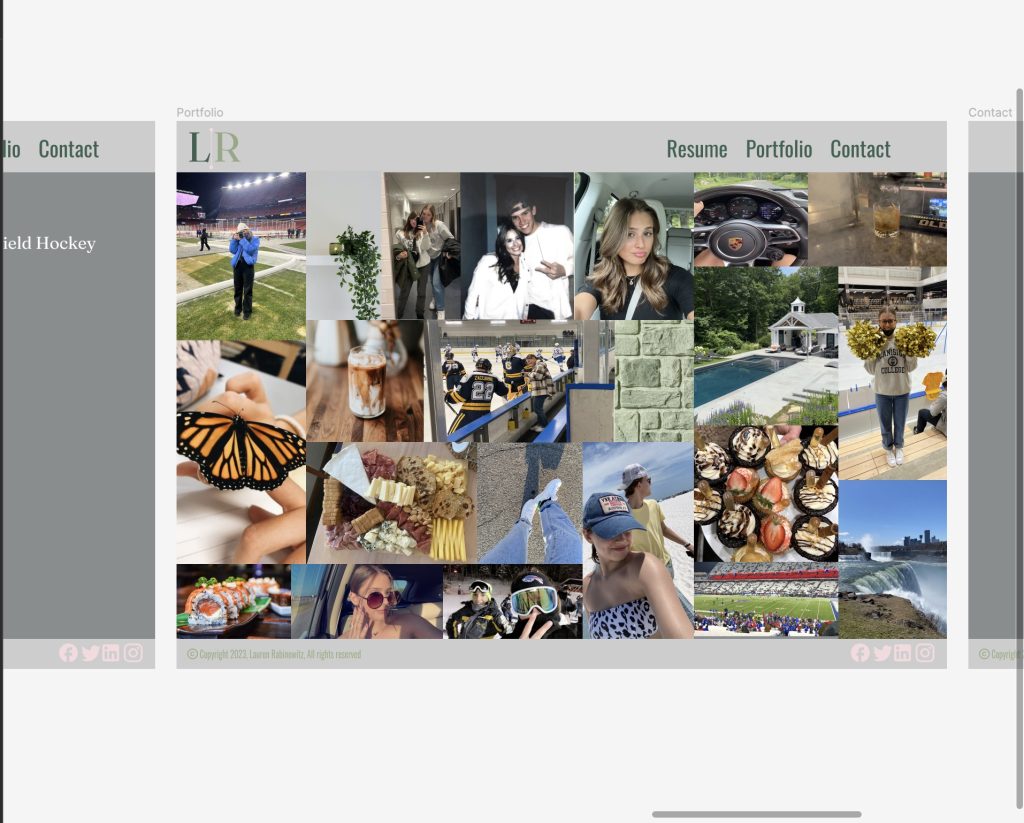
Portfolio:
