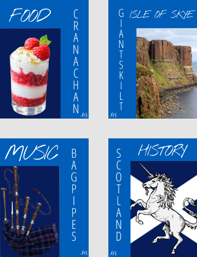
This was the last week of the course, and we learned about typography. We learned the differences between serif and sans-serif fonts, how best to use type as a design tool, and how different fonts can affect how we see things. The easiest thing from the project this week was choosing what to use to represent each area the stamps were supposed to cover. I have been to Scotland, and loved it, so I knew that I wanted to use some of the things I rembered from going in the project. The thing that was the most challenging for this project was probably figuring out the Architecture/Landmark stamp. I wasn’t sure at first what I was going to do for the stamp, as I thought it had to an example of architechture, then I realized it could also be a landmark, or sight. This allowed me to pick the Giant’s Kilt rock formation. Still, I wasn’t sure, as something else that I wanted to include was Edinbourgh Castle, as the castle is/was a military base. I would probably improve the submission by seeing if I could do anything to improve the areas outside of the pictures/focuses of the stamps. In general, this project doesn’t need to be improved, especially for a summer course, there was enough to do without it being overwhelming. For a fall or spring course, however, you could maybe add more categories, or have students do two different stamps for some or all of the catagories. I would use this knowledge in the future when or if I have a job using a program like one of those word counter things, where you give a subject, and have a group put what words they connect to the subject, and the more times a word appears, the bigger it is. Another example, would be if I was in a situation where using type was a large part of th design, or something I had to work around.
Project 5
by
Tags: