The main thing learned here was the way around illustrator. While much of it is the same or similar to photoshop, there are some serious differences as well.
For me, the easiest things were the pen tool – as it is basically identical to photoshop, so I already had experience – and the image tracing. I needed a refresher, but that was just because I have serious memory issues, so while I may remember most of a class, some smaller things, like a 3-4 step process may be forgotten.
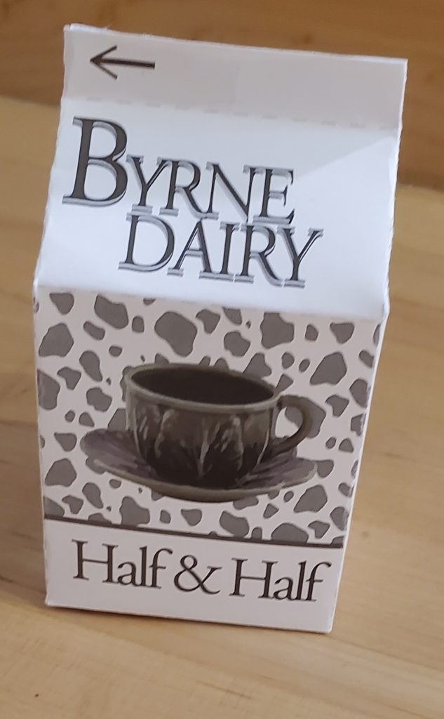
The most challenging thing was probably getting the “Byrne Dairy” text. In of itself, it wasn’t hard, but layers act really different in illustrator, so as I was trying to move them, it wasn’t cooperating, and I kept getting annoyed.
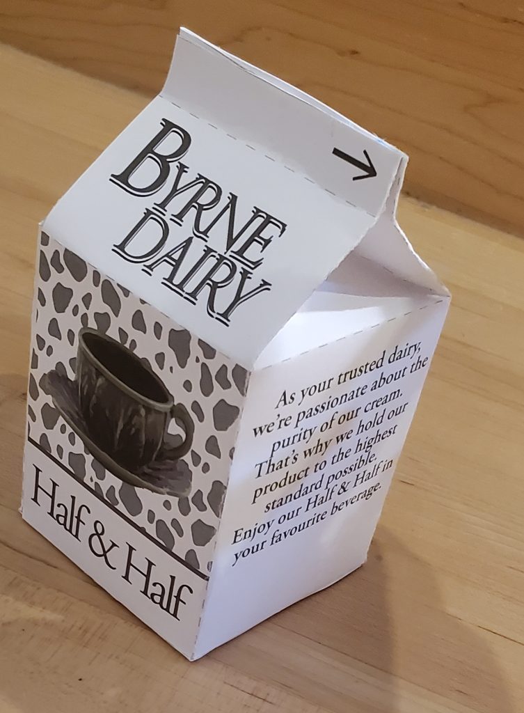
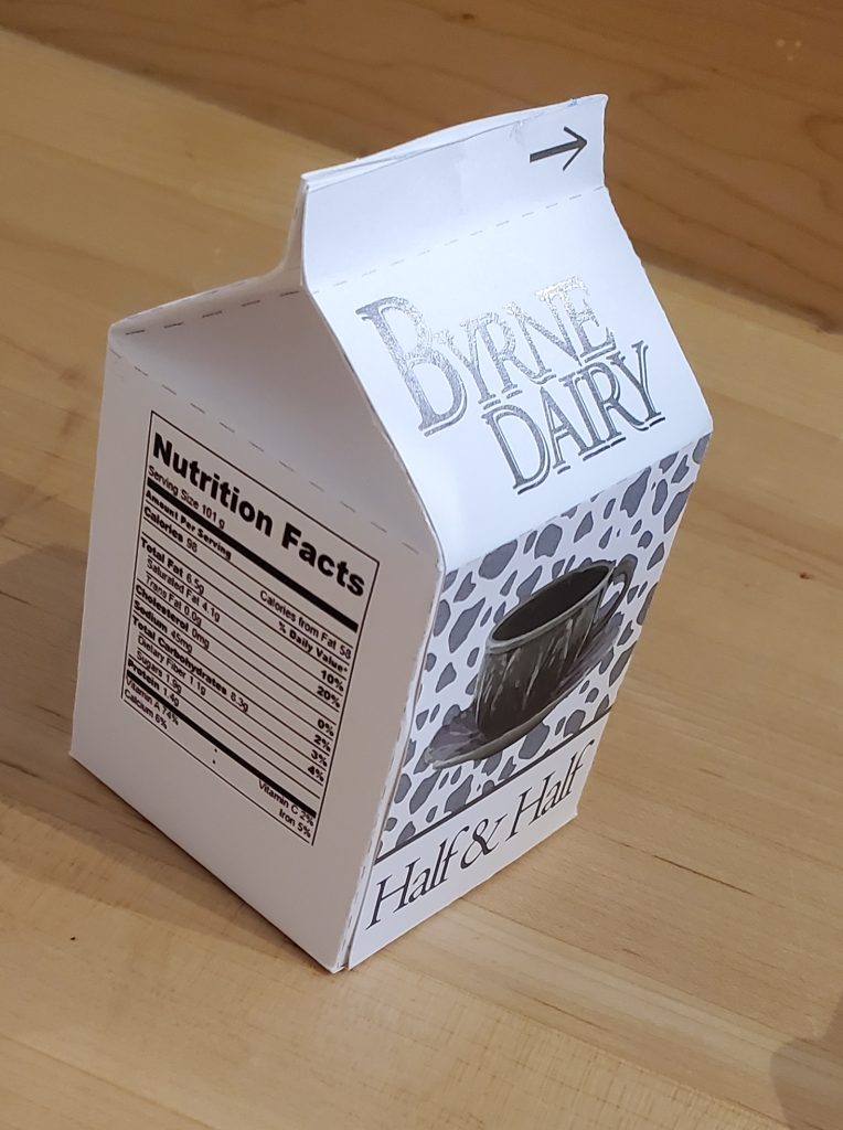
My submission could have been improved in 2 ways, picking a different “main colour” as the green didn’t print well, or making a different background, so it could wrap around the carton completely.
I think the only thing that could change/improve the project, would be to base wether or not the cartons are actually printed or not based on how “on time” the class is, is if its behind, no printing, if its ahead, or on pace, print them.
As I want to be an illustrator, the pattern making or image tracing is probably going to be the most helpful to me in the future.
While there wasn’t a photo or video that inspired me, I did take most of the “blurb” from the brand Garelick Farms that I remembered having growing up.
See Below Photos: