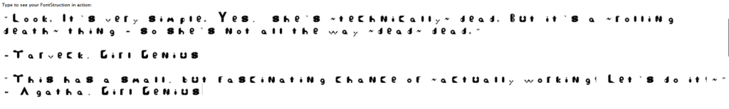
For this project, we had to create our own typeface.
Over the course of my project, I not only learned more about the site fontstruct, but also that while it may seem easy to create your own typeface – especially with the adds and such about creating a typeface out of your own handwriting – that it is much harder than it seems.
The easiest thing in my project was working with letters are are “mirrors” or “chains” of each other – b,d,p,q, or v,w,x – for example.
The hardest part for me was trying to get the entire typeface to look proportional, not just within cases – upper/lower – but to make uppercase and lowercase proportional to each other.
While it is obvious that more time and versions would improve the typeface, I think stylistically something that would improve it, would be to make the designs a bit more cohesive, and make the curves on some letters smoother. The issue there is the capability within fontstruct though, and out of my control past a certain point.
I think the only thing that would improve this is maybe having more time/work days on it? I am time blind, and can have a hard time with the passage of time, but it felt like we blew through this project in almost no time flat.
Learning and cataloguing so much finicky information about fonts – not necessarily in how to create them, though we are looking at it through that view – would be helpful if I were to ever begiving instruction to find or make a font that is like another, or in a specific style.
There wasn’t any particular video or reading that helped me, I just went were it felt natural after starting the design.