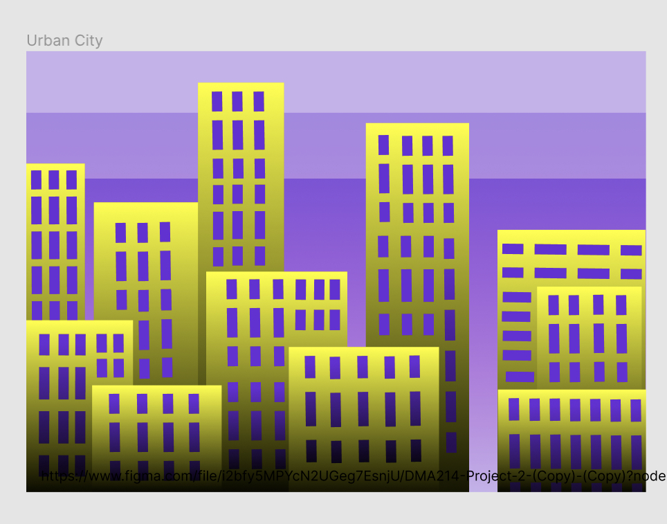
In my first picture, Urban sky, I used complimentary colors purple and yellow. I felt as though purple fit best for a night sky.
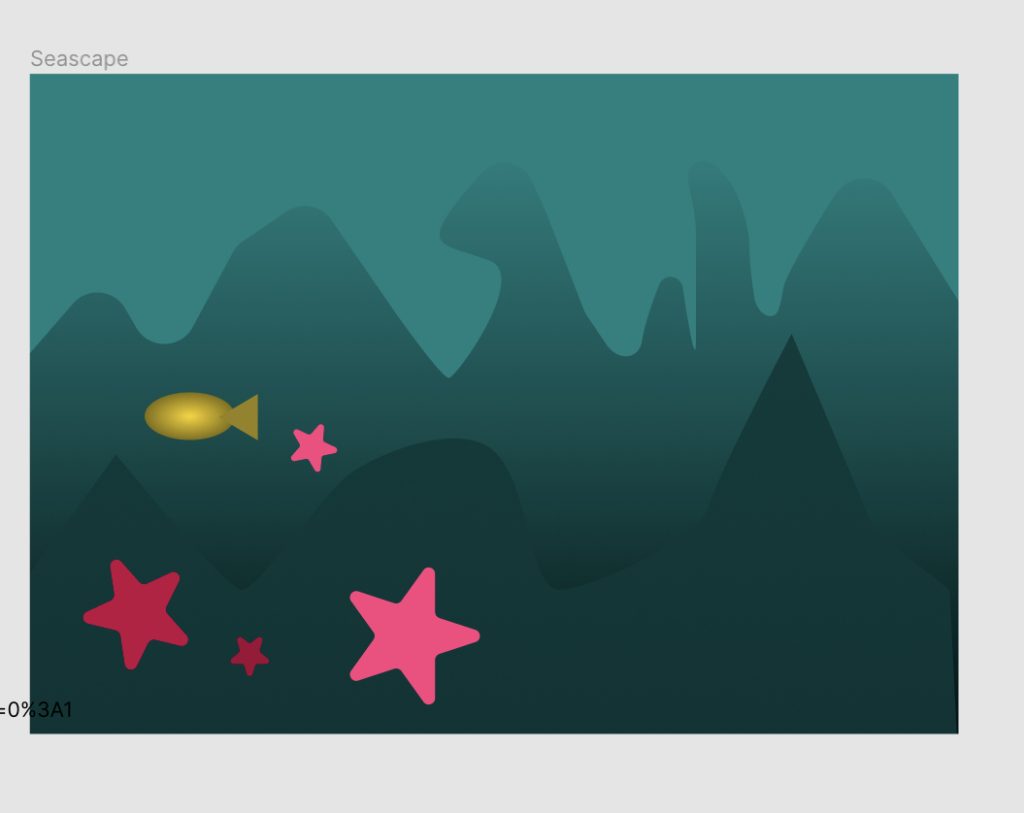
For my second picture, seascape, I wanted all of the creatures to be placed in one area so that is where the main focus is. I used triadic color theory to get a nice sea blue/green, but also add some bright colors for the sea creatures.
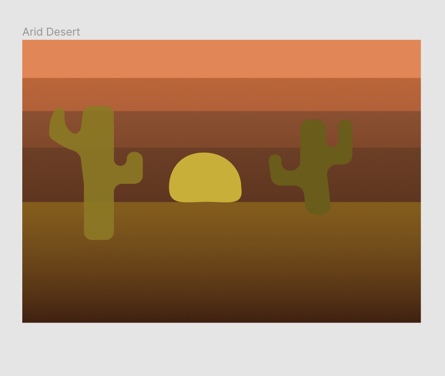
Arid desert: I used split complimentary color scheme, and the colors are kept warm to get the feeling of a sunset.
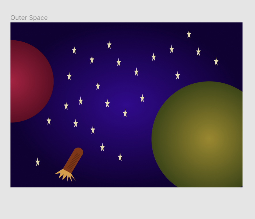
Outer Space: I used split complimentary color scheme, so I can have a basic blue background, with many vibrant colors to my advantage.
- What did you learn? I learned how to use different fills, such as radial and linear, and how to use the shapes to my advantage more. For example, I now know how to create a dotted line, which I used to create my windows in the urban setting
- What was easy? The easiest part for me was creating the general picture. For example, I had no trouble creating the sky and buildings for my urban picture, but the windows messed me up because they were not all angles correctly.
- What was challenging? A very challenging part to this project was getting detail in. I am still figuring out the basics, so I found it difficult to get very creative, and personalize my pictures more.
- How could your submission be improved? Adding more detail, personalizing each picture to my liking more.
- How could the professor improve the assignment for next class? No improvements, I like how you went into detail for each slide you did.
- How might you apply your knowledge in future assignments? I will use radial and linear fills more to my advantage for each shape, and adding more variety/detail to skies. (clouds, sun, birds).
- How did a specific reading or video help you? Watching the professor add his own detail into his work inspired me to be more creative with my work for our next project.