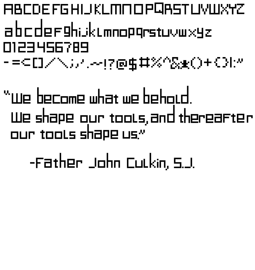
This is the font I created. It is a variation of monospace fonts.

1. What did you learn?
In this project I learned that sometimes less pixels is better for a font. Creating a font in a 16×16 grid can sometimes be more beneficial than a larger space.
2. What was easy?
The easiest part for me was coming up with what type of font I wanted to use. Mine is modeled after the font found on a barcode.
3. What was challenging?
The hard part was actually creating the font and distinguishing it in some ways to make it look unique.
4. How could your submission be improved?
I could improve my submission by maybe altering some of the sizes of the letters to make the lowercases smaller.
5. How could the professor improve the assignment for the next class?
I would just want a way to export my font from Figma to use it.
6. How might you apply your knowledge in future assignments or work scenarios?
Maybe not making a font, but understanding lettering is extremely important for web design.
7. How did a specific reading or video inspire or help you?
I was inspired by the Helvetica documentary we watched. I knew I wanted my font to be very different from it because it can be controversial apparently.