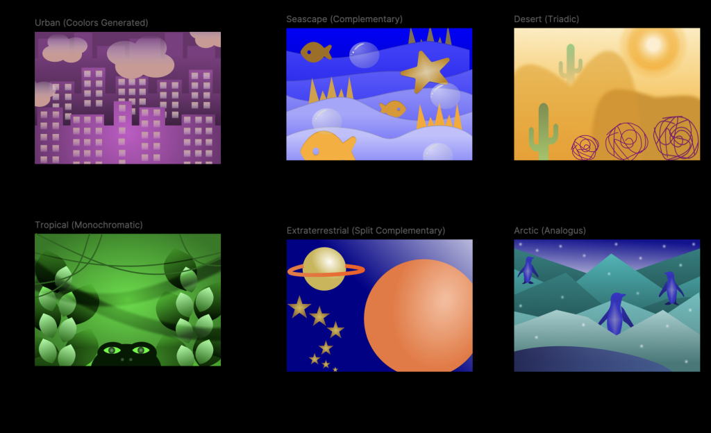
What did you learn? I learned so much doing this project. First, I learned there are many different ways we can categorize groups of colors. I knew some color schemes, like monochromatic or complementary – but it goes further than that. I learned triadic colors are evenly spread out on the color wheel. I chose to do triadic colors for my desert scene, using orange, green, and purple. There’s also analogous (colors next to each other on the wheel). I used analogous colors on my arctic scene with green-blue, blue, and blue-purple. In addition to color schemes, I was introduced to a new world of gradients on Figma. There are so many gradient options and a lot you can do to adjust them, whether it’s lower the opacity or change the distance.
What was easy? Once I learned how to use the gradient tool, I feel like I got the hang of using it to make certain elements of my designs look cool. I also think I am pretty good at using certain tools on Figma that I have used on past assignments.
What was challenging? I find myself often struggling with inspiration. Thinking of cool ideas for designs is one of the hardest parts for me. I also struggled a bit making the planet ring and cityscape windows.
How could your submission be improved? My least favorite of all my scenes is definitely the urban scene because I am not happy with the way the windows turned out. I attempted following along with the class recording Professor Dunkle provided where he showed how to make windows, but I could not figure it out. I ended up making windows my own way, but it was extremely tedious and still looks wrong. The alignment is off and it looks quite uneven. There are also small things in my other scenes that could be a bit more complex or intricate, but could not seem to figure out.
How could the professor improve the assignment for the next class? I think Professor Dunkle would make my assignment more daring or “bold” with certain elements. I have been told I should not be afraid to make elements big and/or out of frame, but I seem to make everything a straight size. I could also get more creative with the tear drop button under “fill” with all of the cool options (i.e, “darken” or “multiply”).
How might you apply your knowledge in future assignments or work scenarios? This assignment will make me more aware of gradients and be more mindful of it with future Figma assignments, or projects in general. I will be using the gradient tool now that I am aware of the depth of it.
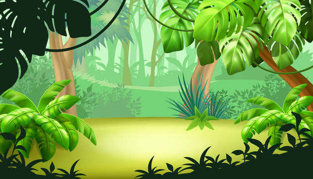
How did a specific reading or video inspire or help you? When I am struggling with inspiration, I look at past students’ work or go back and watch Professor Dunkle’s class recordings/tutorials. Those help me quite often. For this project, the last scene I had to begin was the tropical scene, and I only had the monochromatic color scheme left. I was struggling to come up with an idea, so I looked up “tropical cartoon scene” on Google Images and found a lot of designs like the one I attached below. After looking through them, I figured I could use the color green because it is almost exclusively used in the example image. I also added a crocodile head at the bottom, as they are a green animal.

My Final Project

An example of inspiration I found on Google