- What did you learn?
I learned how useful it is to have a colour pallet while working on different stamps as it helped to give the stamp a theme as well as narrow down one’s colour options to those select colours and their shades
- What was easy?
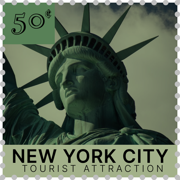
Coming up with the design for my tourist attraction stamp was easy for me as the Statue of Liberty is a staple within New York City and there were multiple good-quality photos to choose from.
- What was challenging?
It was challenging to figure out how to get the cent sign on my stamps
- How could your submission be improved?
I think my submission could be improved by having more variety in the layout of my words, with them at different angles.
5. How could the professor improve the assignment for the next class?
The professor could improve the assignment by allowing us to do one theme (sports of tourist attractions) and then have each stamp as that theme but at a different location in the world.
6. How might you apply your knowledge in future assignments or work scenarios?
I am going to use my knowledge of spacial awareness in regard to design particularly my rule of thirds in future assignments and work scenarios.
7. How did a specific reading or video inspire or help you?
Re-watching the zoom classes as well as the youtube videos which you included within the slideshows, as well as past stamps which I had seen inspired me in my work.
For my tourist attraction stamp, I used the Jacques Francois Shadow font along with Inter Semi Bold and Inter Light fonts. I chose those fonts because when I think of the Statue of Liberty I consider it to be a basic necessity that everyone must go see while in New York City.
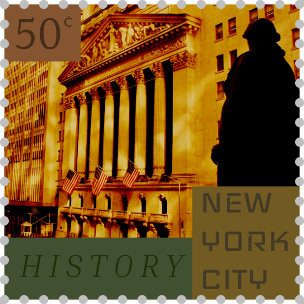
For my history stamp, I used Halant, Inria Serif, and Iceland fonts. I choose those fonts because I believe that all three of them are the type of fonts that one would see while looking at letters written in history.
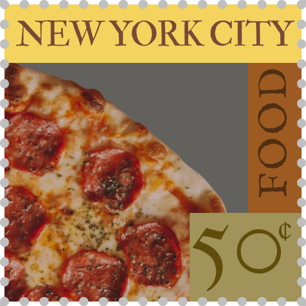
For my food stamp, I used IM FELL English SC, IM FELL French Canon, and IM FELLDouble Pica SC fonts. I chose those fonts because they all reminded me of fonts which would be used in a menu on the page which entails all the details about their pizzas.
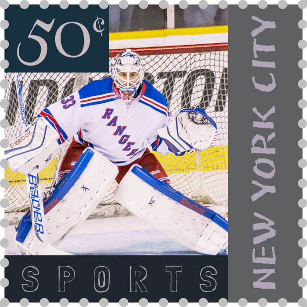
For my sports stamp, I used Londrina Sketch, JejuHallasan, and Henny Penny fonts. I chose those fonts because I believe that they display an array of emotion which is encountered at sporting events such as hockey game.