The Idea Behind SKALAMOOSH
Music consumes a major part of my life, and in some cases many of my acquaintances as well. In today’s world, it’s just as easy to flip open Spotify if you need something to listen to, rather than a TV or movie. Countless folks are plugged into headphones and air-pods as they’re out and about in their daily lives, refusing to leave the house without something to listen to… It thus inevitably leads to questions like “Have you heard this artist?” or “Hey, did you listen to this song?”. To which, in most cases, I respond no. Quite frankly my music taste and library is already huge, it seems pointless for me at times to venture out and discover new things. Finding myself hitting the ‘search’ button to look up anything else but a song I’m already familiar with is usually fairly uncommon.
So what if I didn’t have to rely on my own personal itch to discover new sounds?… And so, the idea behind SKALAMOOSH was born. The name has been taken from the popular Queen song “Bohemian Rhapsody”, a track which is known almost universally (hence why it was chosen). To further fit the name, given the band is called Queen, the color scheme was a main mix of royal purple/violet.
So what does SKALAMOOSH do? It essentially allows anyone to find new music at the tap of a button… You would create your playlists and the like just as normal. Once you’ve got a fairly decent library of pre-established tracks, SKALAMOOSH would then run through your library and determine a song which isn’t present (AKA, how SKALAMOOSH “checks” whether or not you’ve listened to a song) and play it automatically, based on your taste from your current library. There are also active recommendations that cycle through daily for the user, to give them even more choice on what new music they may want to listen to.
The FIGMA Prototype
The Whole Workspace(tm)
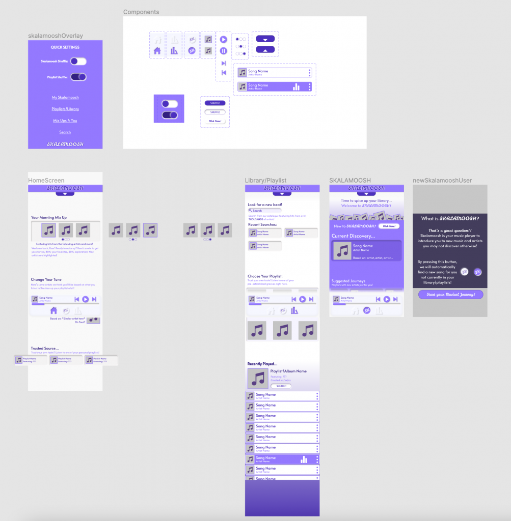
The Home Screen
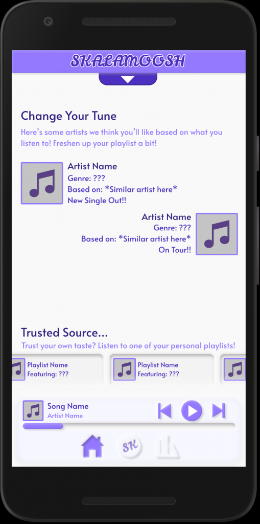
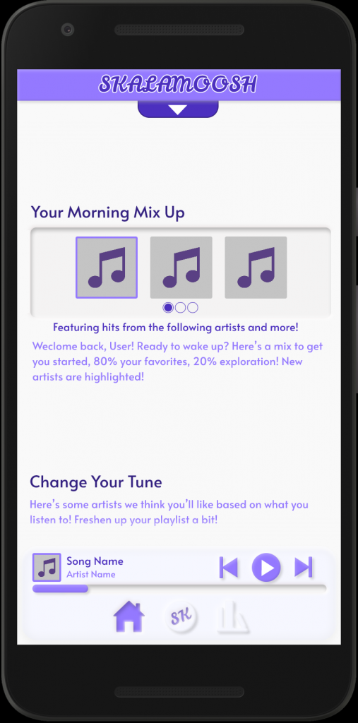
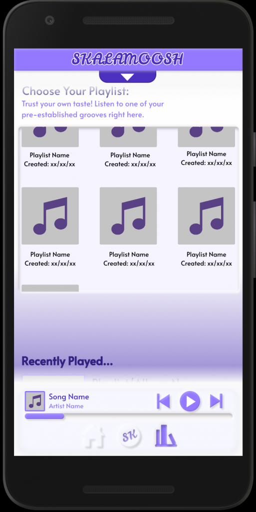
The first screenshot would be what a normal user would load into as their “Home” page. It starts off with a welcome from one of SKALAMOOSH’s prime features, creating a playlist with new tracks sprinkled throughout. Down below, you’ll notice more is hidden, indicating the use of a scroll down to see individual artists SKALAMOOSH has recommended, as well as recent playlists the user has created on a nifty horizontal scroll.
The neumorphic designs were fun to play around with on this project, after learning about them in our one lab, it completely changed the way I wanted to design SKALAMOOSH. A smooth interface with features seemingly blended in, which carries on throughout most of the other pages and interfaces throughout in some way.
Library/Playlists and Music Selection
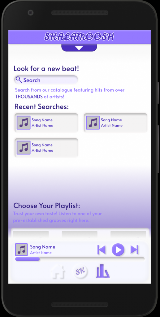
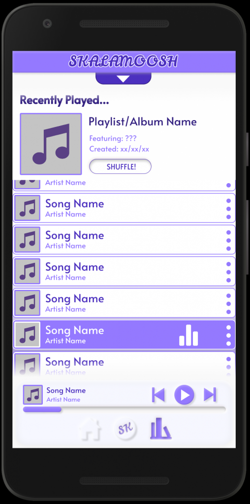
Next is where the user’s music library and playlists are located. At the bottom of this screen as well is also the music selector, which browses through the current playlist’s choices of songs, as well as shows you which song is currently playing with a purple highlight. There’s also the option to toggle a shuffle play, which will (obviously) shuffle the current playlist in a random order. The idea here is that when a user taps on a playlist, there would be code that would send them to this particular part of the screen in the library menu.
At the top of the screen is a search function, that allows the user to manually search for new songs just like any other streaming platform would. It also shows you recent searches, including the album cover that would be associated with those songs. The middle of the screen which the user can scroll to is their own selection of playlists. Gated off in its own window, the user can choose between their current selection of playlists, of which the view window will show six at a time, with a playlist cover (either pre-set by the user, or a mash-up of album covers featured in the playlist), playlist name, as well as the date the user created it. The Neumorphic design is used once again here in both the playlist window and the individual “recent searches” tabs, looking like they’ve been carved out of the background.
The SKALAMOOSH Screen and New User Pop-Up
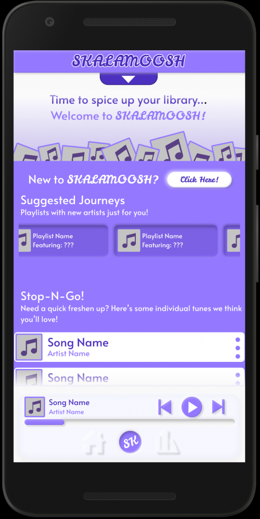
The SKALAMOOSH screen is where the user can really start to explore new music with ease. By clicking the button down in the music bar (more to come later), the user is taken directly to their SKALAMOOSH interface. Here, the immediate new song is displayed prominently, while below are suggested playlists featuring entirely new (or mostly new!) artists to the user, utilizing it’s own horizontal scroll. Further below that is a tab of individual songs for the user to choose from based on SKALAMOOSH’s recommendation, using a similar UI to the library from the previous screen to keep things consistent.
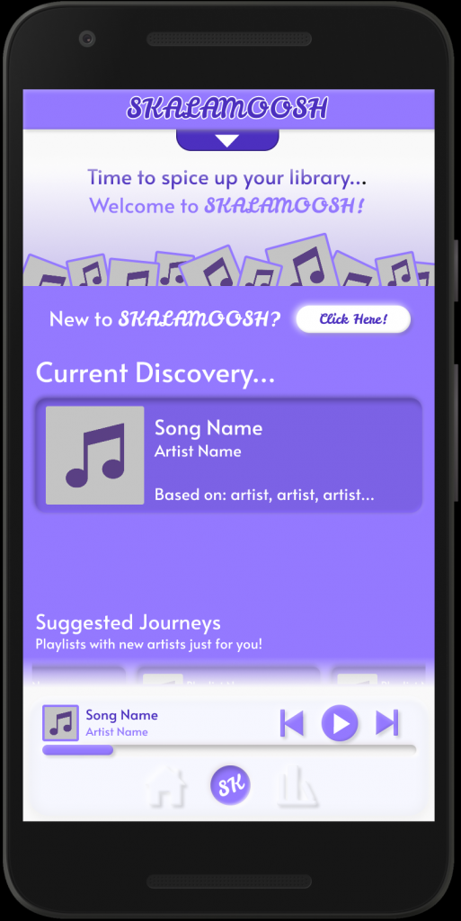
At the top however remains a button that the user can click to initiate what I believe is one of the neatest features I got to work in this prototype, which is a little helpful pop-up to explain what the SKALAMOOSH feature is!
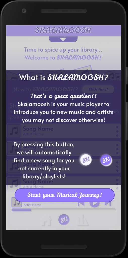
This overlay, appearing transparent enough to make the user realize they can click off this whenever they like, gives the user a brief run-down of the SKALAMOOSH feature. By clicking the button down below, the overlay will close, and the user will resume wherever they left off on the SKALAMOOSH screen previously. The button will always remain at the top, so if a user ever needs a reminder in case they haven’t used SKALAMOOSH in a while or just forget, they can give themself the reminder at any time!
Static Elements: Music Player and SKALAMOOSH Header
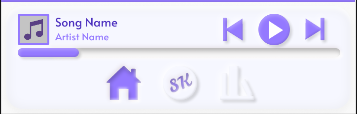
Throughout the app you may have noticed two elements in particular that have remained on every screen: The header bar and the music player. Above is the Music Player, which will always stay at the bottom of the user’s screen, giving them constant access to play and stop music regardless of where they are in the app. On it are your simple features, a play/pause button, a replay button, and a skip forward button. It also tells you the song and artist name, as well as a picture of the album (if there isn’t one, it will use the placeholder shown in the prototype!) the song is from. Below that is a playhead that shows how far the current track has progressed.
On the bottom is the navigation menu, which also indicates which screen the user is on. On it are buttons for the home screen, SKALAMOOSH screen and feature, and library screen- all designed with neumorphic elements in mind.
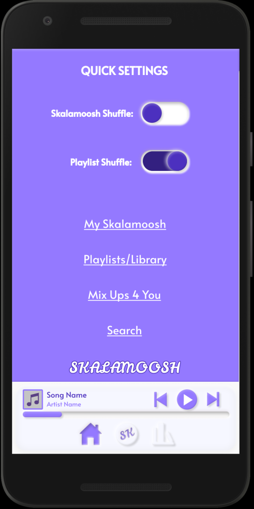
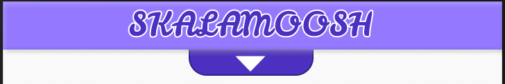
Here is the header bar for SKALAMOOSH that the user can see at all times. The arrow indicates the user can pull down the menu to indicate even more settings and areas to access certain parts of the app. This includes the SKALAMOOSH screen, the playlists section of your library, as well as the search section and even a section that takes you right to the suggested mix-ups on the home screen!
Up top are quick settings for the user to interact with, including a playlist toggle and a SKALAMOOSH toggle (by toggling this off, SKALAMOOSH won’t automatically interject new songs while playing).
Another small detail is the change of the SKALAMOOSH logo down on the bottom, which shifts it’s color palette over just as another indicator that the header bar is open. In FIGMA’s prototype, I could only close this overlay by tapping outside of it. However, the idea is the the arrow would change to an upwards one, indicating the user could scroll the settings back up to resume where they left off previously.
What I Learned, What I Could Improve
The key things I learned about mobile design were the intricacies of spacing and scrolling within said design. During our first W.I.P. discussion, my home page (which was the only page done at the time) had the necessary features, but had them all crammed together without the use of scrolling or spacing. By forcing myself to open up more space, I got more creative and crafted horizontal and vertical UIs within the screens themselves, which feels very neat and smooth in the prototype! I also learned a lot about neumorphic design, and how it can be used effectively to make a smooth looking app. As mentioned above, I’m also immensely proud of the pop-up screen I got to work, which definitely feels like something you would see in a well polished, popular app.
There are things I could add, as well as things I wanted to add but just didn’t have time to! I would’ve liked to have added a volume control somewhere on the music player on the bottom. I also would’ve liked to create an individual pop up menu for the ‘more’ buttons on the side of the track-displays, giving the user options to favorite or remove the song from their playlist, etc. I also would’ve liked to get a proper screen pop up that just showed what song was playing, but I also couldn’t quite get that designed in time. There are other small tweaks and changes, but for getting my feet wet with mobile design, working on a project like SKALAMOOSH was super fun and creative!