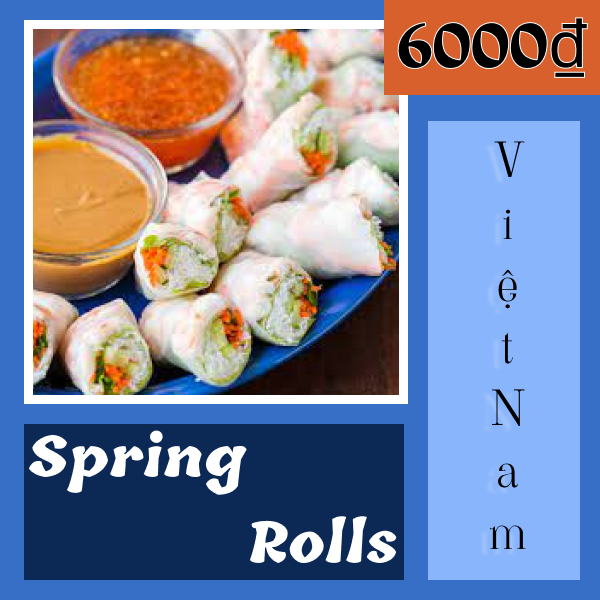
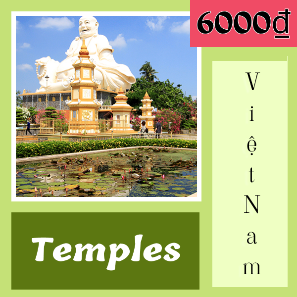
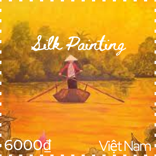
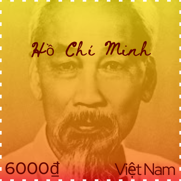
On each stamp the location, which is the country of Vietnam, and its’ currency called “đồng” (6000₫), are displayed.
- I learned about complimentary type faces and fonts in depth and furthered my understanding of the two. The easiest part of the project was finding the images that relate to the culture, the most challenging part was trying to find fonts that might go well together. My submission might be improved if I chose different colors for the fonts. I don’t think there is any need for the assignment itself to be improved upon anymore. I think this project will definitely help me be more conscious of making my font look better and more together on future projects. The “type in design” slides helped me because they detailed just exactly how type can look better by being mindful of things like alignment, spacing, and measure.
- In my first two type faces I tried to emphasize bold vs. thin font and I wanted it to look more modern, and in the second two I wanted to focus on a more classic style.