Lab 1: Acquiring Images
Unsplash and similar image:
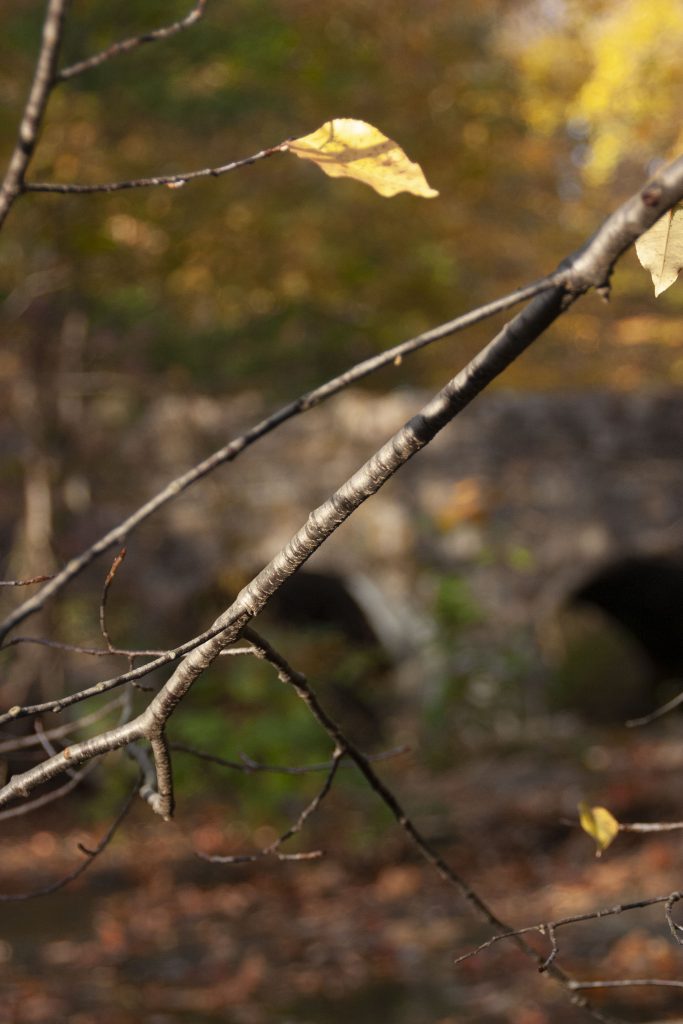
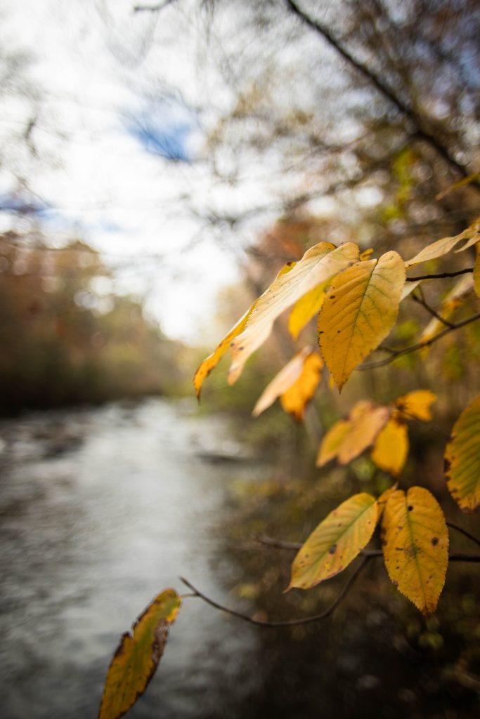
On the right is the photo I chose to down load from Unsplash and on the left is the photo that I personally took on my camera that I thought was similar to the one I downloaded from the stock website. For this photo, I actually took it back in 2017 when I was taking a photography course here at Canisius, so it was taken on a dslr camera as compared to the rest of my images for this lab which were taken on an iPhone camera. Comparing the two images I think it is quite apparent that they were both captured on a high quality camera as you can see the exaggerated depth of field blurring both backgrounds to focus on the subject, being the autumn leaves/branch. As for the photo from Unsplash, in my opinion I feel as though this image is better quality as overall the details when zoomed in to inspect, are much sharper and not as grainy. The colors as well in the image from Unsplash are a bit more vibrant, as compared to the photo I have taken which is slightly washed out, most likely due to improper exposure settings.
Original Drawing:
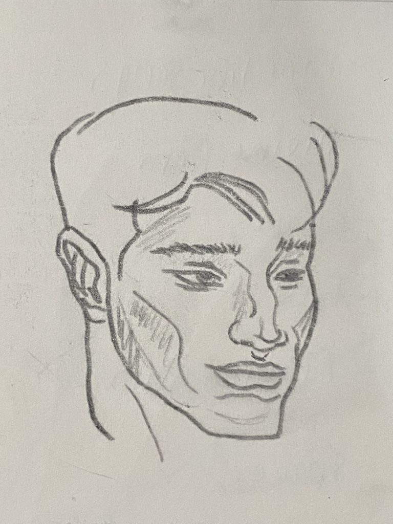
As stated in the instructions of this assignment, the last 3 items were to be photographed and then scanned as to compare the differences and quality between the two. As I do not have access to a scanner, the image that I captured of this original drawing on my iPhone camera is fairly detailed and crisp. One of the pros from this form of capture is that you can still see the details on the paper from the pencil smudges and scuffs around the drawing. If this drawing were scanned, these details from the paper would still be apparent and as I assume, more detailed. As for the pencil lines, I believe that if this were scanned, you would be able to see more details in the pencil strokes and the different shades of the pencil lines as well, as in the iPhone image they all look the same and do not have very many distinctions. To improve the quality of the image from this method, taking a still of this drawing with the correct exposure would dramatically increase the quality and details of the image.
3D Object
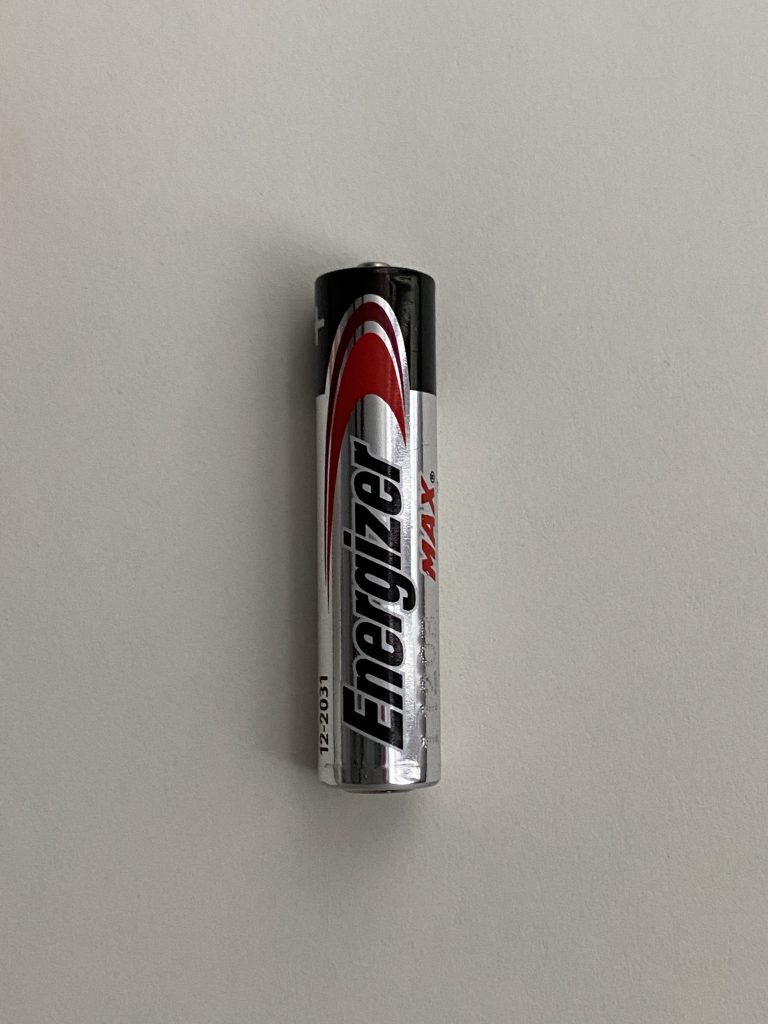
Taking a look at this image of this battery, again with the I phone camera there is still a lot of details apparent but as you zoom in the inspect the image they tend to blur and are not as sharp as you see from the full scale image. The further you zoom in the more pixelated the battery and the paper it is resting on look and starts to distort the details of the image. As stated in the previous image, if this were taken on a DSLR camera, you would not have as much of a problem when you zoom in the examine the details because the image would be of much higher quality.
Magazine Ad

Lastly, for this magazine ad it is slightly different from the rest as it is essentially a secondhand image. In the other images, we were photographing the subject directly and having a first hand source image, where as here we are capturing a copy of an image that was already printed from an original and distributed through a magazine. When zooming into this image there are much more pixels apparent as compared to the other images capture in this lab. Again, to get a higher quality image of this magazine ad, using a DSLR camera would drastically increase the quality.
Project 1
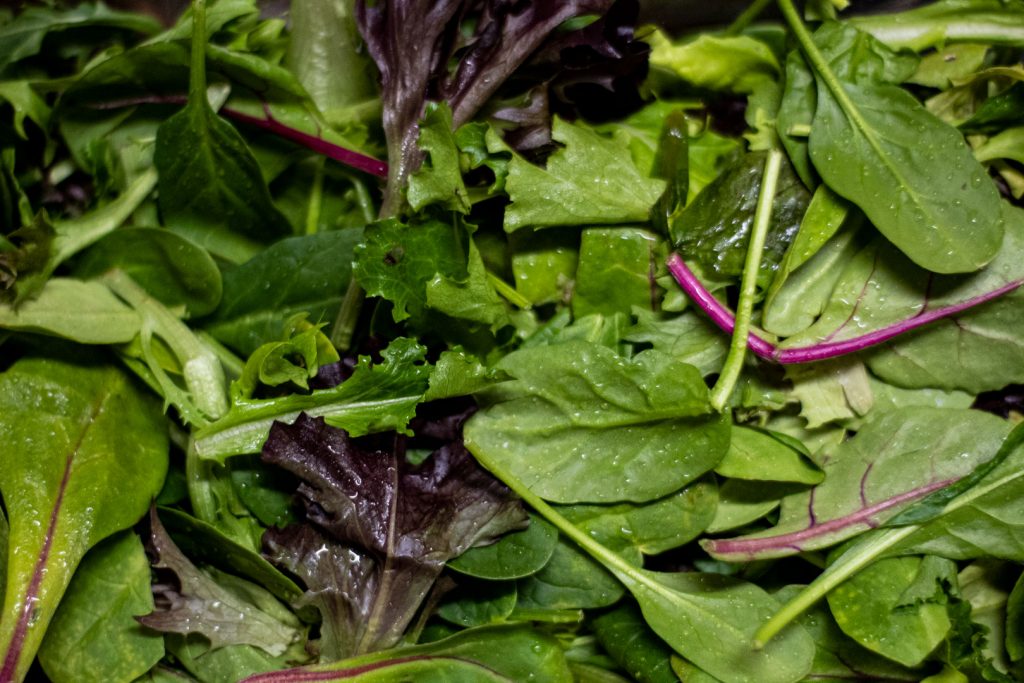
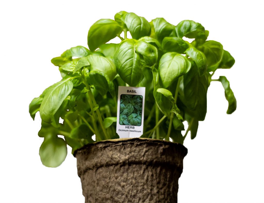
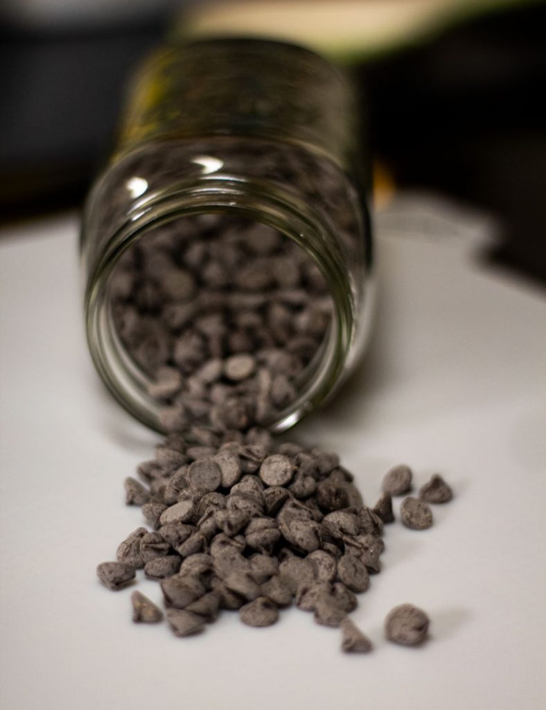
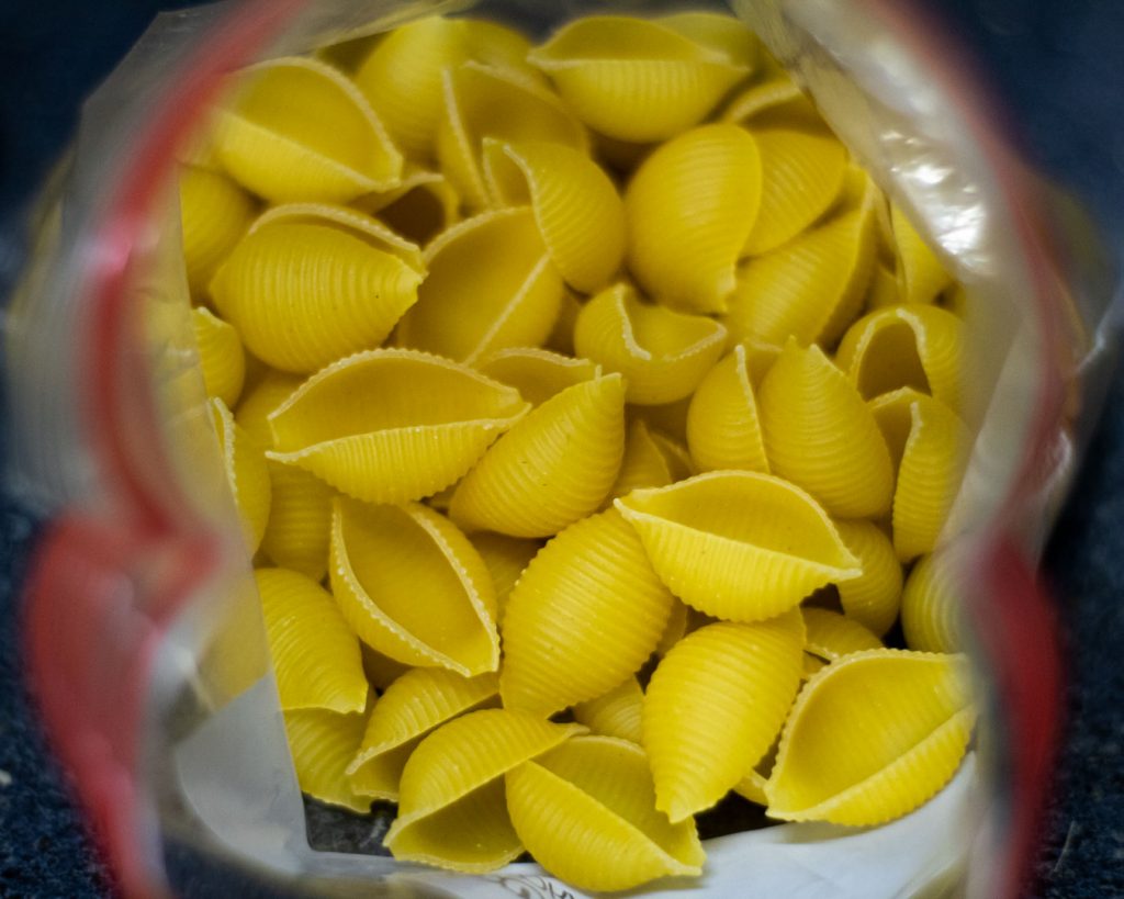
During this project I learned about composing an image to create a theme/portfolio of related images in order to portray a theme. I also learned about adjusting these images and editing them in photoshop in order to take them from not just basic images but more graphic design based pieces. I think the easiest part of this project for me was editing the pictures regarding the photographic aspects as I am very familiar with photoshop and photography using a DSLR camera. The most challenging part for me was finding a theme of images to capture to create a cohesive portfolio. This was very surprising for me because I had to keep in mind the subjects in the images had to be shot a certain way in order to for example of the basil plant, remove the background of the image without losing the main subject of the image. My submission could be improved by spending more time using more digital design editing techniques in photoshop besides basic editing and masking the image to remove specific parts. I do not believe there is anything for the professor to improve on regarding this project as it gives us knowledge on a variety of important design concepts using multiple platforms to create a portfolio. I may apply the knowledge gained from this project in the future if I decide to head more towards a career in graphic/digital design as there are elements taught that are the foundation to understanding 2D design.
