Project 1: Gestalt Principles
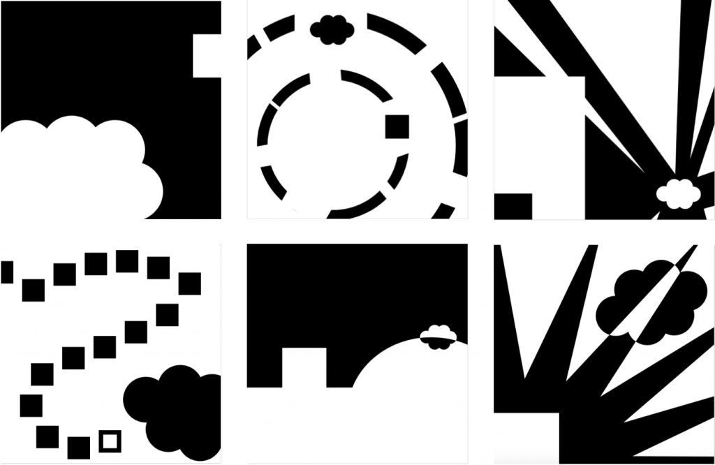
For this project I chose to portray the nursery rhyme, “Mary had a little lamb”. I chose to keep the two important characters, Mary and her little lamb, consistent through my art boards to make the story a little easier to follow. I also tried to make this more cohesive with the contrast in each board, switching between the heavy use of black and white to create a little more dynamic.
- This first board is very simple but uses shape, position and scale to establish the characters in the beginning of this story.
- For this board, the rhyme portrayed is as follows “And everywhere that Mary went, the lamb was sure to go”. For this principle I used shape again but more emphasis on continuation to portray movement.
- I established this frame using scale, position and shape, to draw your eyes to the “lamb” and also “Mary” in this scene.
- In this board, it is portrayed the children playing when they see the lamb at school. This is established through continuation, repetition and shape to create contrast and movement throughout the board.
- This board is meant to portray the line “And so the teacher turned it out, but still it lingered near”. I found this line to be particularly difficult to portray, so I chose to use shape and position in the frame to keep the gestalt principles in use.
- As for the last line in this nursery rhyme, “And waited patiently about,
till Mary did appear”, I used contrast, shape and position to portray Mary and her lamb being reunited once again.
I found this project to be very challenging in the aspect of only being able to use primitive shapes as well as trying to tie in different principles in each board. This on the other hand, did allow me to think outside the box and get really creative and interpretive with a seemingly simple nursery rhyme and turn it into almost a form of modern art/graphic design.
Project 2: Color
Analogous
Triadic
Split Complementary
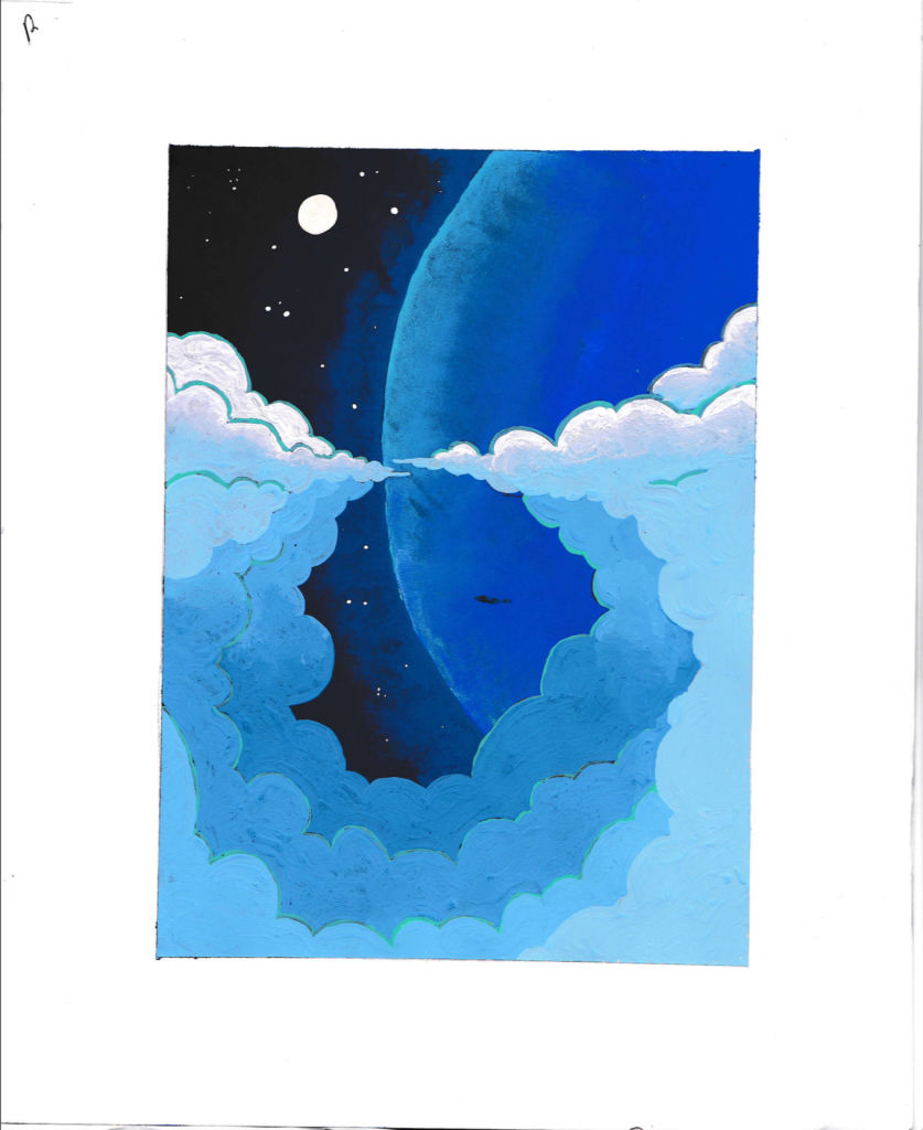
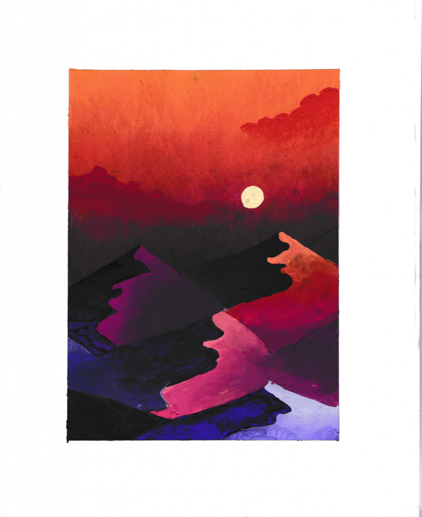
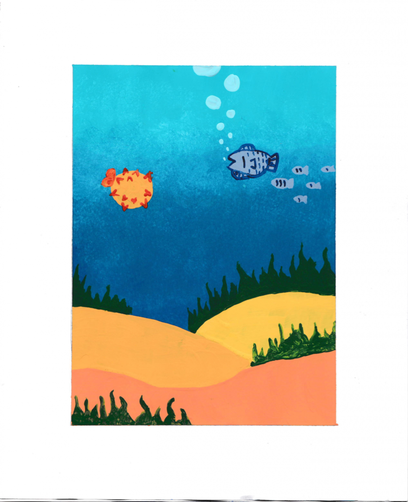
For this project, instead of taking the digital route I thought it would be exciting to hand paint my images instead. This in my opinion, was a much easier process to utilize color, which was the main goal of this assignment.
For my first piece, I chose to portray my galactic scene in a monochromatic scheme. This seems to be the most fitting for this theme as I wanted to stick with the shades of blue in different contrasts to capture that ere feel in space with the clouds parting in the foreground to let the monstrous planet behind them peak through.
My second image is the desert scene, portrayed in an analogous theme. When considering desert scenes, I immediately gravitate towards warmer colors as do many artist, but I wanted to utilize different contrasts to play with light in the scene on the sand dunes in the foreground. The sky in this scene is especially my favorite for the hazy heat stricken clouds above the mounds below.
Next up, the aquatic scene, depicted in a triadic color scheme. This one was a bit more challenging as I am not the best at drawing/painting animal life but I stuck with the basic elements of marine life and utilized different lighting to create more depth. Choosing the main color blue for the water, it worked out fairly well with the complementing colors being green and orange for the marine life.
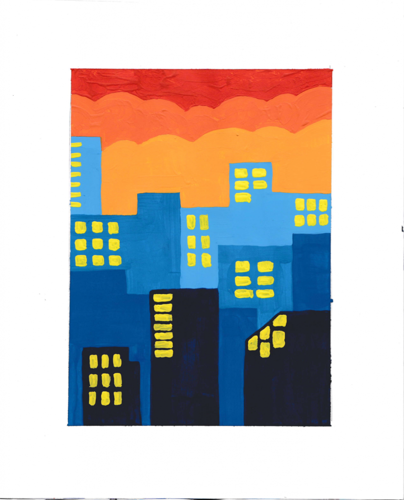
Lastly, my urban scene is painted in a split complementary theme using blues, oranges and yellows. I chose to go for a more stacked and hazy mood to the city as that’s what comes to my mind first when thinking of big cities. Along with the prior scenes I used different contrasts to created more depth in the scene.
Project 3: Image Metaphor
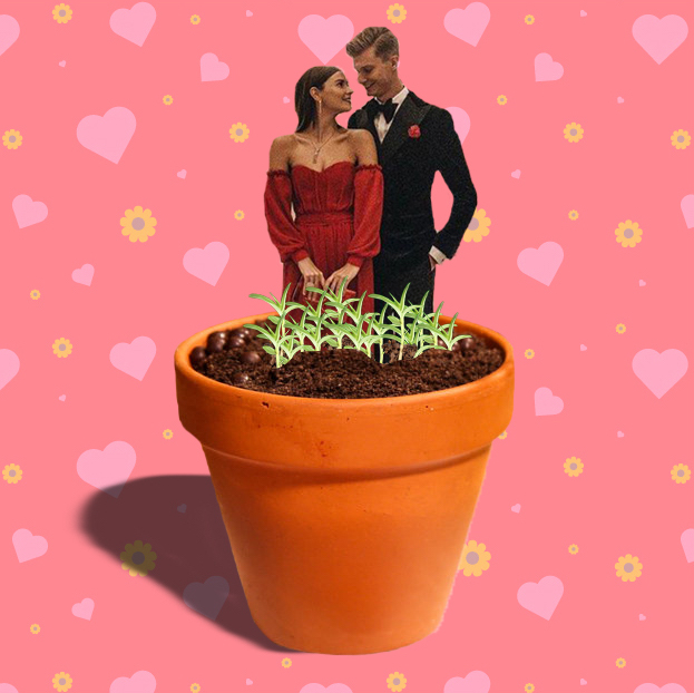
For this project I chose the metaphor, the seedlings of love. I wanted to begin with the idea that love and relationships are like fragile plants. To cultivate something healthy and rewarding it takes a lot of work and attention along the way which isn’t always so easy. Following this concept I wanted to start with the image of a potted plant and have the second image symbolizing love growing from the pot. This pot also is symbolic of a fragile house plant, further reinforcing my previous concept. Instead of hearts I chose to portray a happy couple growing from the pot along with their new roots to show it is still a work in process. As for my pattern in the background I wanted to keep the colors somewhat muted as to not over power the main images. I also chose to utilize both themes being flower/plants and hearts for love to keep everything in this work cohesive.
Projects 4: Typography
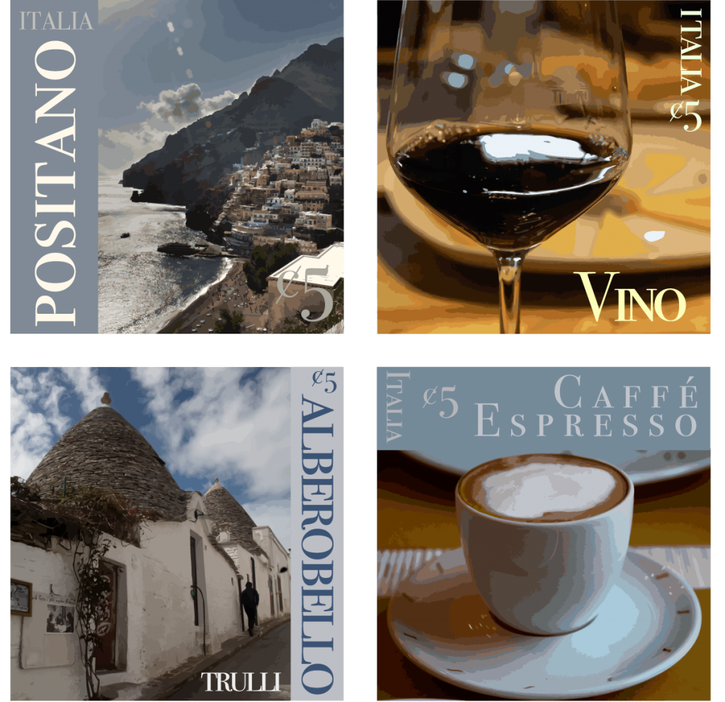
For this project I had to choose Italy as my country not only for my love for their culture but in 2018 I took Tom Wolf’s travel photography class where we travelled through Italy. I couldn’t pass up this opportunity to use some of my images and I had the perfect selection for that portraying industry, food, history and locations. As for the design of my stamps I used the type face Bodoni 72 Smallcaps Book because it looks very elegant and fitting to portray Italian culture in my work. As for color scheme I tried to do more limited monochrome colors for the image traces but I washed out a large majority of the detail of the images no matter how much I played with it which I did not love. For the location stamp, I chose a picture from Positano, Italy which is a beautiful oceanside town along the Amalfi coast. The architecture and stacked houses along the steep incline of the landscape makes for a beautiful photo of the essence of Italy against the contrast of the sparkling sea being so close. As for my second stamp I chose a photo of the wine of Italy which is one of their many leading industries of the country. For food, although it may be a little biased, I chose an image of a cup of espresso, personally my favorite beverage in the world. Lastly for history I chose the beautiful little town of Alberobello. This town is known for its 18th century trulli houses which are whitewashed stone huts with conical roofs.