Final Design for instruction illustration
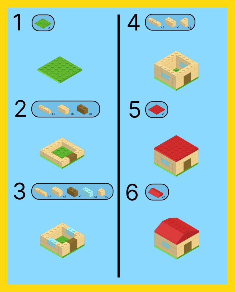
Final Design for instruction illustration

DMA 395 Digital illistration
Create By Coraline Coffey
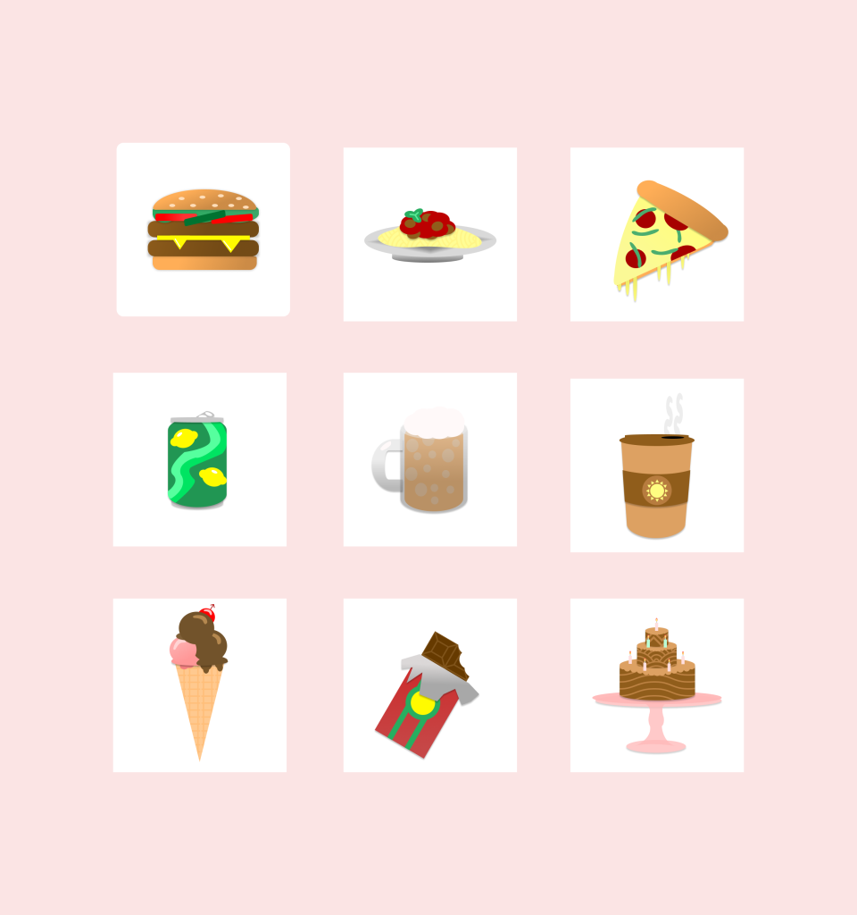
Final Design Series Food
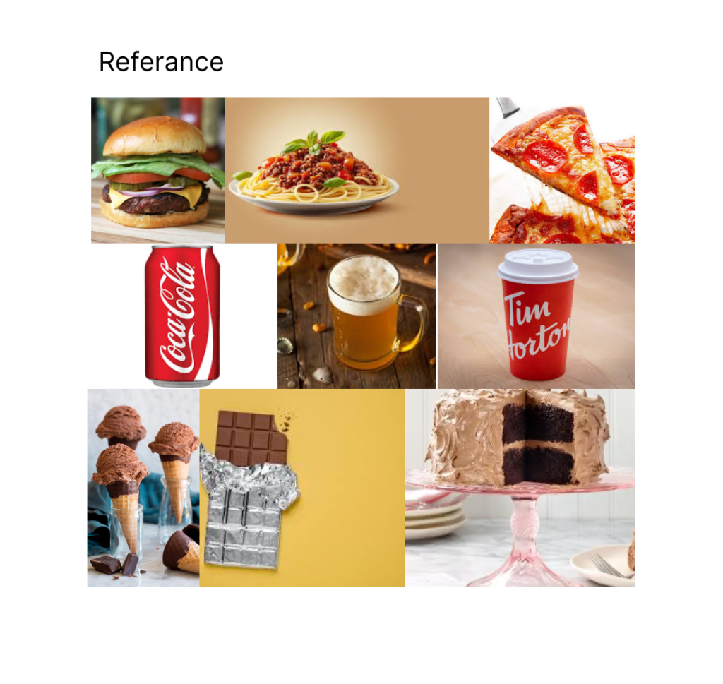
Referance images
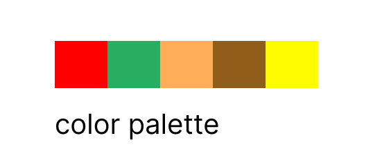
Color Palette
DMA 395 digital illustration
Create By Coraline Coffey
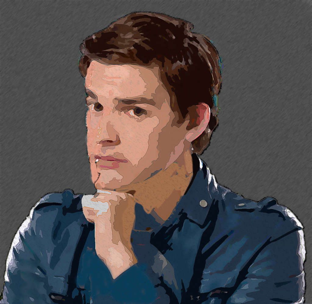
Part 1 Photoshop Portrait
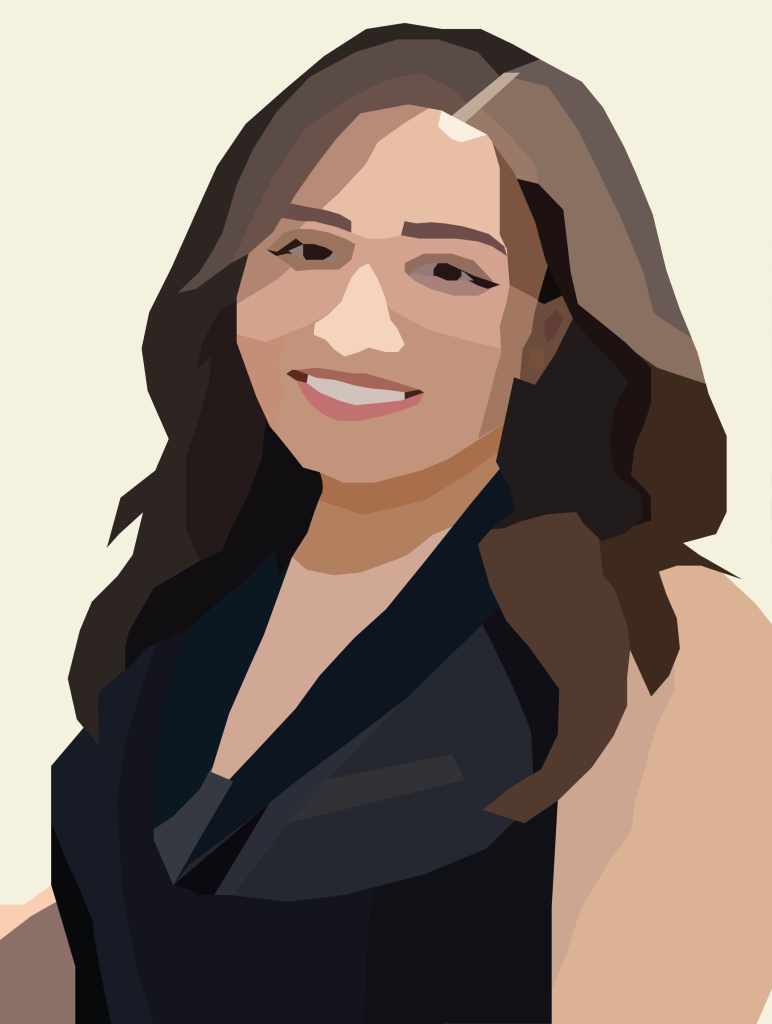
Part 2 Illustrator Portrait
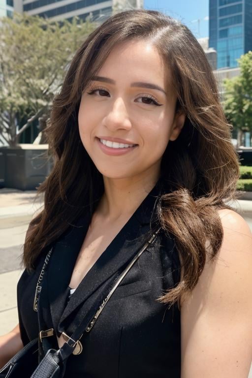
Images sources
Matthew Patrick (Matt Patt)

Imane Anys (Pokimane)
Final Design
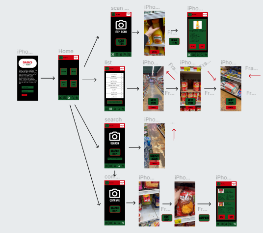
Wireframe
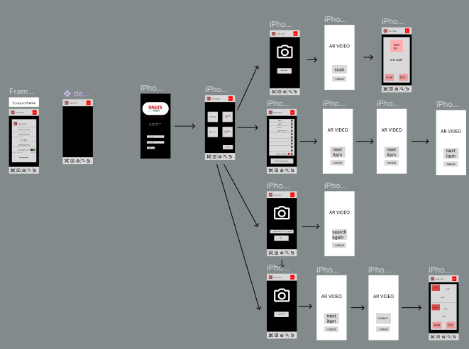
Flowchart

How to implement videos into Figma and how to use them.
Creating an idea and design for my final project.
Figure out how to get the AR elements of the project to work with the limitations of Figma.
My AR videos could have a lot more added to it if made outside of Figma.
Spend more time learning tools to make AR stuff.
In my future assignment I can incorporate videos into my work.
Stamp Project By Coraline Coffey
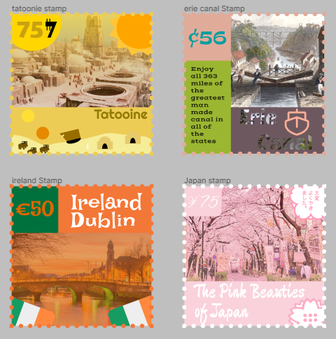
How to implement all the concepts we learned and used them together in multiple designs.
Finding ideas for my stamps and implement the concepts from class.
Nothing was too difficult for this project
A bit more designs on some of my stamps.
Doesn’t need any change.
I’ll for sure be incorporating these concepts into my other projects because they give my the rules and balance that gives the work a processional look.
Typography
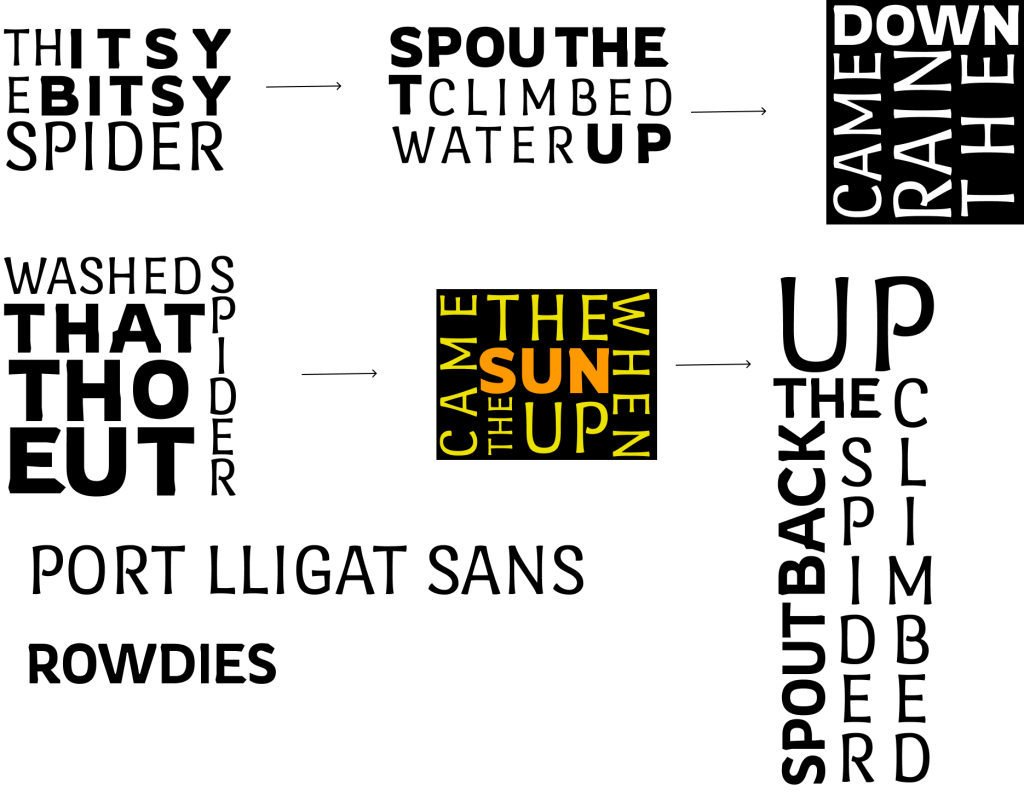
Sketch
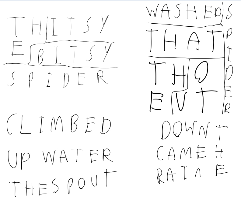
How to edit and customized text in Figma and learn what tools that Figma gives me to create better looking text designs.
Picking the font that I wanted to use.
Wasn’t very interested in the project which made it a bit harder to come up with and create an idea.
I could have been a lot more creative in my design if this kind of art was more interesting to me.
Doesn’t need any change.
I’ll would be incorporating some Typography skills into my future designs.
Final Design
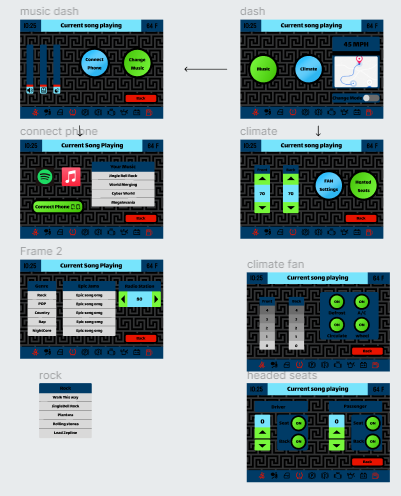
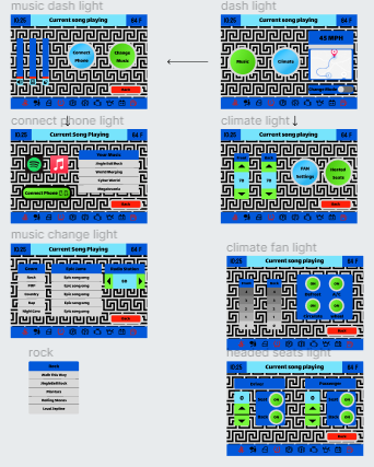
Wire Frames
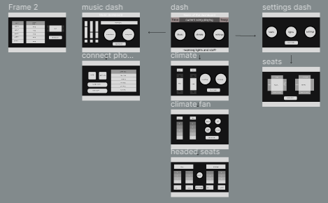
How to make a sliding bar interactions and create styles and variables. I also learned had to use the component coding in Figma.
Using components in Figma because I already have experience with coding.
Setting up Dark Mode was probably the hardest part of this assignment.
Being able to switch to light and dark mode will in the presenting mode.
More time with going over how to set up light in dark mode.
In my future assignment I can add the features, interactions, and components that I learned how to make and apply them to future design projects’.
Final Design
“Media controls the world”
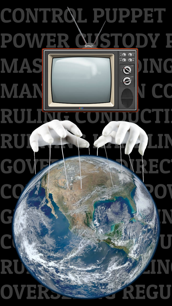
Sketch
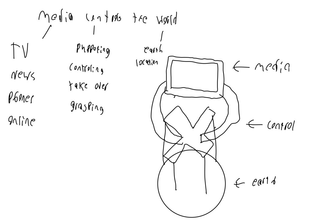
How to combined and merge photos in photoshop and make patterns in Figma.
Making a pattern in Figma and combining images in photoshop.
Coming up with a idea for my project and finding words in my metaphors that I can use to make a design.
Add more effects to my final design.
No improvements need to be made.
I’ll definitely will be using photoshop whenever I’m working with multiple images that need to be combined.
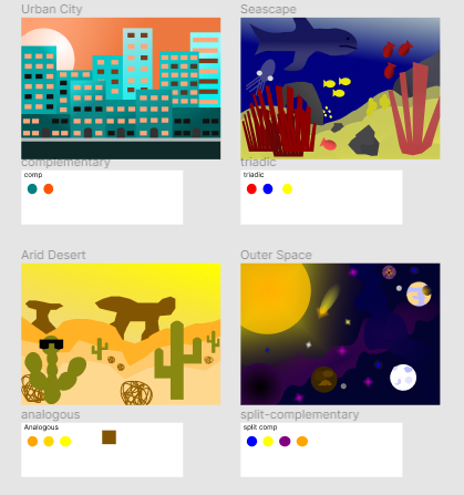
How to incorporate 4 different color palettes into there own design.
I found creating the designs with analogues, split-comp and triadic to be the easiest color palettes to work with in there respected scenery.
Creating a city design using a complementary color palette was quite difficult due to the lack of different colors I had at my disposal.
I could have used more gradients in my designs.
I wish we spent a little more time going over color theory in class rather then reading the articles online.
I’ll create my future color palettes using the color rules and palettes that were used during this project and incorporate them into my future works.
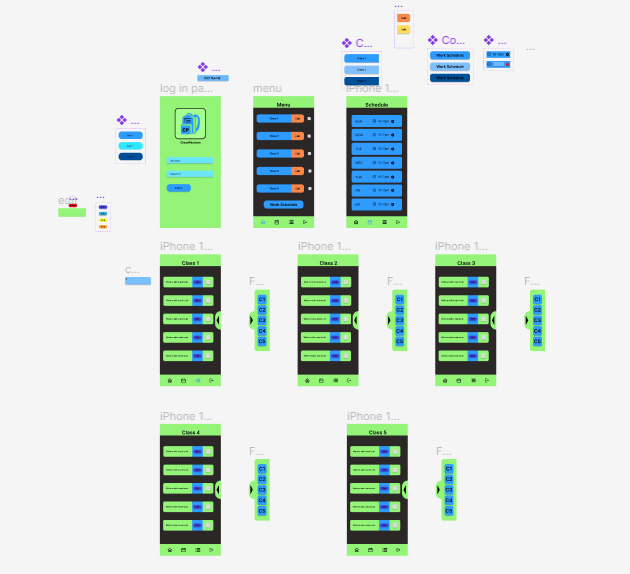
I learned how to create interactions in Figma for example creating a slide in menu that allows you to change frames that can be pulled in and out of the frame your currently on. I learned how to create pop ups in incorporate them as features in my design.
Brain storming an idea and coming up with my design was the easiest part of the project. once i had a rough idea i wanted to create the over design came to me with ease.
The challenging part to this assignment was creating all the pop ups and features in Figma like my slide in menu and fake edit text button because it wasn’t something i have previously done in my other classes or pass assignment so it was all new to me.
When designing my app I should have thought about what features i want in my design before i start working on my final design for the project.
In my opinion nothing needs to be changed or added for this assignment to be improved for the next class.
In my future assignment I can add the features and interactions that i learned how to make and apply them to future design projects’.
Iconify helped a lot with finding icons for my app.