What did I learn?
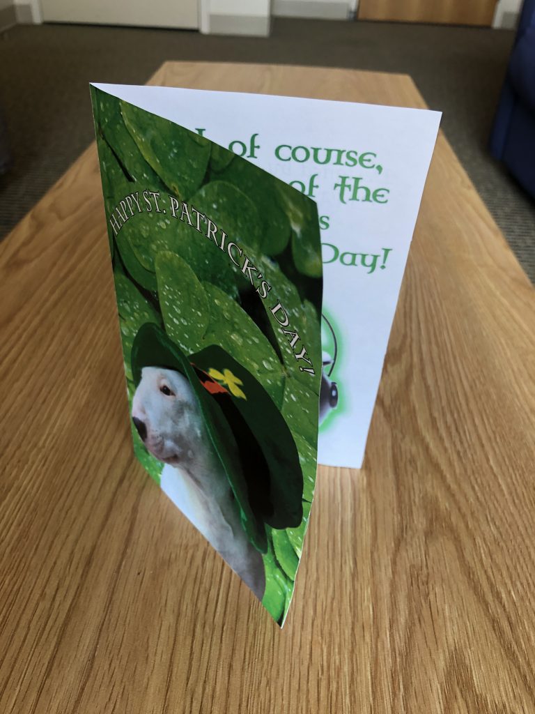
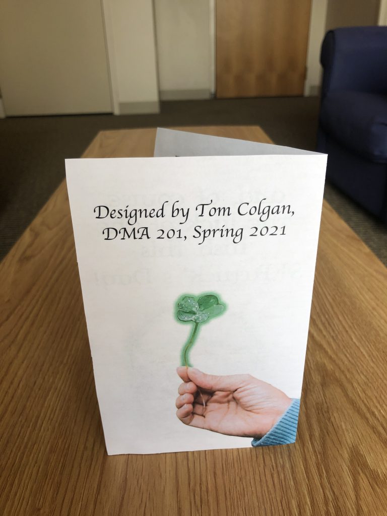
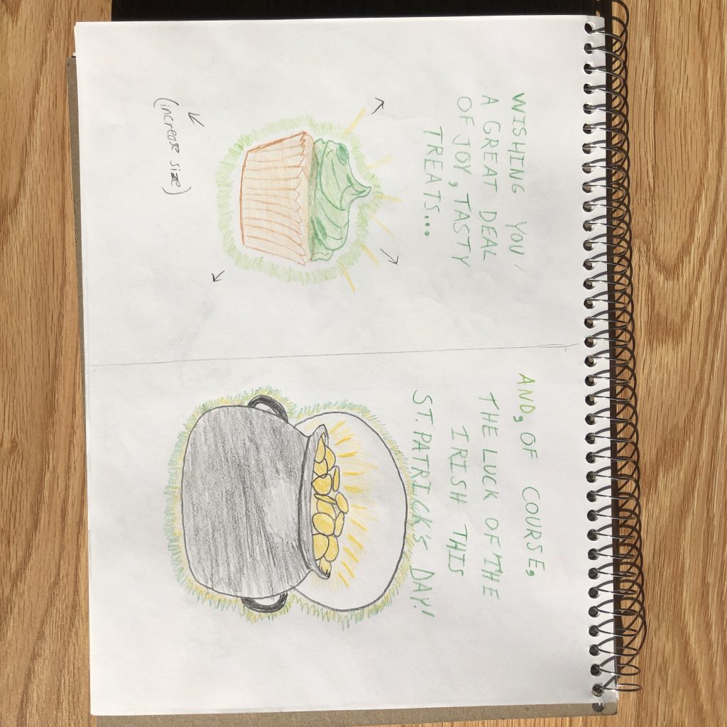
During this project, I learned how to remove an outer glow from only a portion of a foreground image rather than having to remove art from the whole image. From previous labs, I also learned how to Properly format the PDF file of my work for printing. When I printed it the first time, the back side was upside down, so I had to make sure “flip along short edge” was selected before printing it again.
What was easy?
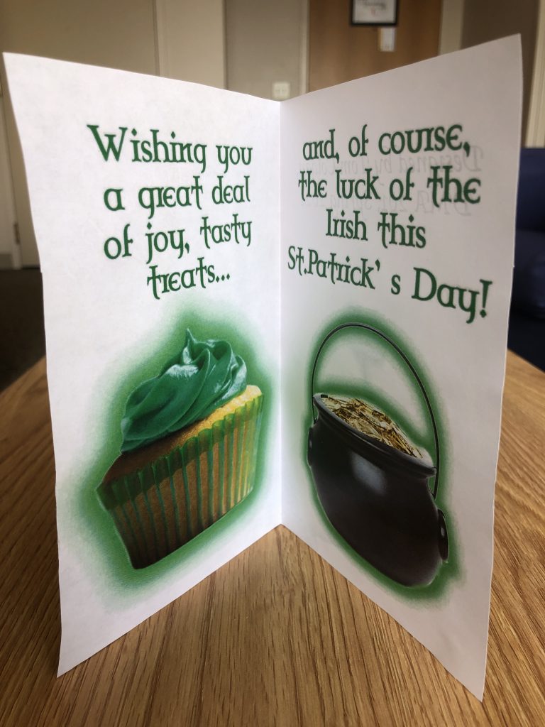
I think the easiest part of the project was dividing each artboard into equal halves as well as removing the background from images that were used in my card’s foreground.
What was challenging?
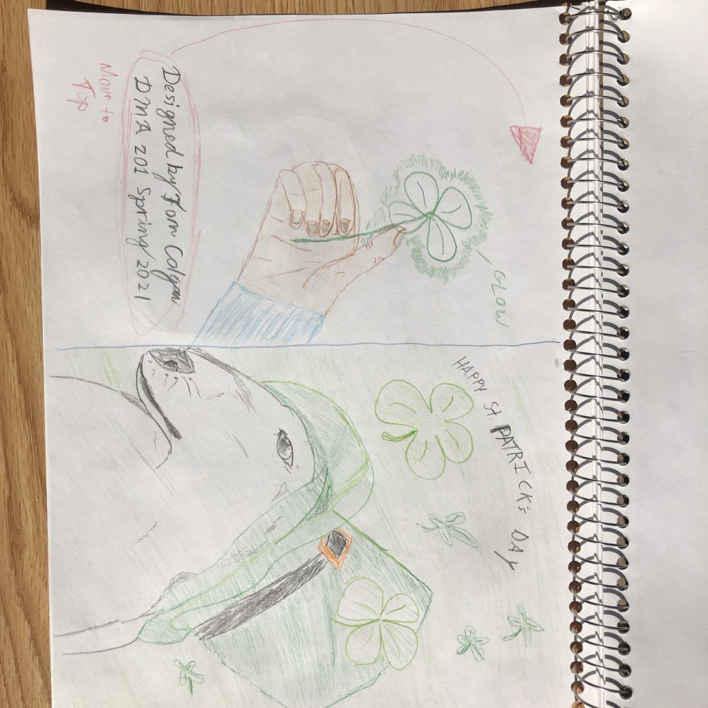
As previously stated, I thought that removing an outer glow effect from only a small portion of an image was difficult, but that is mainly due to the fact that I have never used photoshop prior to taking this course. Professor Dunkle helped me through this process and explained that I could duplicate the layer, disable the effect on one, and use the brush tool to remove the effect from a particular area.
How could your submission be improved?
I feel like I could have improved my submission by having more fun with the colors, effects, and design features within photoshop. I definitely like I could’ve made the images on the inside of the card pop a bit more in some way.
How could the professor improve the assignment for the next class?
I think everything went very smoothly for this assignment, so I don’t think many things need to be changed. It was nice to see that there were tutorials for both Gimp and PhotoShop posted on D2L, and these were very helpful.
How might you apply your knowledge in future assignments or work scenarios?
I do not plan on going into a digital media arts background, but I can definitely see myself using the knowledge from this project to make cards for friends and family. I also feel that I have a good grasp on most of the concepts within this project, so I will be better at using layer masks, effects, and removing backgrounds from images.
How did a specific reading or video inspire or help you?
For this Project, I referenced “7 Beginner Mistakes to Avoid When Designing for Print,” which reminded me to leave a larger margin around the design area so I could trim the excess white paper and have a clean print to the edge of the trimmed card. If I had printed at 100% scale, the ink would not reach the edges, and some of my work might have been cut off, so I decided to scale mine to 90%, which left enough room for my design to be printed completely.
