Crafting Landscapes with Color Schemes
By Kayla Gajewski
The World of Color
In the realm of design, color is a versatile tool that transcends aesthetics. It has the power to evoke emotions, set moods, and bring life to my creations. My recent project delved deep into the intricate world of color, teaching me invaluable lessons about the role it plays in design.
My artistic journey began with the task of creating four distinct landscapes, each representing a unique environment. These landscapes were my canvas, and I had the responsibility of bringing them to life through the careful selection of color.
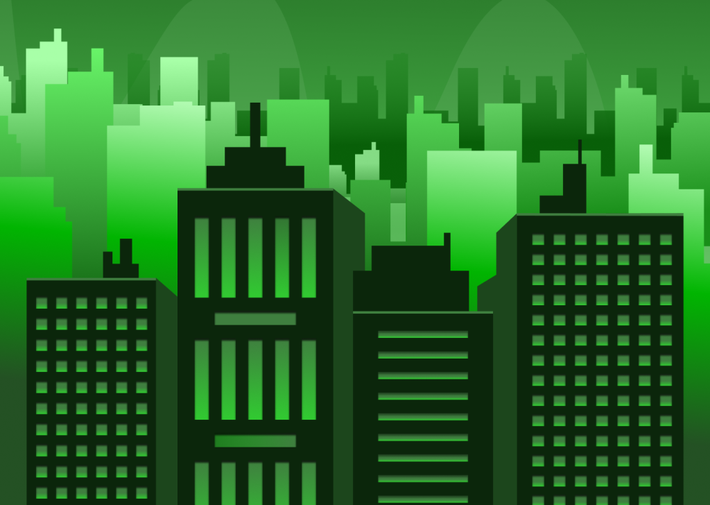
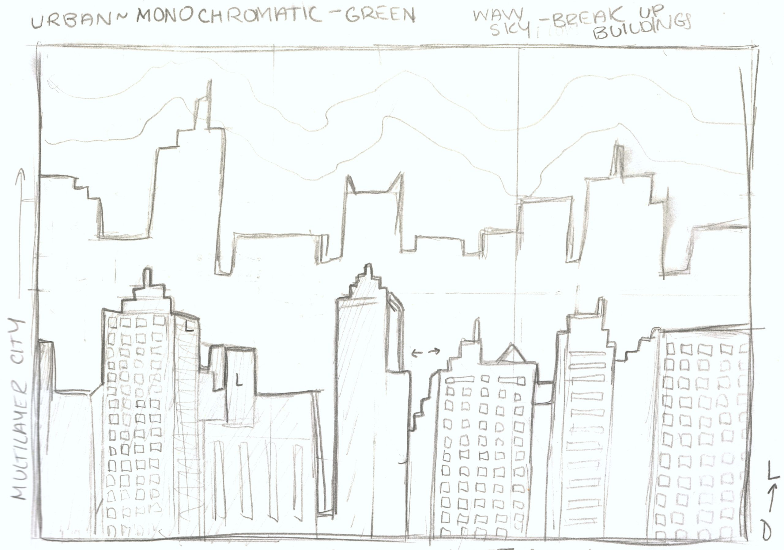
Urban – Monochromatic Green
For my Urban landscape, I chose to immerse myself in a monochromatic world dominated by shades of green. Green, representing life and vitality, helped me capture the essence of a bustling city while harmonizing with the color found in natural surroundings.
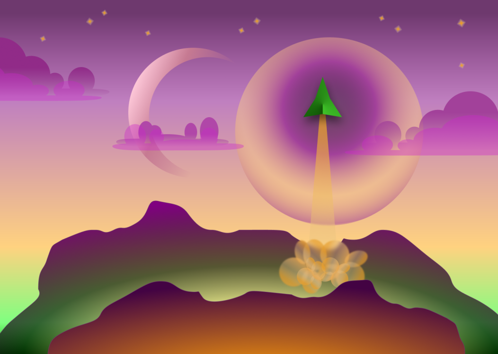
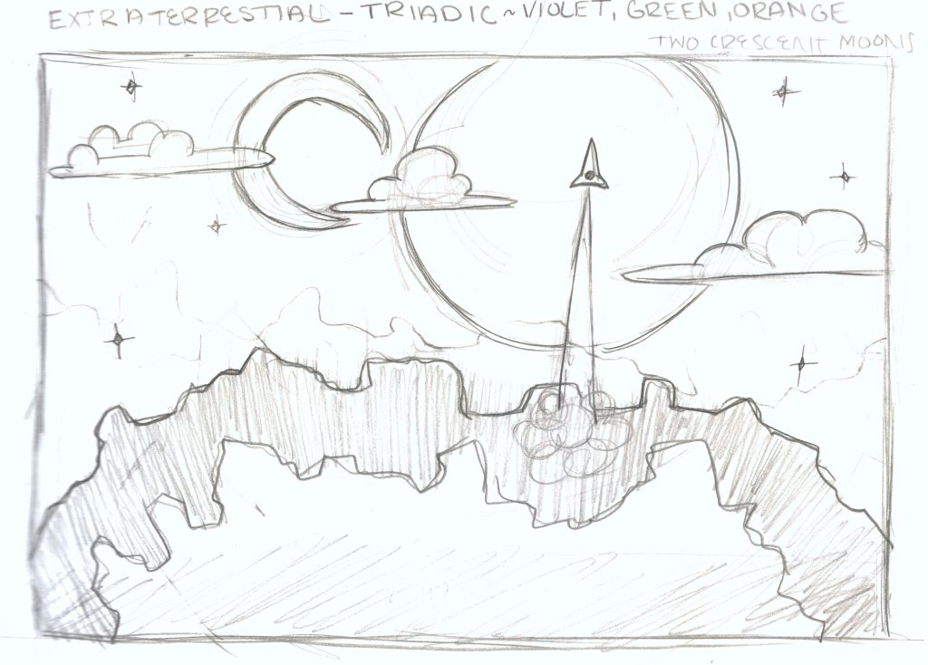
Extraterrestrial – Triadic (Violet, Green, Orange)
In my quest to create an extraterrestrial world, I explored the world of triadic color schemes, where violet, green, and orange came together in perfect harmony. These vibrant colors transported me to an alien realm, defying the conventions of earthly palettes and sparking my imagination.
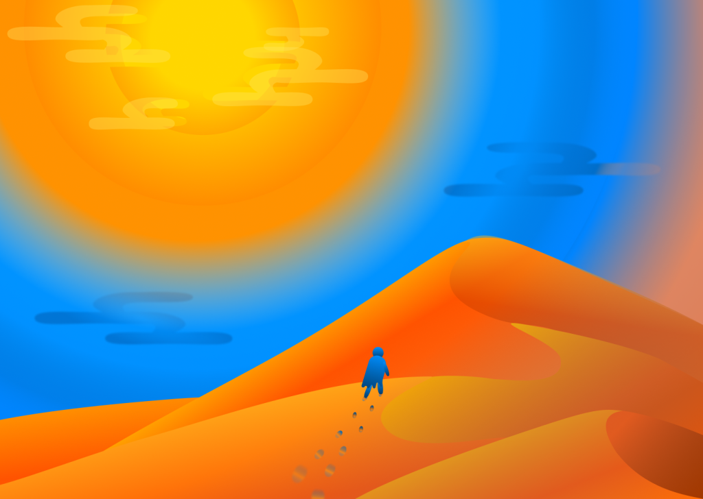
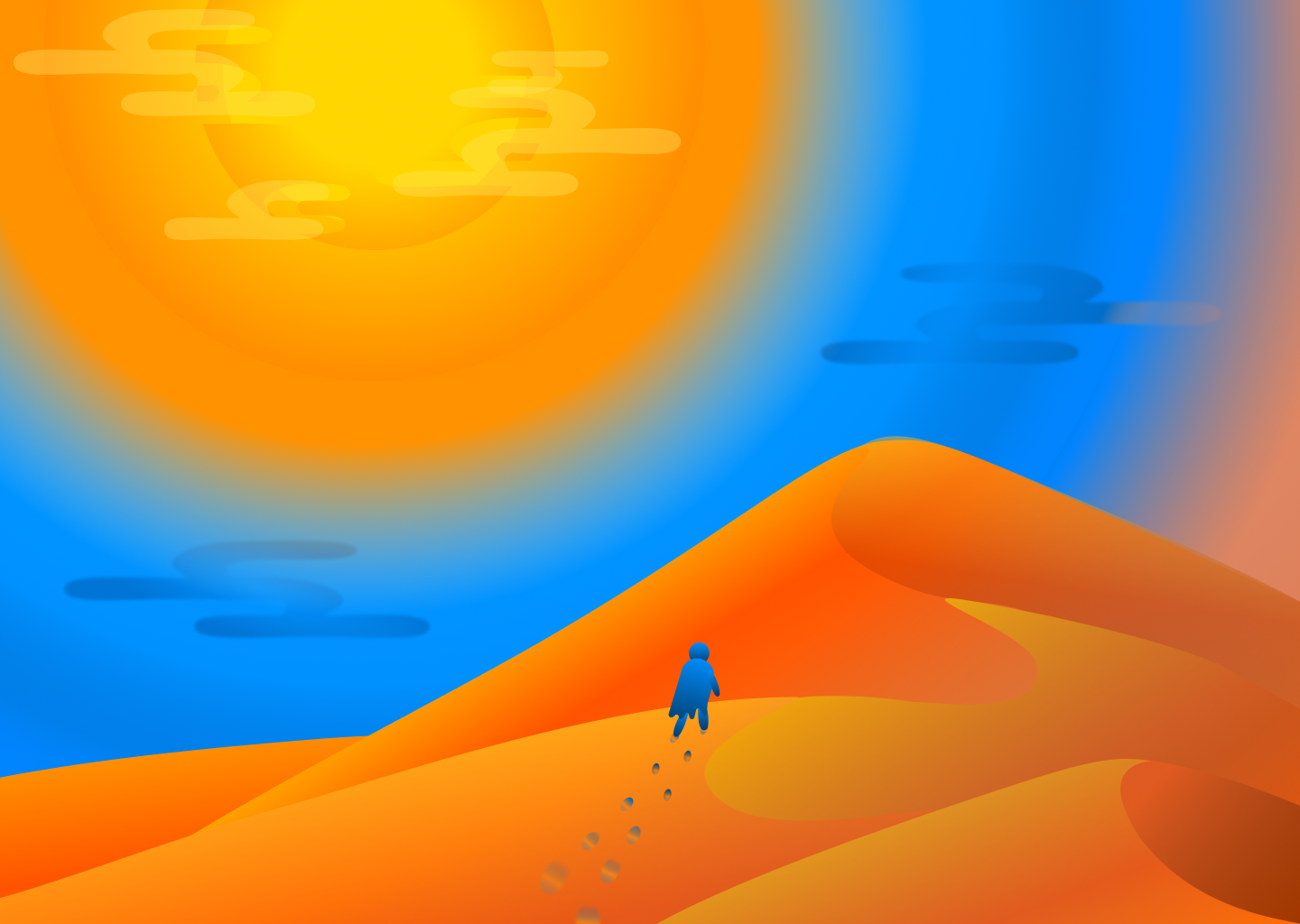
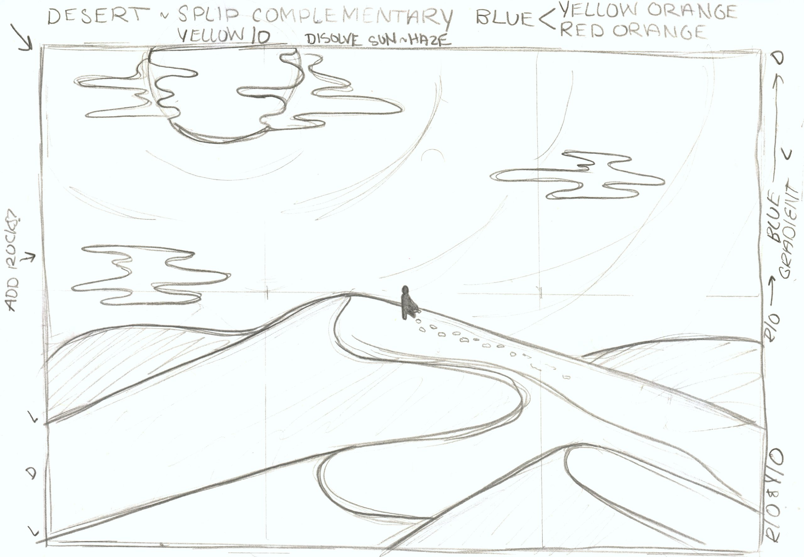
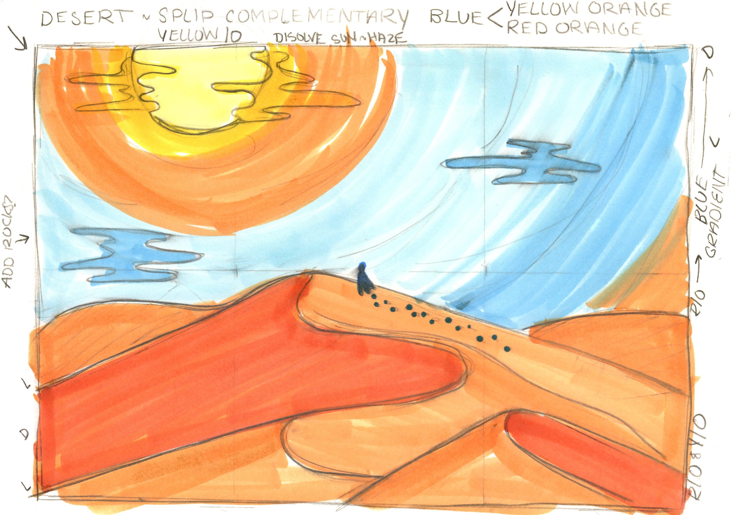
Desert – Split Complementary (Blue, Yellow-Orange, Red-Orange)
The Desert landscape posed a different challenge. I opted for a split complementary color scheme, marrying cool blues with fiery yellow-oranges and red-oranges. This choice allowed me to depict the arid, sun-soaked environment and capture the intense contrast that defines the desert.
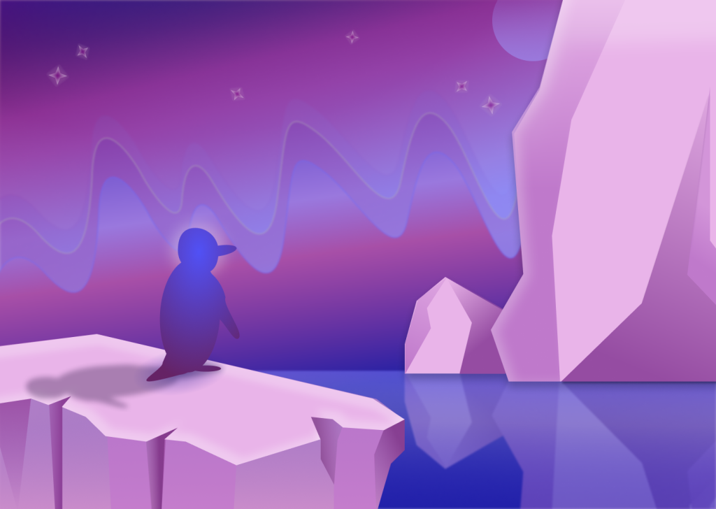
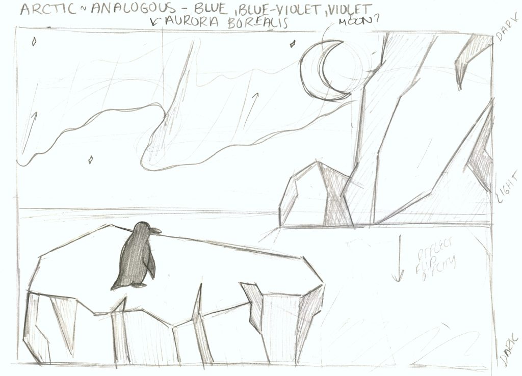
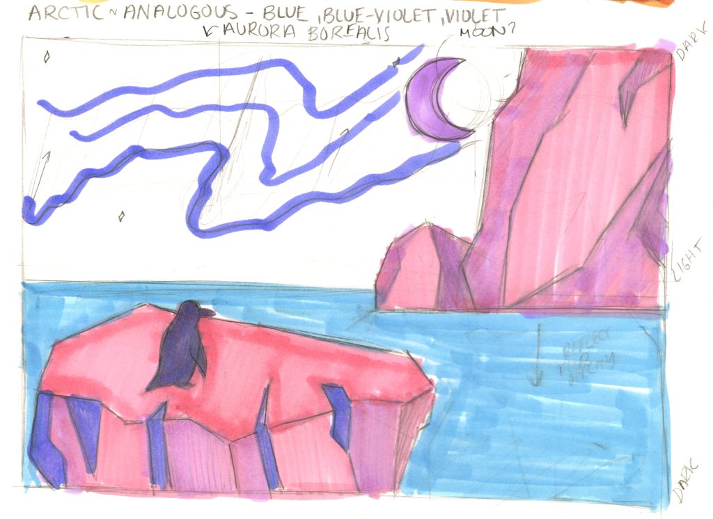
Arctic – Analogous (Blue, Blue-Violet, Violet)
The Arctic landscape provided a stark contrast with its icy and serene setting. To convey this, I chose analogous colors—various shades of blue, blue-violet, and violet. These colors created a sense of calm and unity, much like the tranquil Arctic expanse.
The Creative Process
Creating these landscapes was a journey filled with its own set of challenges and moments of triumph. I learned that a monochromatic scheme, like in the Urban landscape, can evoke a sense of harmony and tranquility. In contrast, a split complementary scheme, as seen in the Desert landscape, introduced an element of energy and contrast.
Everthing starts with an idea! I began by sketching a draft composition of what I initially had in mind for each landscape. While also utilizing Gesalt prinicples from my previous project and writing down each color scheme I intended to use, each came to be formidable sketches moving forward in my work.


I used Copic markers to roughly block out colors within each pertaining to the schemes I chose. This would aid me in creating the final versions of the landscapes in Figma. While refering to the sketch in color, it helped me keep to the overall idea of the project: exploring and applying color schems! The triadic scheme in the Extraterrestrial landscape embraced the surreal, while the analogous colors in the Arctic landscape created a serene and inviting atmosphere.

Throughout the drafting stages to the final production, I made sure each had a main focal point, while the elements around it helped to tell the story of that focal point.
In my Desert landscape, I portrayed a lone figure in cool, tranquil blues navigating the intense heat of the desert represented by vibrant yellow-oranges and red-oranges. This choice conveyed the idea of the figure harmonizing with the environment while emphasizing the stark contrast.
In the urban cityscape, prominently detailed buildings dominate the foreground, portraying the sharp lines typical of a bustling city. Meanwhile, in the background, less detailed buildings fade into darkness, illustrating the city’s vast expanses beyond our immediate view.
In designing the Arctic landscape, I sought to convey more than just ice and snow. The inclusion of a penguin as a central figure implied a cold yet welcoming environment for various wintery creatures. The backdrop of icebergs against a sky awash in blues and purples hinted at the mystical aurora borealis, a signature feature of the Arctic.
In my extraterrestrial landscape, a vibrant green spaceship commands the spotlight as it departs from the glowing green surface. Surrounding it, a fusion of violets and oranges, seldom seen on Earth, enhances the otherworldly aura of the scene.
From concept to its final execution, I diligently ensured that each composition possessed a central focal point. These focal points were carefully crafted to tell unique stories, where the elements surrounding them wove narratives of harmony, contrast, and enchantment. Whether it was the lone figure in the desert, the bustling urban cityscape, the welcoming Arctic landscape, or the extraterrestrial voyage, each design choice served as a “brushstroke” on a digital canvas, allowing me to convey emotions and messages through the vibrant language of color in design.
Reflecting on the Journey
What did I learn?
Color is a powerful tool that extends beyond mere aesthetics. It has the remarkable ability to evoke emotions, set moods, and breathe life into my designs. Furthermore, I discovered that different color schemes, such as monochromatic, split complementary, triadic, and analogous, can profoundly influence the atmosphere and narrative of a design.
What was easy?
Selecting a color scheme for the Urban landscape proved relatively straightforward. Working within a monochromatic palette of green was both visually appealing and conceptually harmonious, conveying the essence of a bustling city seamlessly blending with its natural surroundings.
What was challenging?
The Desert landscape presented a unique challenge. Balancing the cool blues with fiery yellow-oranges and red-oranges in a split complementary scheme required careful consideration to capture the intense contrast of the desert environment accurately. This landscape pushed the boundaries of my color comprehension and artistic skill.
How could my submission be improved?
My submission could be improved by delving deeper into the intricacies of color theory and exploring even more unconventional color schemes. This would add depth and creativity to my designs, offering viewers a more captivating and immersive experience.
How could the professor improve the assignment for the next class?
To enhance the assignment for the next class, the professor could consider broadening the scope of the project beyond landscapes. While this project was incredibly insightful and informative, exploring how color theory applies to other design elements, such as branding, web design, or interior spaces, would provide students with a more comprehensive understanding of the practical applications of color.
How might I apply this knowledge in future assignments or work scenarios?
The knowledge gained from this project on color and design will significantly influence my approach to future assignments and professional scenarios. I intend to use my newfound understanding of color’s emotional impact and the versatility of different color schemes to create designs that better resonate with audiences and convey meaningful messages.
Did a specific reading or video inspire or help me?
Throughout my creative journey, several readings, resources, and videos served as invaluable sources of inspiration and guidance. One particular resource stood out: “The Psychology of Color” by Riley Johnson, a TEDx talk. This video delved deep into the psychology of color, unveiling its profound influence on human emotions. Johnson’s insights heightened my understanding of color’s pivotal role in design and underscored the significance of making deliberate and thoughtful color choices. It was a source of insight and inspiration throughout this project.