Combining Images
By Kayla Gajewski

The Direction
Our most recent project aimed to explore the world of visual metaphors. The assignment was to create a powerful and thought-provoking design that visually expressed a metaphor. Challenging me to combine images in a unique and exciting way, utilizing techniques such as addition, substitution, intersection, pattern, texture, and collage to convey the essence of a metaphor.
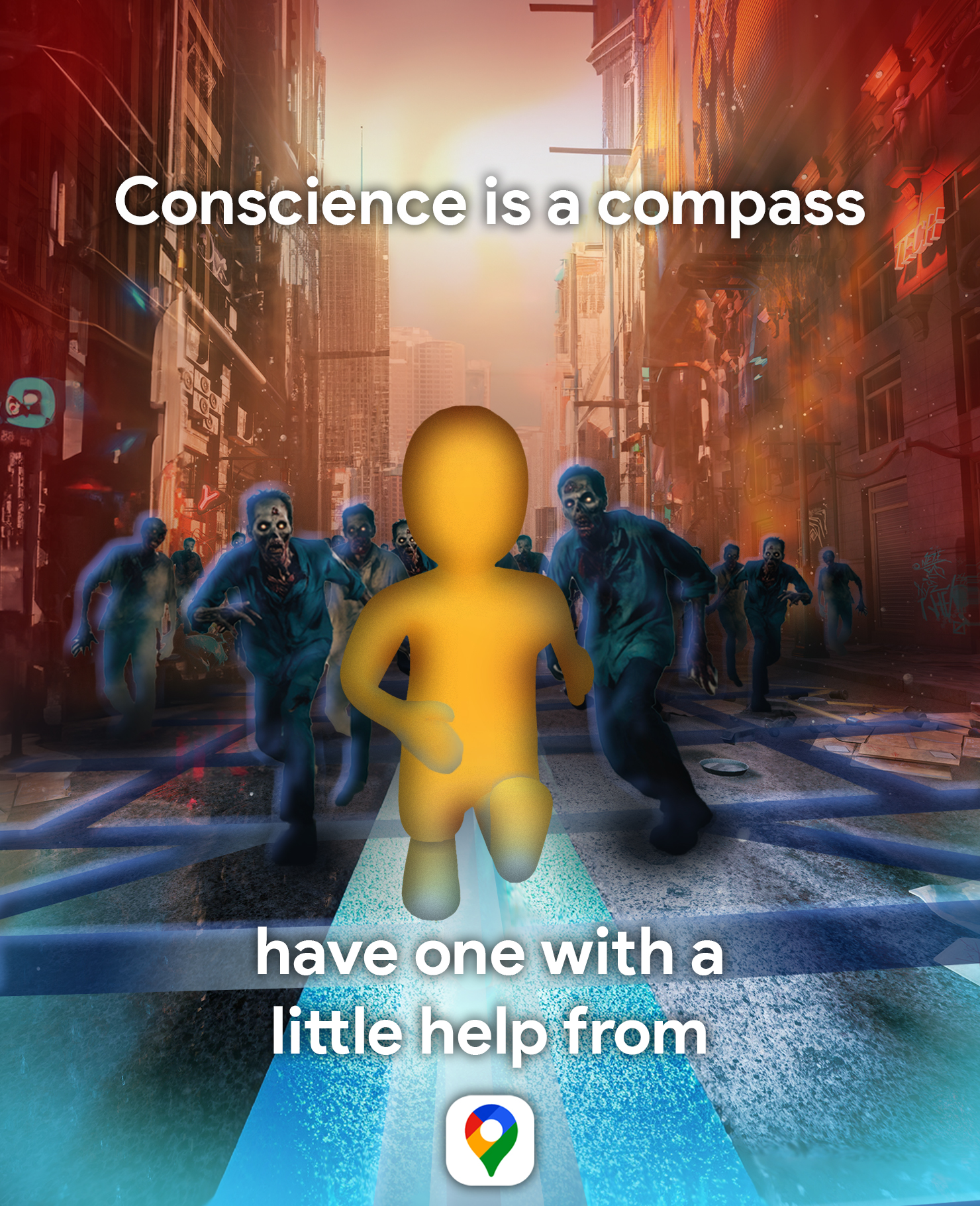
Vincent van Gogh once said that “Conscience is a Man’s Compass,” and this quote became the focal point of my project.
The Creative Process
Brainstorming and Conceptualization
I began by diving into the metaphor, trying to visualize the relationship between a “conscience” and a “compass.” What does a “conscience” look like visually, and how can I represent a “compass” in a manner that resonates with the viewer?
After some consideration, I found myself drawn to two seemingly contrasting ideas: Google Maps and zombies.
Take a look at an iconic filming location of “The Walking Dead”. Woodbury was created for the sake of filming and remains standing today as a tourist attraction in the west central Georgia town of Senoia. This TV show was the main inspiration for why I wanted to incorporate zombies to represent the opposite of what a physical conscience is. Zombies are a common and well-known example of beings without consciousness, walking around without direction (or in this case Google Maps), as portrayed in the show time and time again.
The concept that emerged was a Google Maps advertisment. A poster to represent the app and the modern compass guiding us through daily life. I planned to use recognizable Google Maps imagery, such as the blue line that appears once you search for directions, with a grid like map pattern to emulate the birdeyes view you see from above.
Fusing these elements together into a cohesive and understandable image for viewers unfamiliar with the underlying intent, possed another challenge.
Sourcing Images
Adobe Stock and The Web
Here are the images that ended up being a part of the final concept! Sourced from Adobe Stock (except for the Google Map Pin…sorry Google!) I also found and used the iconic font Google often sports called “Product Sans Bold” in my final image.
Reimagination in Progress
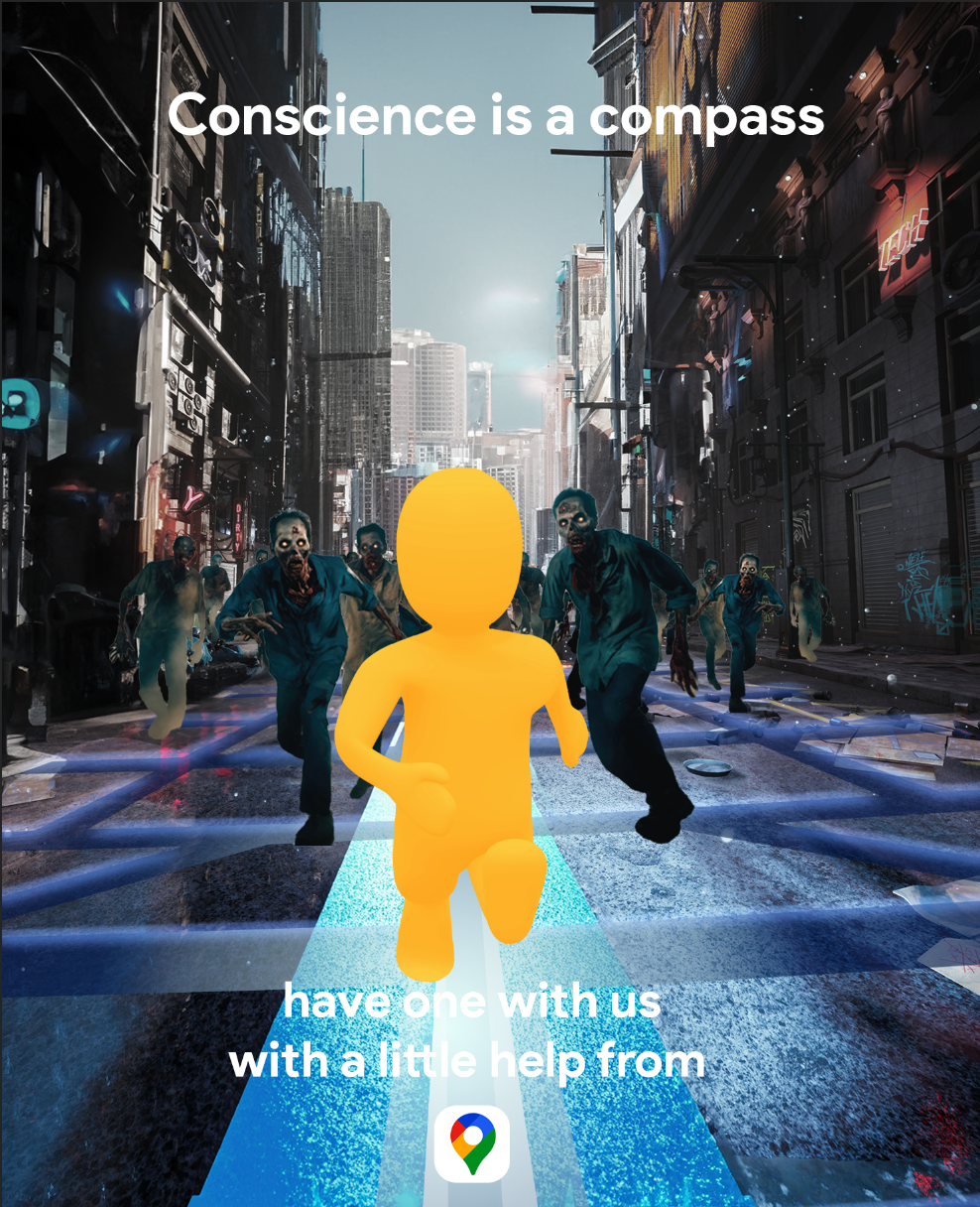
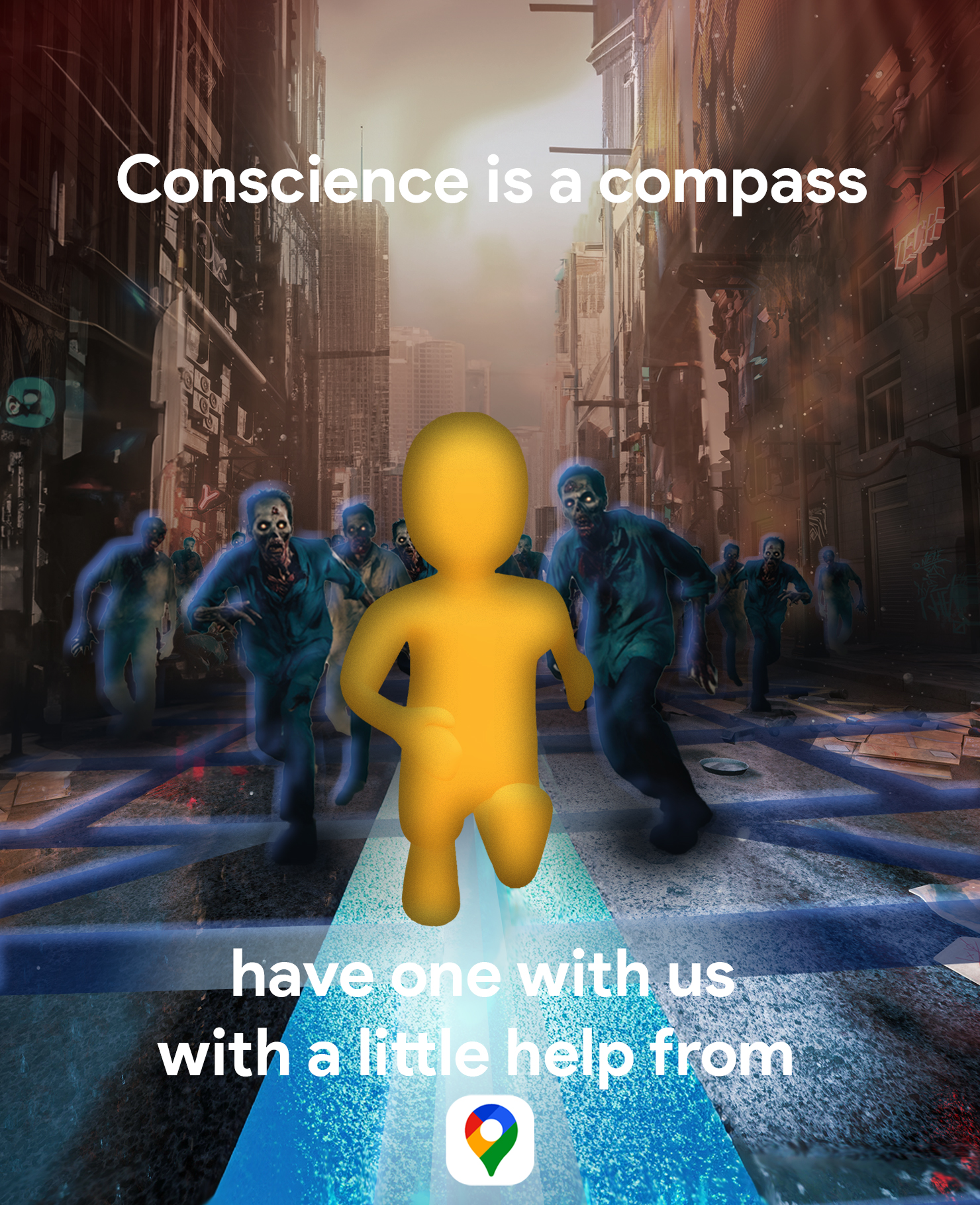
Below are images to show the progression my project took, working from a sketch, into photoshop, and ultimately the final creation! I began by roughly sketching out a basic composition. As I was taking this on in Photoshop, I wanted to spend more time there, refining the image combinations rather than getting too detailed with a full pencil drawing.


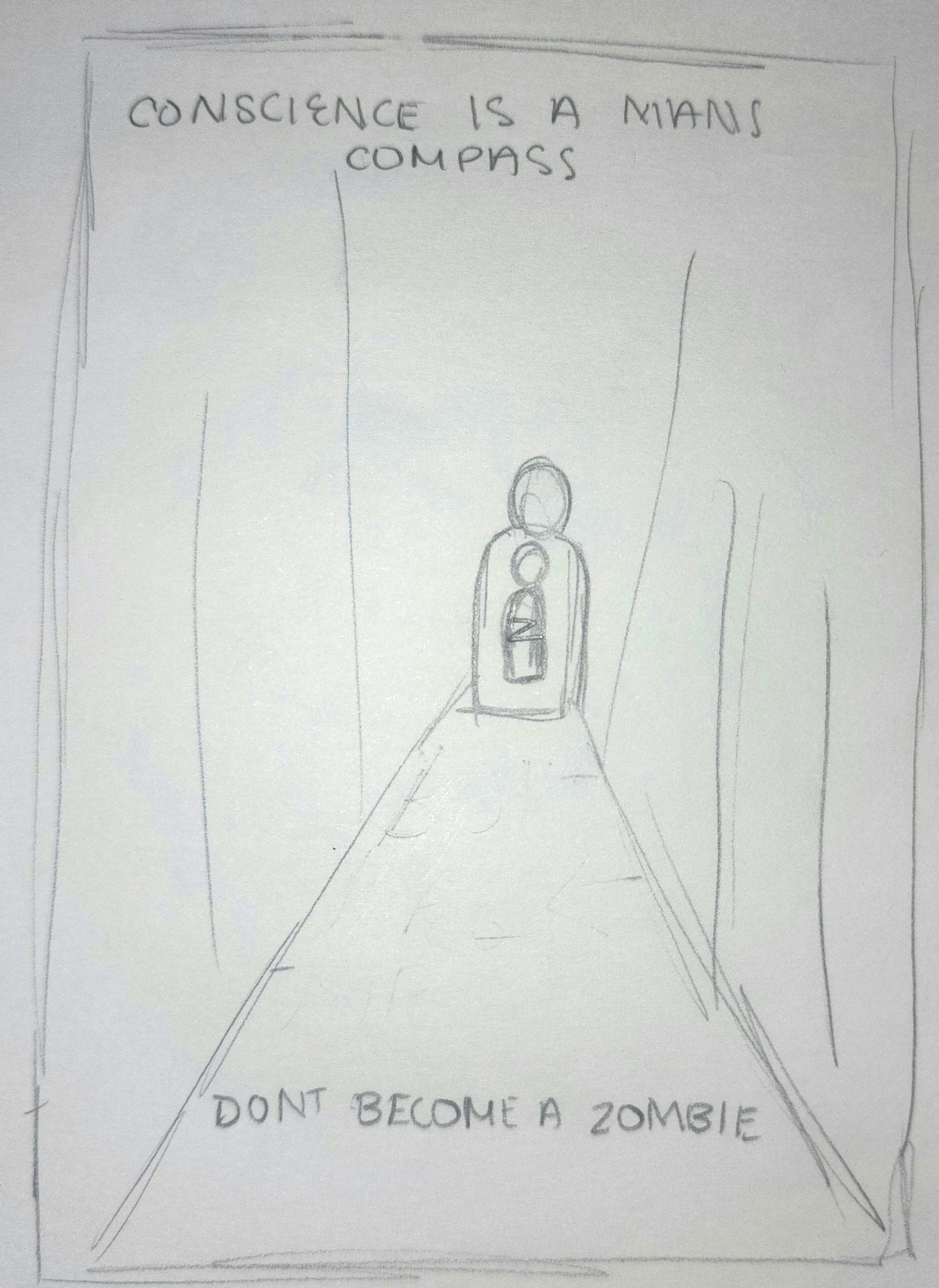
The biggest change I made was the representation and presence of the “Bio Hazard Man”. Despite being connected to generally apocalyptic themes, the idea was lost on how he tied back into Google Maps. After some feedback, utalizing the Pegman like character found in Google Street View, helped to refresh and bring the idea to life.
Then it really came down to the details of portraying the environemnt as one you may want help navigating through. I wanted my image to take on a color scheme that was reflective of that. Blue tones highlight the Pegman and the app towards the bottom of the image, with a glowing blue line to lead the way. While darker, deeper red tones creep up with zombies behind, insinuating danger.
While “The Walking Dead” characters didn’t have Google Maps to lead the way, I certainly hope we would. But since the dead haven’t risen from the grave, at the very least, Google Maps is there in our everyday lives to give us a point in the right direction.
Reflecting on the Journey
What did I learn?
Aside from the exploring the technicalities of using photoshop, combining images can convey a deeper narrative than what initally meets the eye.
What was easy?
Searching through thousands of stock images was a challenge, but it also allowed me to approach the project with a new sense of creative freedom. There are millions of images online that could be used to represent the Van Gogh quote, but narrowing it down to a few was a breeze trying to picture what different images may look like together.
What was challenging?
While searching for the stock images proved to come easy, finding a way to combined them in such a way that conveyed any meaning aside from a city of zombies was the hardest part. It took more than just copying and pasting them together. Moving through different variations of this project was key. While the use of color, and a focal point helped add depth to the image.
How could my submission be improved?
My submission could be improved perhaps by reimagining the quote from an entirely different perspective. As we saw during the final critique, metaphors in images can be interpreted in many different ways. Exploring other ways a conscience is a compass could be interesting, and may even prove to have better results.
How could the professor improve the assignment for the next class?
Overall the creative freedom of choosing our own metaphors to combine photos in any which way we chose, was a great way to explore Photoshop while calling back to previous topics we’ve learned like layout and color.
How might I apply this knowledge in future assignments or work scenarios?
I’ve worked with Adobe applications in the past. But a majority of my knowledge was in Illustrator. Moving into future assignments or even work related scenarios after completing this project has left me with a new found self confidence in navigating and using what Photoshop has to offer. The images we were all able to create, even with basic photoshop tools, is a timeless skill that could be applied to all concentrations of Digital Media Art!
Did a specific reading or video inspire or help me?
Having the lists of metaphors linked in our assingment, was a great starting point. Often times getting started is the hardest part, but having the lists at our disposable proved invaluable as I found my metaphor listed in one. Allowing me to get right to work in Photoshop.