Transforming Nursery Rhymes with Typography
By Kayla Gajewski


Behind the Fonts
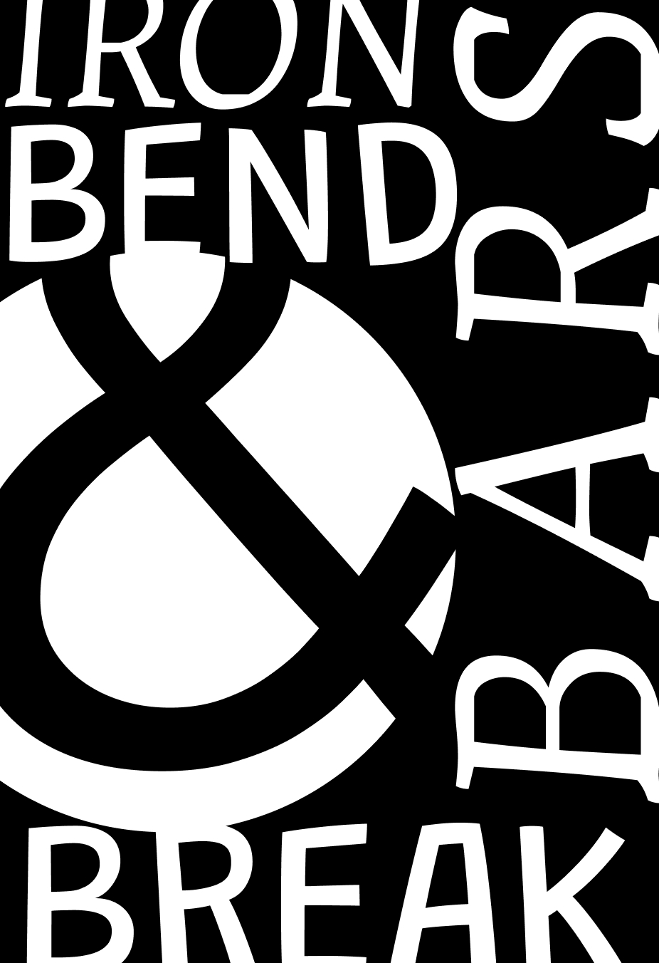
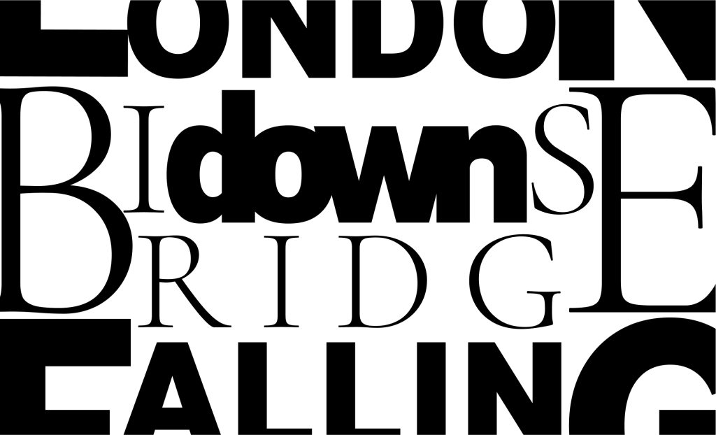
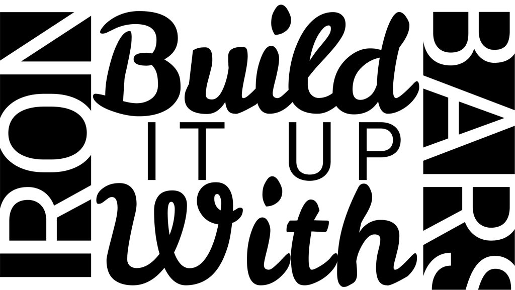
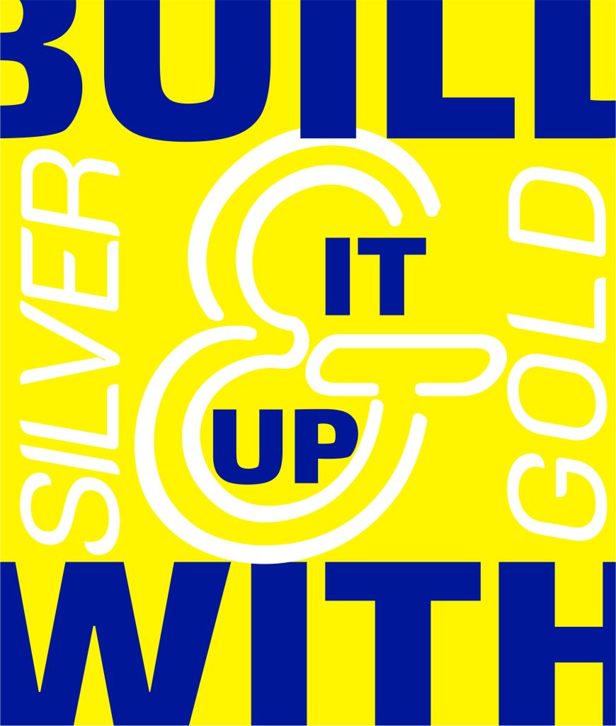
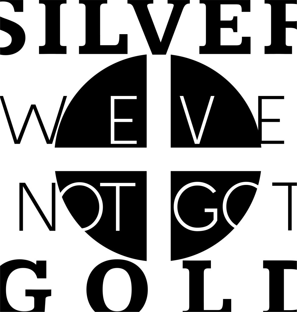
Embark on a design adventure where text arrangement becomes a strategic puzzle, reminiscent of the tactical placement of Tetris shapes. The challenge? Transform the verses of the “London Bridge” nursery rhyme, previously utilized in “Nursery Rhyme Remix: Designing London Bridge’s Collapse”, into a visually captivating word cloud.
The Creative Process
The creative process unfolded as a series of sketches, experimenting with various ways to harmoniously arrange words within a confined space.
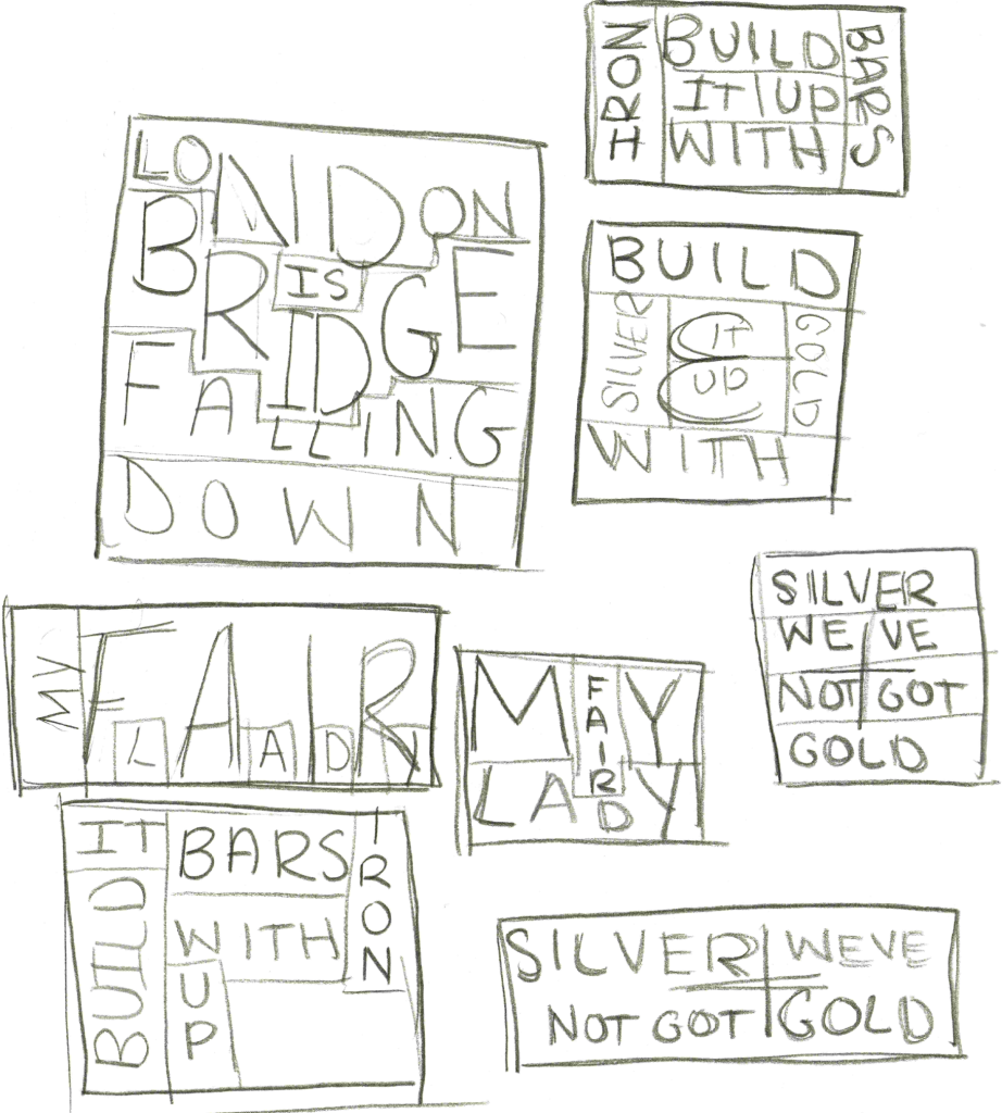
The exploration extended to finding the optimal combination of fonts, considering factors like contrast in weight and size. Each word was visualized as a “cell,” and careful attention was given to rotating, resizing, and extending words beyond the frame to fill the space optimally.
Six frames were crafted, corresponding to each line of the nursery rhyme, and variations were introduced to maintain visual interest. Notably, frames with a black background and white letters, as well as frames with a personalized color scheme, added a striking visual contrast. The deliberate decision to occasionally allow words to be cut off by the frame, while still maintaining legibility, contributed to the overall aesthetic.
As the possibilities are endless, this lead to variations of some frames being made.
This project resulted in a visually engaging and dynamic exploration of text arrangement, a testament to the creative journey that unfolded through sketches and thoughtful font pairings.
Reflecting on the Journey
What did I learn?
I learned the fundamentals of arranging words in a creative and clever manner. This project expanded my understanding of design principles and the creative potential of text placement.
What was easy?
Sketching and generating general ideas for how to fit all the words together was relatively straightforward. The initial conceptualization and visualization seemed to flow smoothly.
What was challenging?
The most challenging aspect was transitioning from sketches to Figma and finding fonts that not only worked well together but also maintained sufficient contrast. This step required careful consideration and experimentation.
How could my submission be improved?
My submission could be enhanced by exploring even more variations. The limitless possibilities suggest that further iterations might reveal improved ways to portray each line of the rhyme.
How could the professor improve the assignment for the next class?
The assignment was great overall, but one potential improvement could be showing additional examples for font pairing suggestions. Perhapes in everday advertisments or logos.
How might I apply this knowledge in future assignments or work scenarios?
The knowledge gained from this project can be applied extensively in future design scenarios. The experience of grappling not only with the placement of elements but also with the nuanced selection of fonts will undoubtedly prove valuable in various design projects.
Did a specific reading or video inspire or help me?
Nothing in particular, this seemed like a project that time exploring Figmas font library was the most inspirational and useful in pairing fonts.