1. What did you learn?
I learned how various new ways to go about aspects to photoshop such as layers, masks, etc. I was already familiar to Photoshop prior to this course, but because I taught myself the program, I didn’t know much about several of the features that were utilized for this project such as artboards and layer masks.
2. What was easy?
I thought that adding effects to the pictures were relatively easy. I liked having the ability to customize these effects as well. For example, the drop shadow effect had different variables that could be changed such as opacity, distance, spread, etc.
3. What was challenging?
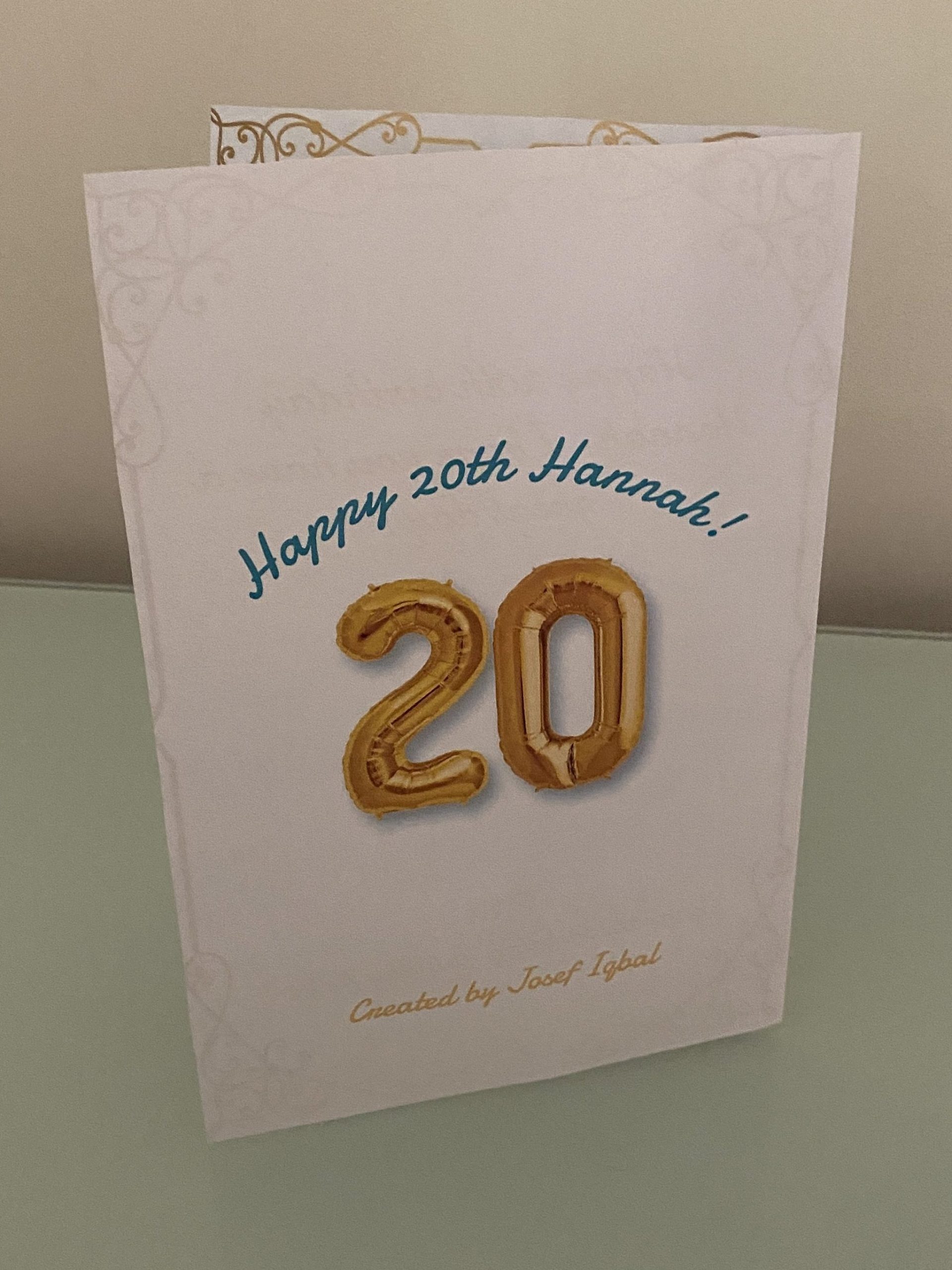
It was definitely challenging to use different methods than I was already familiar to get similar results. For example, I used a layer mask to remove the white background from the “20” balloon picture. Before, I would have just rasterized the image and used selection tools to delete the background.
4. How could your submission be improved?
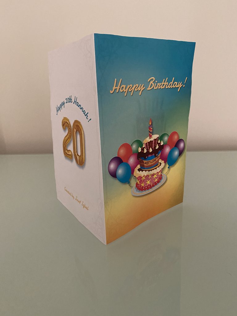
I could change the right portion of the inside of the card to better distribute the negative space. I left a lot of white in between the two texts and not a lot of white at the top or bottom.
5. How could the professor improve the assignment for the next class?
Although the project seemed pretty straightforward and the requirements were listed at the end of the instructions, a proper rubric would be helpful to reference along the way.
6. How might you apply your knowledge in future assignments or work scenarios?
This knowledge will definitely be helpful while creating posters for clubs and activities that I am involved in. For example, I am going to be starting a graphic design volunteer position this month, and now I have a better understanding of not only Photoshop, but different things that add or subtract appeal from the final product, such as use of negative space.
7. How did a specific reading or video inspire or help you?
After reading the article “7 Beginner Mistakes to Avoid When Designing for Print,” I had a few different things to keep in mind while working that I would not have thought to look for otherwise. For example, I made sure to double check for typos and choose readable fonts with appropriate line weights.