DMA 214 Project 5: Stamps

What did you learn?
I learned how to combine font, color, and images in order to make a stamp.

What was easy?
The easiest part was likely just coming up for the theme of each of the stamps and picking a color theme.

What was challenging?
The most challenging part was making the pictures/art for each stamp.

How could your submission be improved?
Having more unique designs for each stamp, as a lot of the formatting looks too similar.

How could the professor improve the assignment for the next class?
Have examples of stamps that people have made in the past.

How might you apply your knowledge in future assignments or work scenarios?
I could use this when designing things in the future, especially when thinking of layout color and text font/placement.

How did a specific reading or video inspire or help you?
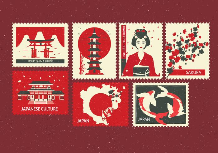
What inspired me was this picture: Tokyo Stamps Vector 379656 Vector Art at Vecteezy. This image helped me in figuring out what my stamps theme should be, and what kind of style I should go for.
Similar Posts

  • DMA 214 Project 3

    Metaphor: Art is the mirror to the soul What did you learn?I learned how to cut images together and how to make a pattern. What was easy?The easiest part was making the pattern. What was challenging?The most challenging part was finding the images that would work well with the metaphor that I chose. It was…

  • DMA 217 Project 2

    Link: https://www.figma.com/file/sncMT9lnBURyhDQFBqyLWc/DMA217-Project-2-lamb7?type=design&node-id=0%3A1&mode=design&t=vSn85GHgKPeWd9Hh-1 What did you learn?I learned how to make a visually appealing website in Figma and the starting process of how to transfer it into code. What was easy?The easiest part of this project was likely coming up with the color scheme and the fonts for the pages. What was challenging?The most challenging part…

  • Project 3: Infographic Illustration

    Link to Full Resolution Images This was made using Adobe Illustrator. Many of the designs within are made in an isometric style, while some just flat. I chose a bright and eye catching color theme to make the poster more attractive. This poster is something I really wanted to make for myself, as I often…

  • DMA 214: Project 4 Typography

    Twinkle Twinkle Little Star What did you learn?I learned how different types of fonts will complement each other. What was easy?The easiest part was likely just thinking of what each frame would look like. What was challenging?The most challenging part was making sure that all the type would line up well and look good and…