Lab – Hierarchy

Inspiration

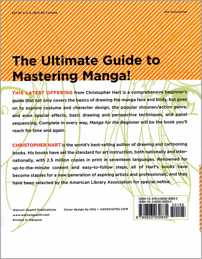
For my Hierarchy lab, I took inspiration from the back of Christopher Hart’s cartoon books (which I’ll use religiously as guides). I designed mine to resemble the similarities from the small text at the bottom, to the brightly colored paragraph starters. I again chose the retro/typewriter font, but the Marker Felt font for the beginning of the paragraphs to capture a nostalgic feel.

Project – Alignment

This project was to make a poster for the Canisius Digital Media arts branch. We had to include all the classes and prerequisites for this major/minor.

I chose to go for a retro nerdy style with the font Krungthep, also color coded the course codes so nothing got lost in the shuffle. I also alphabetized the courses so it was organized so the reader does not have to jump around too much and get confused.

Project – Movie Poster

This project we had to create a kind of poster for a film using fonts that gave the reader an idea of the movie. This was difficult because I had so many ideas, I knew I wanted to pick either a mystery or animated. I chose “The Great Mouse Detective” which is a mouse version of Sherlock Holmes and is based on a book series “Basil of Baker Street’ by Eve Titus. It was going to be either this one or “Who Framed Roger Rabbit.”

This project was fun but I know my submission can be better. Clean up the magnifying glass for starters, bold the text for Mouse, and maybe add ears. My favorite aspect of my submission is the magnified section of Detective, and the shadow for Great.

Digital Media Arts – Lab

This lab we had to create a poster for the Canisius Digital Media Arts Club while using different spacing and fonts. I used mainly bold texts like Arial Black and more retro/sci-fi looking fonts like Acumin Variable Concept.

This was a rather simple lab, though it was difficult to pick fonts that stood out. My take on the lab could be improved by picking fonts that matched, seeing as the top in Papyrus is out of place.